
DALL·E 2 and The Origin of Vibe Shifts
By Means of Natural Selection
Sponsored By: Flatfile
Today's newsletter is brought to you by Flatfile, the customer data onboarding platform.
Data onboarding stifles growth in even the largest companies.
One of the worst ways your team spends time is manually formatting customer data before it can be imported.
B2B companies spend tons of effort trying to fix this data onboarding process, usually, by hiring services teams, building custom import scripts, or asking customers to spend hours formatting data with CSV templates.
What if you could:
- Save your team from wasting hours formatting spreadsheet data.
- Import and migrate disparate data in as little as 60 seconds.
- Onboard sensitive data safely with HIPAA, GDPR, SOC 2 Type II and Type II compliance.
Flatfile’s data onboarding platform solves these problems, transforming customer, partner, and vendor data from messy and unorganized, to clean and ready to use, with 1-click.
Sometime around 2015 there was a mysterious vibe shift in web design. It came so suddenly, and with so much decisive force, that it stood apart from the normal ebb and flow of aesthetic trends. It was like an invasive species taking over an ecosystem from a weaker competitor.
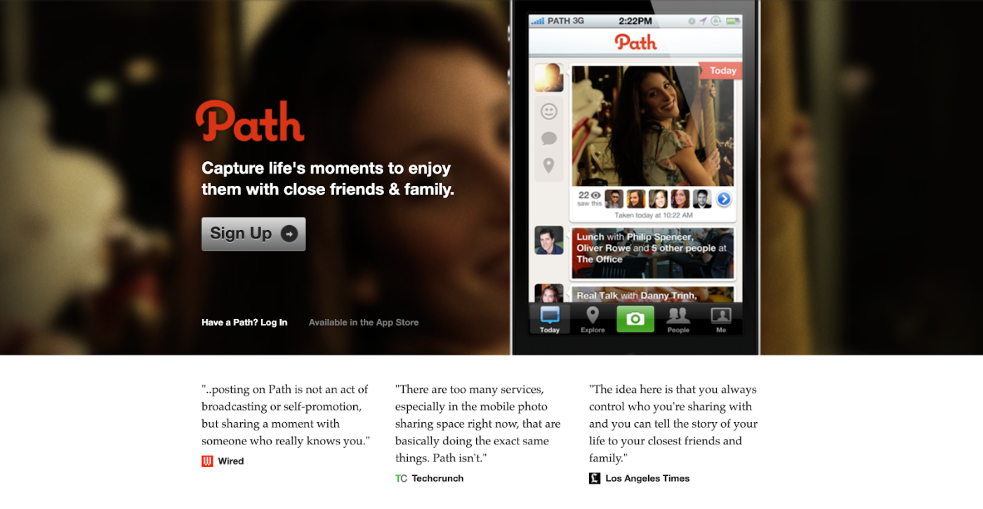
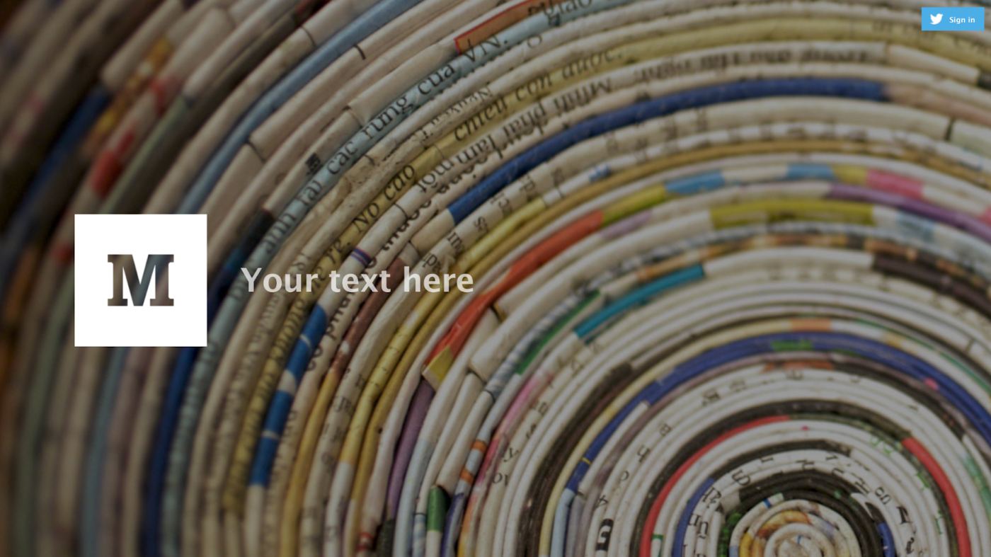
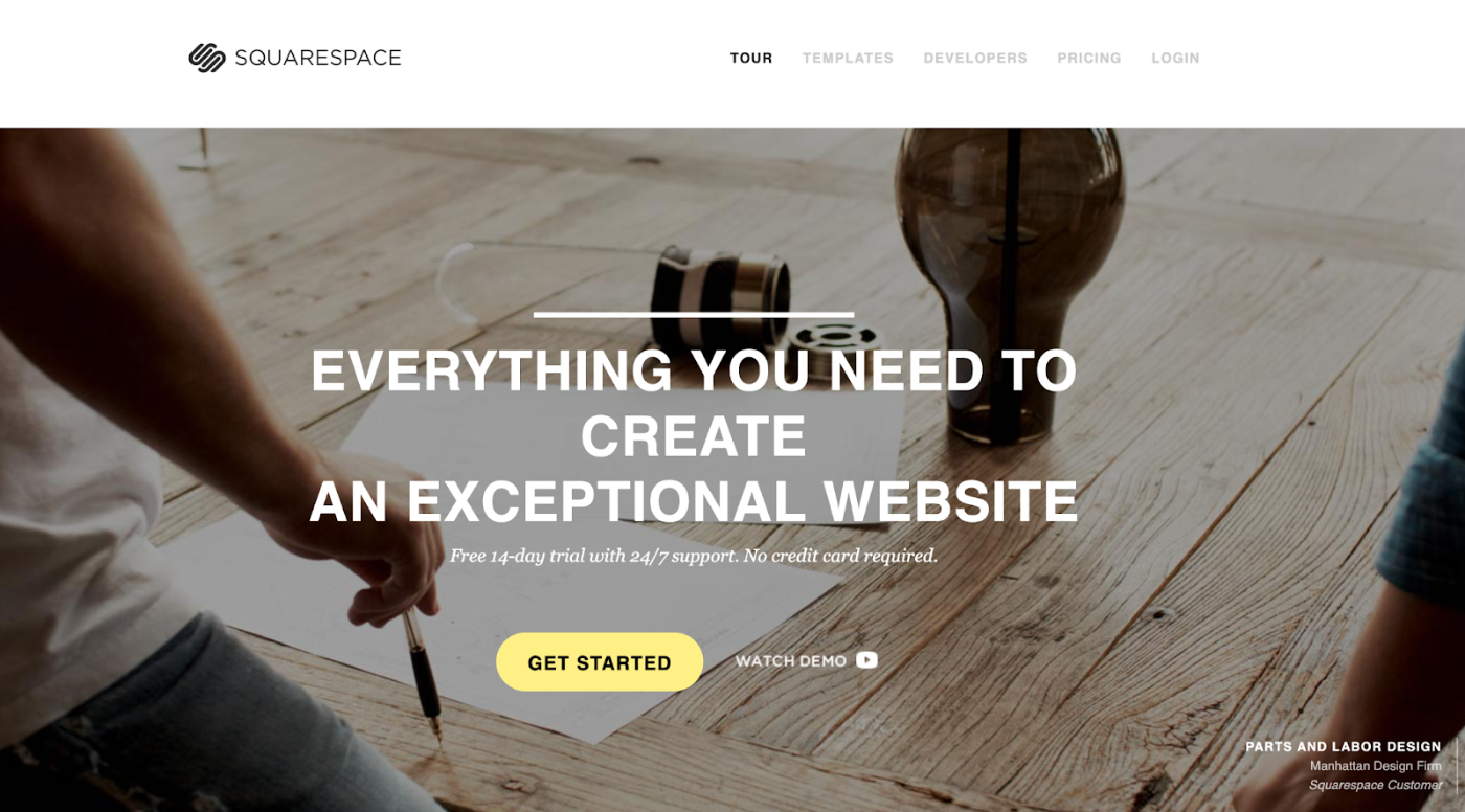
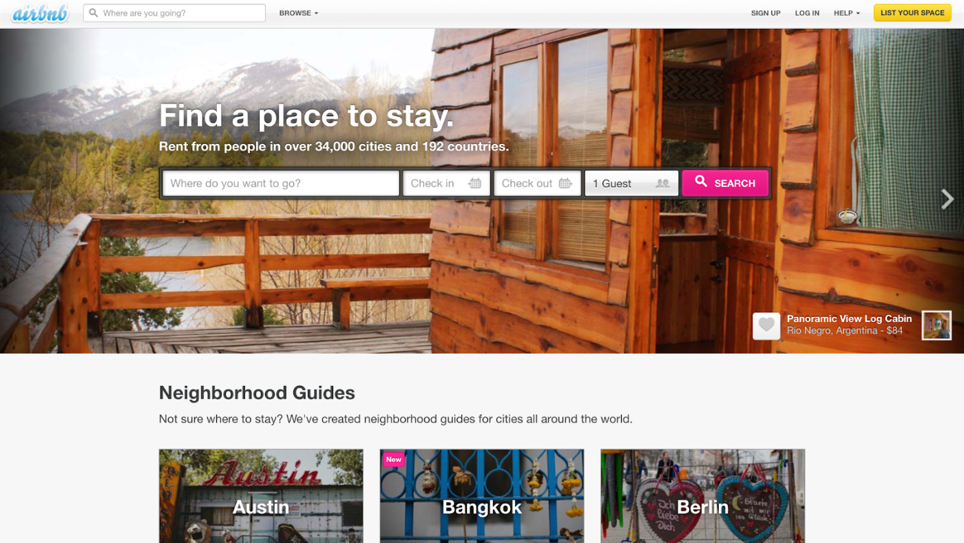
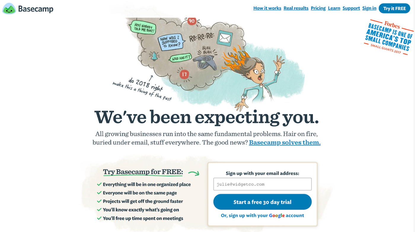
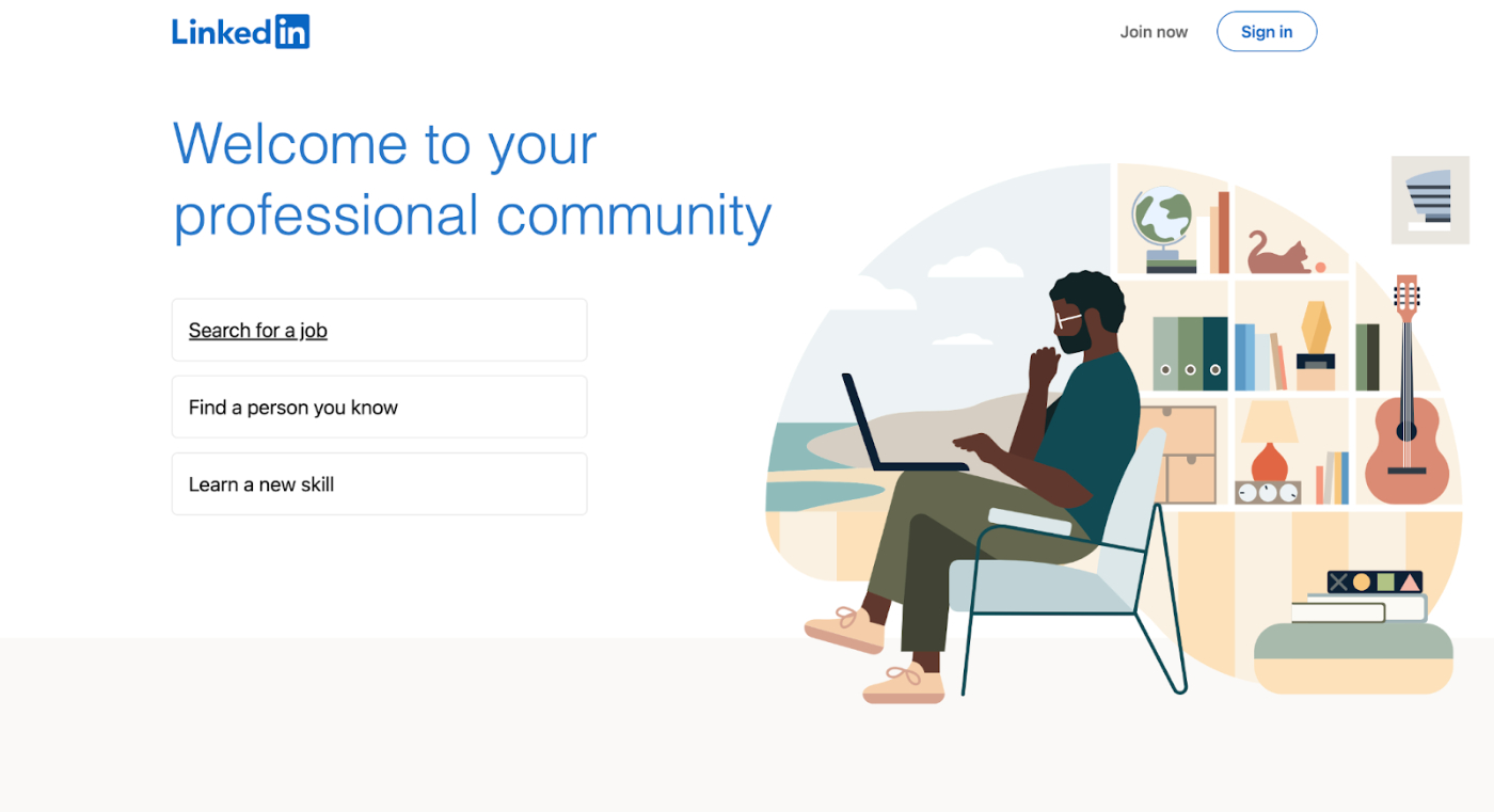
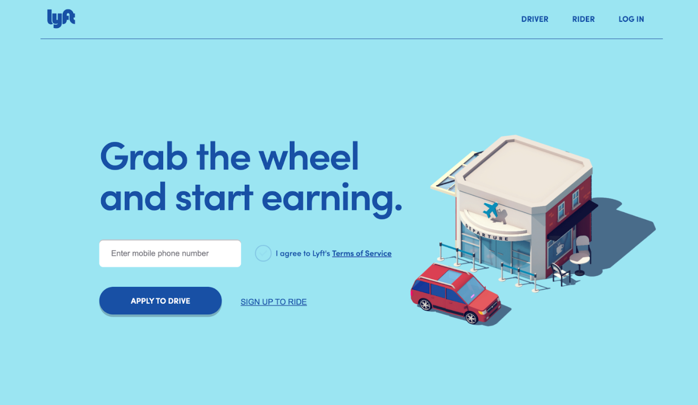
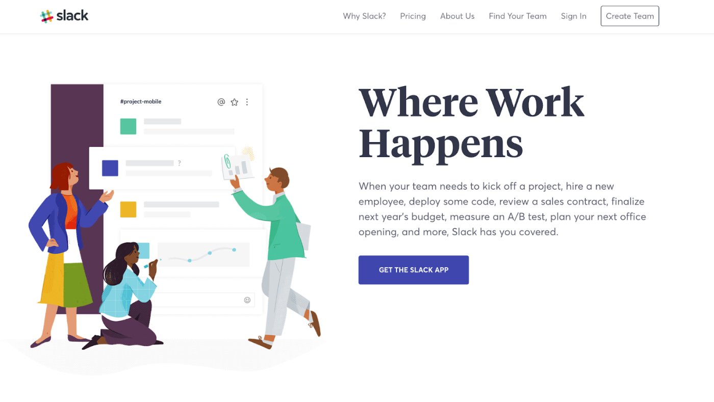
Before the vibe shift, all the cool websites looked like this:

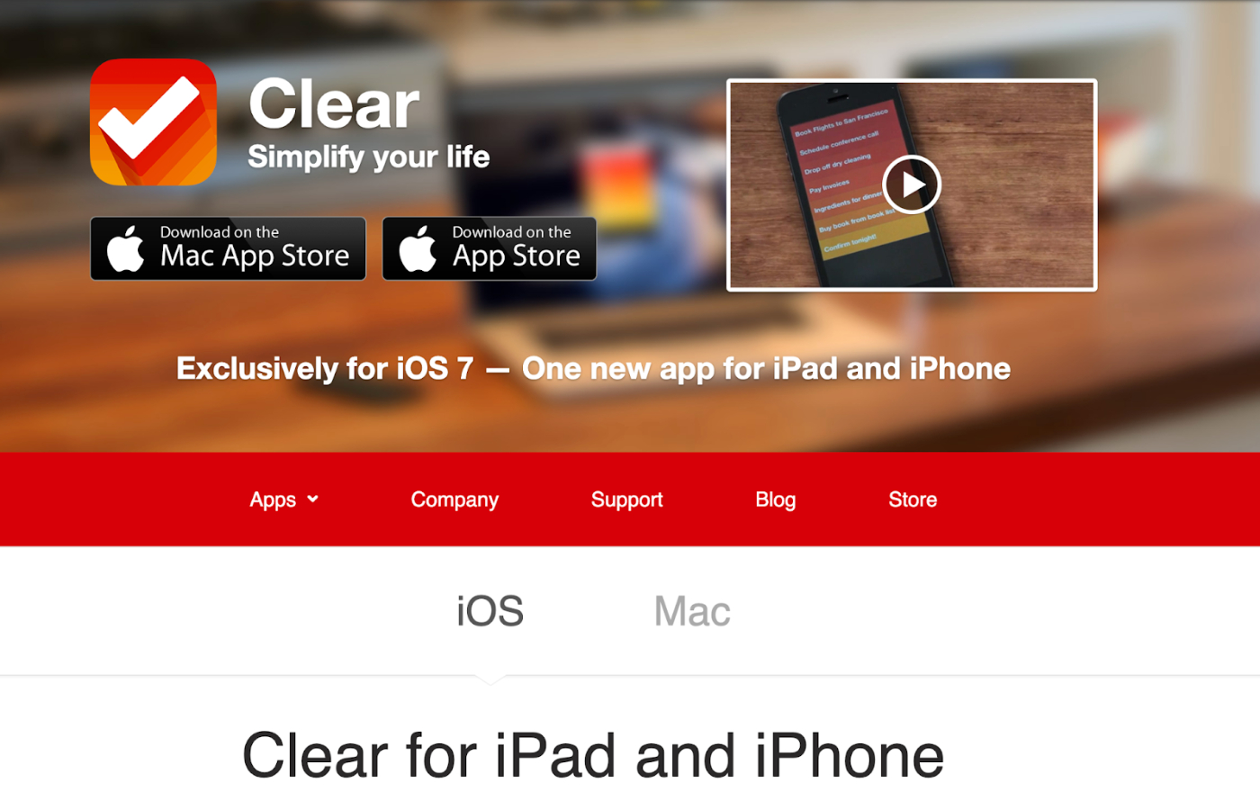
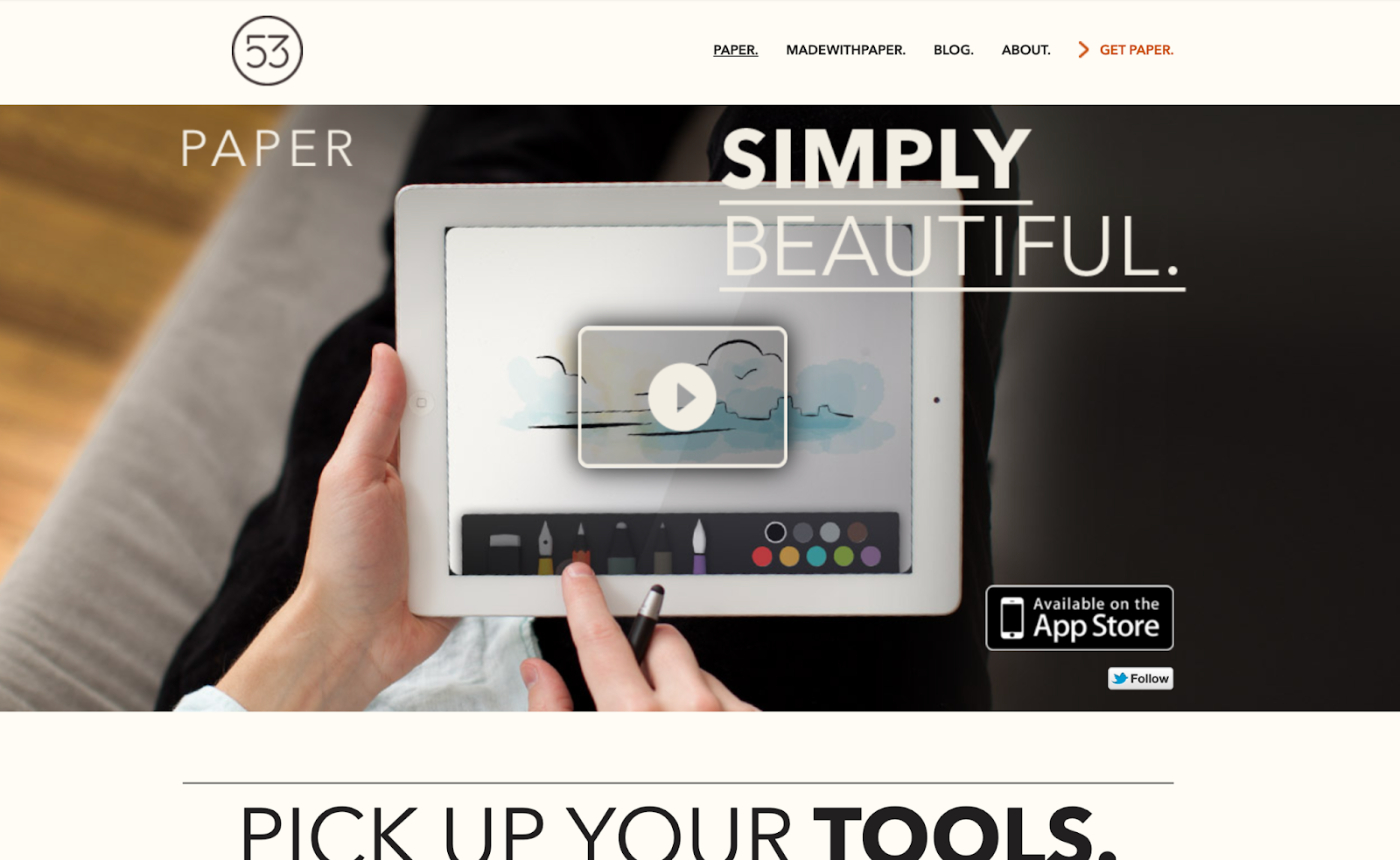
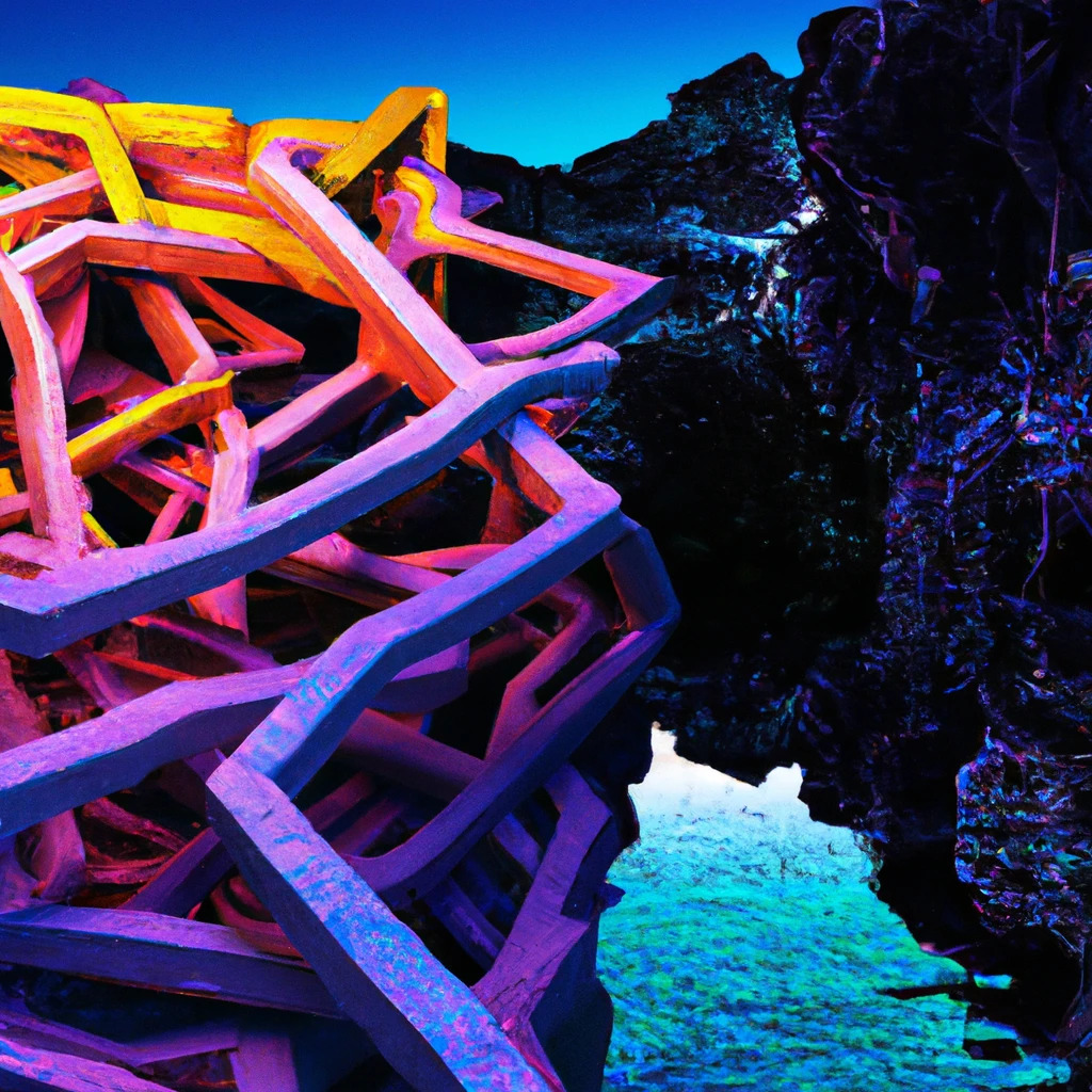
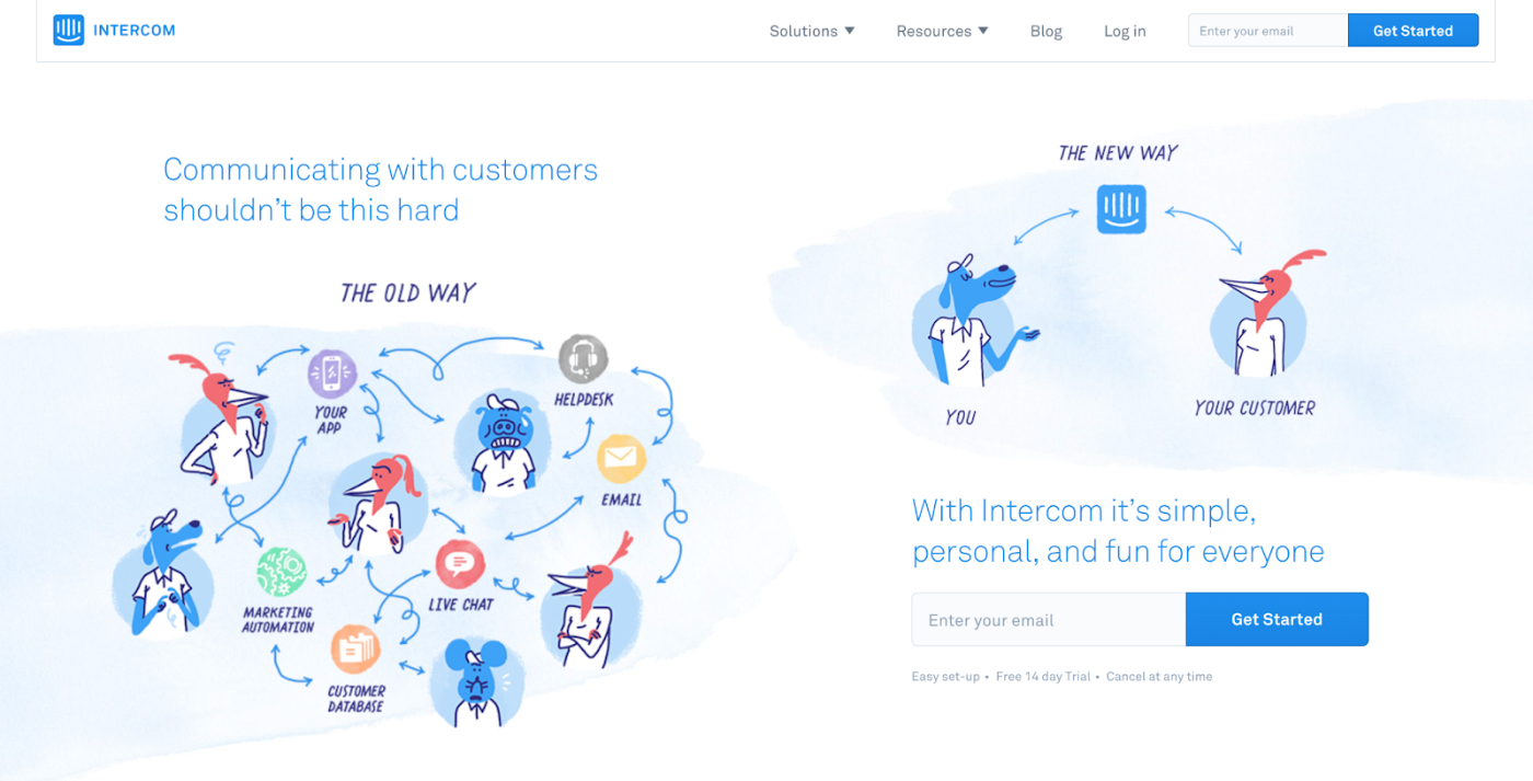
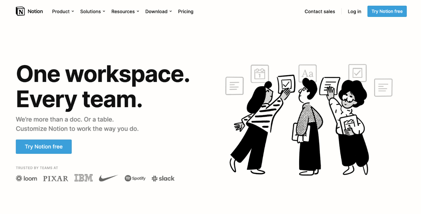
After the vibe shift, websites suddenly started looking very different:
What happened?
Was there some deep angst in the collective unconscious that could only be soothed by abstract illustrations? Did people just get bored of all the background photos? I think there’s more to the story—a very specific economic cause.
I think when Unsplash (the free photography website) was founded in 2013 it killed the old vibe by democratizing access to great photography, and thereby ruining its function as a costly status signal. Companies then started using custom illustrations in their brand aesthetic because illustrations suddenly became much more rare and expensive relative to photos.
I’m interested in this little piece of design history because today I think history is on the brink of repeating itself. Now that we have DALL·E 2 (and other AI image generators), a huge portion of visual vibes will become democratized. What Unsplash did to photography, DALL·E 2 will do to illustrations, 3D renderings, and eventually all visual styles.
In other words: a vibe shift is indeed coming.
But the point of this essay isn’t about predicting next year’s design trends. To me the more interesting thing is to understand the ecological process that generates those trends, seeing the true signaling function of visual design, and learning why some corporate status signaling is so effective and why some isn’t. Projecting further out, it’s about trying to picture a world where it’s cheap and easy for anyone to generate just about any kind of image they want.
To answer these questions, we’re going to tap the most well-developed pool of knowledge on the use of costly signals and their evolution over time: biology.
Costly Vibe Signals
Companies, like most organisms, need to attract mates to survive and reproduce. Specifically they need to attract customers, employees, investors, and counter-parties for transactions of all sorts.
Just like biological entities have limited slots available for mating and alliances, economic entities also have limited slots available for transacting: you probably only work for one company, only use one CRM, one team chat system, one payments provider, etc. These natural limitations create competitions for mates in the economic world that are very similar to the competitions found in nature.
The fundamental challenge in these competitions is information. Agents want to choose the best partner to transact with, but they have incomplete information and limited time and energy to decide. From the outside it’s hard to know if a company is going to be able to deliver on their promises, just the same way it’s hard for a female peacock to know if a male is going to have good genetics, so we have to rely on external surface-level signals to make decisions.
The best and most reliable type of signal is known as a “costly” signal because it’s hard to fake. For example, if a male peacock has a giant array of feathers and still manages to drag it around everywhere and survive, it’s a pretty good bet that they are physically fit and have good genes. These signals are called “costly” because it costs something tangible to send them, which is proof of fitness (in the broadest sense of the word “fit”: well adapted to survive in the environment).
The primary function of visual aesthetics in corporate design, in my view, is to send a costly signal to prospective partners that the company is fit to survive. “We are strong, wealthy, and reliable,” they say to your subconscious. Of course, besides visual aesthetics, a company’s marketing materials need to clearly articulate the product’s value proposition. But this essay is about how they do it. Cheap-looking design often signals a lack of resources and taste.
The exception that proves the rule is Berkshire Hathaway’s website, which is the corporate version of shabby chic, like a top model wearing baggy torn-up clothes: a costly signal in its own right. (“Look what I can get away with!”)

It raises the question: for those of us who aren’t Warren Buffett, and do need to dress to impress, what defines quality?
There are universal principles of visual design that matter across time and in every cultural context. But also, there are certain processes and materials that are seen as premium. This is context-dependent; it changes over time based on technology and economics. When a design uses a premium material like an illustration or an intricate 3D rendering, it is seen as an honest “costly signal” that the company behind it has lots of resources to spare. This, more than grid alignment or proper typographic hierarchy, is the thing that sends a tingle down your spine and makes you think “I should sign up.”
The weird thing is, what gives you goosebumps today might feel lame in 20 years. Just look at the “pre vibe shift” websites above—at the time I can promise you they made nerds like me drool. Today… not so much.
How does this happen? And what will happen when AI gets so powerful that anything is possible with a few keystrokes?
Natural Selection & The Red Queen’s Race
Some tasks are rewarded on the basis of absolute performance, like for example climbing trees to avoid bears. It doesn’t matter if your friend is better at climbing the tree than you as long as you can climb high enough to avoid the bear.
Other tasks are rewarded based on relative performance. Signaling is one of those types of tasks. For a male peacock looking for a mate, it doesn’t matter if you have a big beautiful tail if the guy next to you has one that’s a bit bigger and brighter. Visual aesthetics coming from corporations fits in this category, too. They only give us goosebumps when they are better than everything else we’ve seen lately. If the only website you’d ever seen was designed by a two year old, you’d be absolutely stunned by my web designs, even though I’m just moderately competent at it.
(Side note: one of the things I loved about the show Severance was the incredible reverence with which its characters treat the self-help book. If your entire conscious existence was spent in an office where the only reading material you had access to was the employee handbook, you’d think it was amazing too! I thought this part of the show was hilariously realistic.)
The tricky thing about relative tasks is that in the real world, people are improving around you all the time. So in order to maintain the same level of performance you’re used to getting, you have to keep improving. This is known as a Red Queen’s Race, after a story in the sequel to Alice in Wonderland where Alice visits a strange land where no matter how fast she runs she always seems to stay in the same place.
I got a pretty visceral sense of the Red Queen’s Race in design trends when I visited the Wayback Machine to gather screenshots for the top of this post. It was cool to see the vibe shifts wash over bellwether brands like Apple, Squarespace, and Airbnb. You can tell they absolutely work hard to find an edge, meticulously crafting and AB testing ideas, only to have the design edge wash away within months. (I suspect a similar dynamic is at play in the newsletter game 😭)
Partly these design edges get competed away thanks to copycats at other firms—trends in typography, color, etc. But these shifts are small and continuous. Overarching vibe shifts, like the one from photos to illustrations, are a separate phenomena.
We should get familiar with it, because it’s about to get extreme.
Extinction Events & The Vibe Singularity
When Unsplash started to gain steam, it was like a comet hitting the design universe. Suddenly anyone could get a high quality photo of almost anything they wanted, for free. The phrase ‘game change’ has been beaten to death, but it really does apply here. Use of photography exploded in popularity at the low end, and went nearly extinct at the high end.
What will happen when DALL·E 2, or something like it, gets released to the public? The first order consequence is there will be a lot of websites and blog posts that now come with illustrations, or other cool visuals these algorithms are capable of generating, like 3D models, faux photos, clay models, etc. At the high end, in the short run I think the most likely path is to run towards interactivity. There are currently no AIs that can make interactive visualizations.
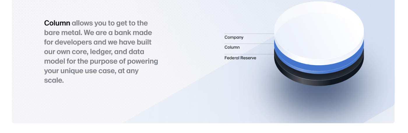
For example on Column, a new type of banking platform that startups can build financial products on top of, there is a cool animation that happens as you scroll.
The cylinder thing on the right starts out with a bunch of layers:
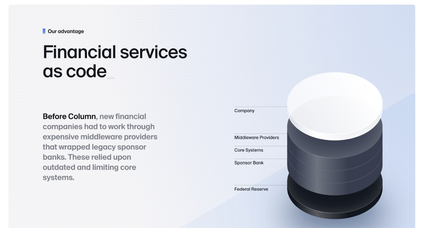
Then all those layers get compressed into one as you scroll:
(Side note: if there ever were a prime candidate for a company that needs to do some costly vibe signaling, it’s a startup that needs to convince other startups to build financial products on top of it. Historically Stripe has been a leader in design too, for the same reason.)
Anyway, this sort of animated / interactive design isn’t exactly new, but I bet we’ll start to see a lot more of it now that the cost of illustrations has dropped to roughly zero.
But remember, this is a Red Queen’s Race. Technology will keep advancing, and eventually could reach a point where you can type a prompt like, “a landing page for a financial services company” and it will spit out something amazing that you can fine tune by typing. There’s a whole category of AI website builders now, and even AI tools that generate marketing copy.
It might seem far-fetched, but the technology is moving much faster than you might think:


So what is the end game? What happens if we reach a “vibe singularity” in all forms of art, where anyone can create anything by typing a few phrases? How does status get signaled through aesthetic vibes when all the vibes are free?
I think the leading edge of aesthetics will probably always involve human skill, even if the methods we use to channel that skill will change dramatically. When it comes to relative-performance games, we should think of AI tools more like an instrument that can be played well or poorly, and less like a replacement for humans. If all that mattered was absolute performance, then sure, the AI would be able to perform well enough to get the job done without human intervention. But when it comes to status games, relative performance is what matters. And human+AI is probably going to beat AI alone for a long time.
Already we’re seeing it with GPT-3 and DALL·E 2—some people are creating amazing things with it, and others are doing little more than the AI equivalent of “hello world.” On the amazing end of the spectrum: Github Copilot helps programmers write code faster, Sudowrite is a new tool to help storytellers beat writer’s block, and Fable creates “virtual beings” that are basically characters in stories you can interact with. These are, of course, way cooler than anything you could do if you took human creativity and skill out of the equation.
Furthermore, I think future generations are going to be ridiculously good at working with AI to create cool things. Just like anyone under ~35 is considered to be “internet native,” today’s kids will be considered “AI native.”
I’m excited to see what they make!
What did you think of this post? Train our ‘algorithm’ by using the feedback buttons below!
Thanks to our Sponsor: Flatfile
Thanks again to our sponsor Flatfile for today's newsletter. Click here to view the data onboarding platform that the world’s best companies use to onboard their customers.

Comments
Don't have an account? Sign up!
I like how you captured what's happening in the market right now but wrote about it as if it happened in the past a while ago - maybe that's the whole point! :-))