
I used to use Roam every day, but I don’t use it much anymore. Based on what I can see on Twitter, and a casual survey of friends, I don’t think I’m alone.
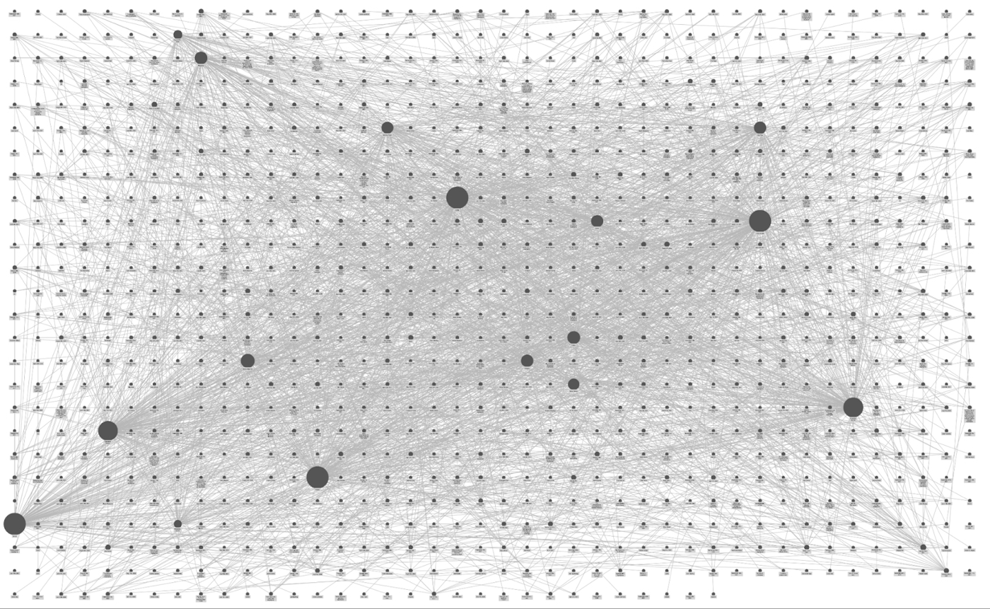
A year ago, the idea of networking our notes with bi-directional links became the biggest thing in the tools for thought space since Vannevar Bush described the memex. Top-down hierarchies and tag systems became the pet explanation du jour for everything that was wrong with note-taking. So we all hustled on to the Double-Bracket Express determined to build our own networked knowledge graphs. But where did we actually go? At least for me—and most of the people I know—we got a garbage dump full of crufty links and pieces of text we hardly ever revisit. And we feel guilty and sad about it.
(It is a very appealing looking garbage dump, however.)
There are probably a host of reasons why this happened: Roam’s product velocity seems to be incredibly slow, there still isn’t really a good mobile experience, they’ve had well-documented community issues—the list goes on.
But there’s one main reason that I don’t use it anymore:
When I write my notes the thought, ‘Where am I going to put this?’ plagues me every time. It’s a direct and immediate pain. And it sometimes gets in the way of me even taking notes at all. I have this sensation many times a day and it’s deeply uncomfortable.
Roam’s job was to get rid of that pain. And it did—for a while. But now it’s back.
. . .
The core idea that caught on with Roam is the concept of a bidirectional link. Previous note-taking systems allowed linking in only one direction: you could link from one note to another, but the note being linked to had no automatic link back to the original note.
Bi-directional linking, by contrast, creates a link from the first note to the second, and from the second to the first automatically. Roam made this extremely easy to accomplish—just by typing pieces of your notes in [[ brackets ]] you could link between notes, and even create new ones if the note you were linking to didn’t already exist.
The idea was to create a highly-networked system of notes with lots of links between them. By doing so, you could increase serendipitous encounters with old notes, and decrease your risk of losing a note, and generally get more out of the whole note-taking experience, or indeed life itself:
I believed that if I used it, I’d learn more from my experiences because I wouldn’t forget them. I’d take away more lessons from the books I’d read because I’d always have them close at hand. I’d make better decisions, produce better writing, and maybe my hair would even start to look as lustrous as Conor’s.
(Side-by-side comparison. How am I doing on the hair part?)There’s a ton of intelligence and deep thought behind Roam’s design. But did it actually work for me?
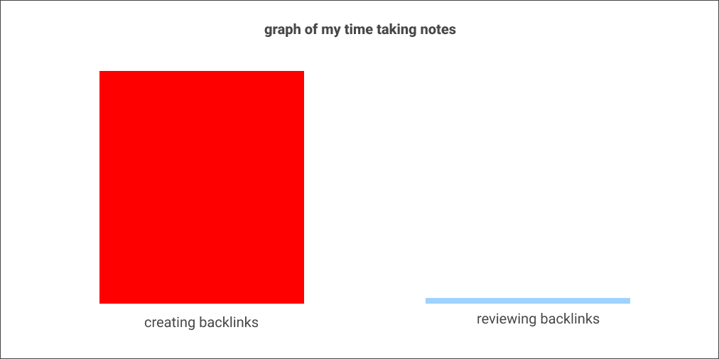
Not really. If I plotted out the percent of my time writing bidirectional links vs. actually looking at my notes and clicking through the links in them, this is what I estimate it would look like:
It turns out that I am rarely in a position, while writing or thinking, where I want to glance through lots of old notes as a way to figure out what to say or do. Mostly that feels like sifting through stale garbage.
My most common behavior is to Actually Write the Notes. That’s why Roam needs to help me with the thought, ‘I don’t know where to put this.’ If it does that well, it makes the vast majority of my time spent in the app a breeze. If it does that poorly, it makes my experience so painful that I want to switch systems.
The genius of bi-directional linking is that when I first started to use it, the neurotic hamster in my head decided to turn down the volume knob on the ‘Where should I put this?’ question.
Why? Bidirectional linking is a very good story. Roam’s job is to make me believe that if I just surround pieces of my notes like this [[ ]] I won’t really have to worry about finding the note again. It’s now networked! The need to take notes far outstripped the need to review them (see: graph above), so Roam solved my problem.
After some time though, reality started to sink in. ‘I am not really going back through all of these notes as often as I thought I would.’ My next automatic assumption is that if they were just organized better I might go through them more. And so, the question starts to creep in again. ‘Where should I put this?’
Once I’m back to thinking this way, all sorts of other problems that I have with Roam start to creep in. ‘Where is the mobile app?’ And, ‘why doesn’t it feel like the product is improving? And, ‘why does everything feel like a mess?’ All of these problems were present, but none were important so long as I believed Roam was solving my core issue. But now that it’s not, suddenly, point-solution alternatives like Apple Notes and Things start to feel appealing. And the whole thing unravels.
I used to use Roam for lots of things: a daily diary, book notes, keeping track of lists like my todo list, and taking meeting notes.
Today, this is my stack:
- Daily Diary / paper notebook
- Book Notes / split between Roam and Muse
- To-do List / Things
- Meeting Notes / Apple Notes
The whole thing moved away from Roam because I started to worry again about where to put things.
This might seem trivial, or useless, or reductive. But it is actually quite valuable. If we're really using Roam to regulate the emotional experience of not knowing where to put a note, then that suggests a lot of product changes Roam could make to perform better at that job.
. . .
Search
The easiest way for Roam to fix this would be to improve the search function. If I believe that I can find anything again with the right search query, the neurotic hamster in my brain gets less bent out of shape about where I will put the note.
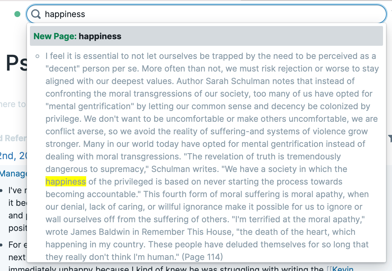
But right now, searching in Roam feels like a claustrophobic mess:
The first result is a gigantic paragraph of text, with zero context attached to it to help me understand where it comes from or why it might be relevant. Same thing if I continue scrolling:
If I’m looking for one quote in particular, I might be able to scroll through this pretty quickly to find what I want. But it’s not easy to combine search terms together, or do anything like a fuzzy search to get me closer to what I want in case something is misspelled:
The same kind of search works way better in Apple Notes, and the interface is cleaner. So I’m much more likely to use it.
Automated Taxonomy
Of course, search doesn’t solve all problems. As I wrote about in The Notetaking Cold War, part of the point of bi-directional linking is to create a bottoms-up taxonomy of your ideas, to be able to create an infinitely flexible organizational system that changes as your uses for the information you’ve collected change.
I think there’s a lot of value in Roam’s language-like flexibility. But it’s also really clear to me that most people take notes about a few kinds of things:
- People
- Meetings
- Books
- Companies
- Tasks
- Projects
There are probably a few more—basically all kinds of proper nouns. Surrounding your proper nouns manually with double brackets just feels like a waystation on the road to creating an automated taxonomy and discovery system for notes. There’s no fundamental reason why the Photos app on my phone should be able to automatically compile a pleasing slideshow with music about a road trip I took 6 years ago, while my note-taking app can’t do the same thing.
Of course, this is a huge challenge in itself. There are many reasons automated note organization and discovery is harder than the same thing for photos. For examples, here is a randomly selected photo from my camera roll:
Seriously, that was random. Instant dopamine hit. Stick a better filter on it and it would be even better. Here’s a randomly selected note from my Roam:
- [[Interstitial Journal]]
- {{[[DONE]]}} Get out Talk Therapy
- {{[[DONE]]}} Digest edits
- {{[[TODO]]}} Read
- {{[[TODO]]}} Write for an hour
- {{[[TODO]]}} Nap
First, it’s incomprehensible. I have to load a lot of context into my brain to understand it. But once I do, it’s a snooze. Even if we somehow limited our selection to notes that actually have interesting content, it doesn’t fare much better. Here’s another random note:
“Well, we found that when she went back to the very source of a symptom and described it all to me, then that symptom disappeared on its own—with no need for any hypnotic suggestion——"
This quote is interesting, but I have to remember a lot in order to figure out why I thought it was interesting in the first place. And I could’ve looked at 10 photos in the meantime.
Of course, this could be solved by a better note-taking system on my part. Something closer to the actual Zettelkasten ideal that I’d like to strive for. But ideally, the software helps where I fall down.
So in order for Roam to truly solve my ‘Where should I put this?’ question, it would need to both be able to find the right note for me at the right time (difficult) but also be able to show me the right portion of it in the right way so that I can instantly feel a *click* and know why it’s relevant (much harder).
What’s Next
It gives me zero pleasure to write about why Roam isn’t working for me anymore. It should be noted, it’s also easier to play Monday Morning quarterback on this kind of thing than it is to actually build the product. I hope they figure it out—but mostly I hope that someone figures it out.
The underlying genius of Roam is that it is structured not like a tool, but like a programming language. It’s based on the insight that the best way to organize information depends on how you’re going to use it, and that information can be used in an infinite number of ways. So having an infinitely flexible organization system—like a programming language—is the best foundation for a note-taking system.
As I wrote about 2 years ago in the Opportunity in Productivity, I still have a feeling that the way forward lives in more automation. Even programming languages have IDEs that automate and autocomplete many of the mundane tasks of programming. Hell, with CoPilot, they’re even starting to program for you now.
It’s time our notes do the same thing.
The Only Subscription
You Need to
Stay at the
Edge of AI
The essential toolkit for those shaping the future
"This might be the best value you
can get from an AI subscription."
- Jay S.
Join 100,000+ leaders, builders, and innovators

Email address
Already have an account? Sign in
What is included in a subscription?
Daily insights from AI pioneers + early access to powerful AI tools













Comments
Don't have an account? Sign up!
I loved this writeup, Dan! Not to point you at another shiny toy, but I believe Obsidian picks up where Roam falls off — and, more importantly, using it with Nick Milo’s “Linking Your Thinking” note *making* strategy. This approach has been a game changer for me (for now?)!
; I ve been trying to figure out why I've been moving away from Roam --I loved the case of writing through the day, but somehow it didn't work, "that back linking thing, I don't get it" --I wasn't going back to old notes, and I couldn't easily find things. Bingo you said it. THANK YOU Im now trying Milo's obsidiean method but so far it may have a similar problem. I use building a second brain and everything makes sense there --so why do I keep trying other, less comprehensive systems where I can't easy find anything?
I'm sorry for your disillusionment and appreciate your open and honest commentary on this.
I was also tempted by Roam, but I'm confident and grateful I dodged a bullet given the alarming number of red flags I saw at the time.
I've ended up mostly-happily using Notion. Is it perfect? Nope. But it's improving, it has very broad usage across many demographics, the company is apparently profitable, and -- of particular note -- I felt more comfortable with the community and company behind Notion.
More specifically, with Notion, people are excited about and in some cases loyal to *a piece of software and the broader community that uses it* vs. worshipping an individual and a way of life. And that's a far more healthy foundation upon which to grow both a tool & and community!
I think the digital note taking experience and knowledge work in general still has a lot of simplification to go. Roam power users are leading the charge for sure, but to make it your own it takes a lot of sustained effort, new habits and almost an obsession to the platform to make it all work. It's a high bar but if you do it can work wonders for coming up with insights.
Personally, I've replaced Roam with Obsidian as it gives you bi-directional linking and hierarchical file structures. As for the feeling of infinitesimal time spent on backlick creation and lack of on reviews. I've found Andy Matuschak's ideas on Evergreen notes and incremental writing are great concepts to build blocks of knowledge as you synthesise and then plug together to form bigger, deeper concepts. Worth looking into!
Similar to my experience. Got excited at first but losing interest. Feels too cumbersome for me. Product’s forward motion too slow. Still looking for a more practical way of taking notes on books I am reading. Time to try something else.
I am glad I am not the only one pulling my hair out whenever I try to search in Roam