The Boneyard Principle: Why the Next Big Thing will Emerge from a Failed Idea

How subtle UX improvements can make a half-a-trillion dollar difference

By David King and Mishti Sharma, who are currently deep in the boneyard building a living room for your phone.

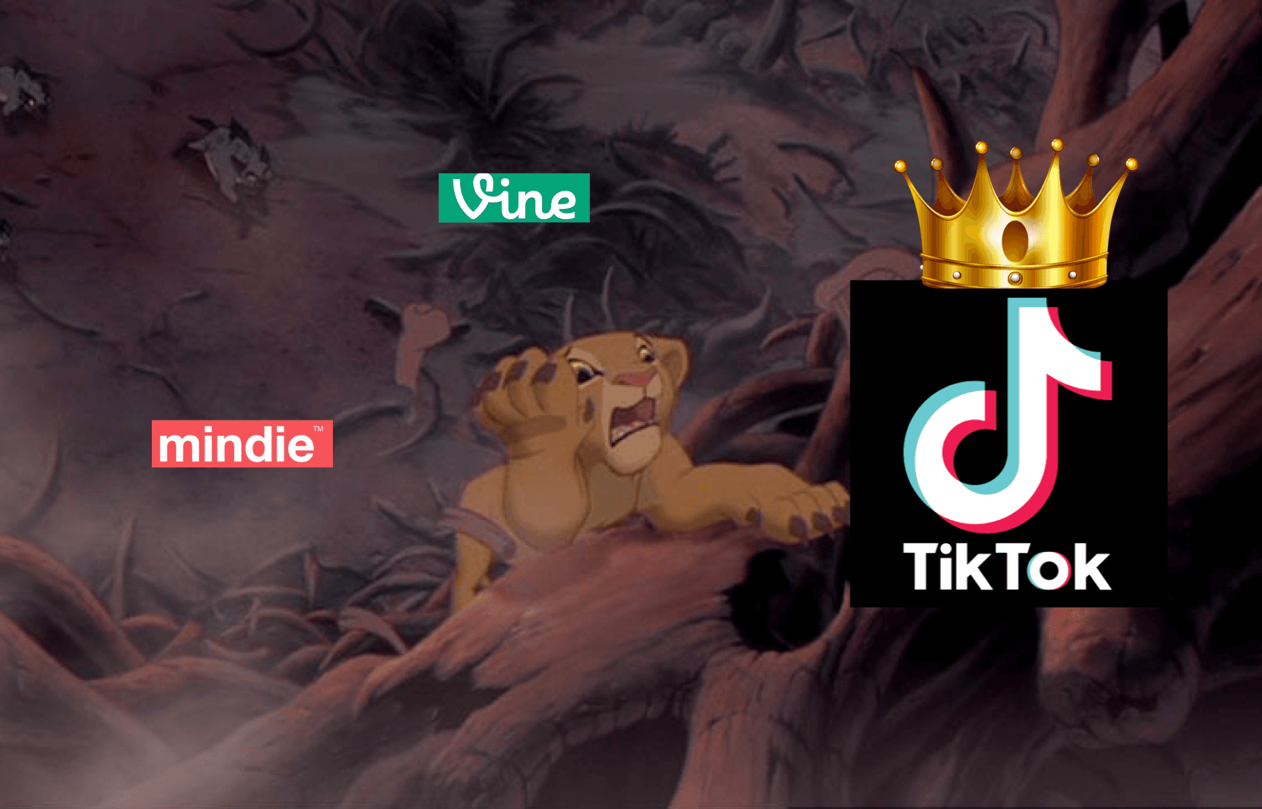
Most successful consumer social products walk through a boneyard of failures before achieving victory. Before TikTok came Vine, before Tinder came Match.com, and before Instagram and Snap came Flickr. Each of these groups shared the similar high-level ideas of social video, dating, or social photos. But the boneyard often hid big ideas in plain sight. "There are very few genuinely new ideas," as Marc Andreessen observes. "Invention happens over long periods of time, by lots of very smart people playing each others’ ideas against each other."

Why do some consumer social products finally make it big after a series of misses? Part of the magic often hides within UX details — particularly, those that help people make fewer decisions and take fewer risks. The more opinionated an app is about how it should be used, the easier it is for users to act without fear of rejection. Products benefit from giving people the plausible deniability to say: “I’m not seeking attention, I’m just doing what this app tells me to do!” 

To see how this works in practice, let’s observe a breakthrough UX approach that transformed a category with multiple previous failures— short-form looping video—to create one of the largest successes of all time.


Video didn't kill the video star (UX did)

Today, TikTok has edged out Google as the most visited domain in the world, according to Cloudflare. When the app first launched, however, it was far from obvious that it would work, because it had come after a long line of failed short-form looping video products: 

  • In 2012, Vine introduced a 6-second looping video app that Twitter acquired pre-launch 
  • In mid 2013, Instagram launched its own 15-second video feature 
  • In late 2013, Mindie launched a TikTok-like vertical snapping consumption format with background music

Despite early visibility and excitement, none of these products sustained momentum. Vine’s creators left Twitter within two years, and the product eventually shut down. Instagram videos never broke out as a unique format, and the app is now pushing its Reels feature, which copies TikTok’s novel UX. Mindie fizzled due to music label woes.

Given this boneyard of failures, you might have concluded that short-form looping video was dead. But at the same time, across the ocean, TikTok (then known as Musical.ly) was just getting started. What was different? 

We’ll focus our comparison on Vine vs. TikTok. Vine's UX placed an enormous amount of decision-making baggage upon users. TikTok, on the other hand, gave users just one easy option: open the app and watch entertaining videos. Let's start with onboarding.

Don't stop me now

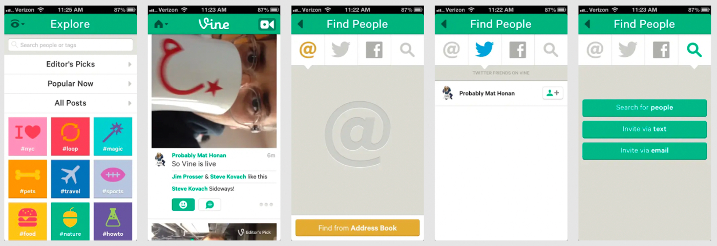
Vine presented many hurdles before you could watch your first video. First, you needed to decide whether to login with Twitter or email. If you chose Twitter, after two confirmation steps, you had to type your name and number. Then, you had to enable location, and lastly, enable push notifications.

^Vine onboarding from 2013

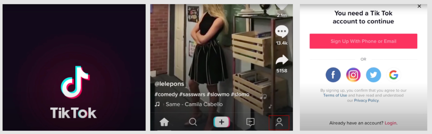
In contrast, as soon as you opened TikTok for the first time, you saw entertaining videos—time to satisfaction was instant. You didn’t have to worry about making an account, let alone following creators, channels, or friends. You only saw the option to create an account if you tapped the profile icon at the bottom of the app.

^TikTok onboarding from 2018

Tell me what I want (what I really really want)

The consumption UX of both apps underscores how many more decisions Vine users had to make to have a successful video-browsing experience. 

Vine divided its UX into two traditional surfaces: Home and Explore. Home showed you content you opted into receiving, whereas Explore showed you things you might not know about yet. Vine’s Explore screen asked if you were more interested in “Editor’s Picks,” “Popular Now,” or “All Posts.” You could search the app or to click into a specific hashtag. As a new user, you wouldn’t know what each term meant or which you should care about. Decisions. Stress. Ugh.

Vine’s “Find Friends” process was comparatively heavy, too. You had four tabs available: contacts, Twitter, Facebook, and search. Should you trust this new app with your contact list? Should you follow people from your address book, Twitter, or Facebook? Would people think it’s weird if you follow them? Should you feel bad if they don’t follow you back? 

In contrast, TikTok integrated the explore-exploit process into one tab. You never had to decide which tab to view—you just had to swipe to the next video when you were done with the current one. You also never had to follow anyone to see great content, because the app learned about your taste as you watched videos.

^Vine consumption UX from 2013

Eugene Wei emphasized the importance of TikTok’s single-page format in his post Seeing Like an Algorithm:

“[TikTok’s] entire screen is filled with one video. Everything you do from the moment the video begins playing is signal as to your sentiment towards that video. Do you swipe up to the next video before it has even finished playing? Did you watch it more than once, letting it loop?...Did you share the video through the built-in share pane?…The default UI of our largest social networks today is the infinite vertically scrolling feed...As you scroll up and past many stories, the algorithm can’t “see” which story your eyes rest on…if the user doesn’t press any of the feedback buttons like the Like button, is their sentiment towards that story positive or negative? The signal of user sentiment isn’t clean.”

Get in, loser: we'll bring the party to you

TikTok's consumption UX wasn’t the only simplification that helped it succeed. Just as importantly, the app helped new creators—even those without followers!—get attention for their videos, lessening their fear of rejection. When a creator posted a video, TikTok showed it to a sample audience and then expanded to bigger targeted audiences if it did well—a form of a recursive publishing feedback loop. Creators with no followers could still reap rewards for videos that were funny and understandable by anyone. This was uniquely powerful for the medium of short-form video, which suits jokes, dances, and aesthetics with wide appeal.

TikTok also nailed music licensing to help video creators use soundtracks, resulting in meme patterns that softened the risk of creation. (Vine lacked licensed music, and Mindie got embroiled in lawsuits with its longer soundtrack excerpts). TikTok creators often riffed on existing soundtrack trends instead of trying novel combinations, which gave them plausible deniability for creating something new. ("I'm just following what everyone else is doing on this app!") In fact, 40% of early TikTok (Musical.ly) videos originated from creators watching a video and then cloning its soundtrack to make their own.

Vine was propped up for a time by Twitter’s marketing engine, but it never built its own consumption engine to drive creation. It focused too much on its new media format and not enough on the UX innovations required to make that format successful—and hence remained in the boneyard. 

Creating a UX where users had to decide on virtually nothing—and the app just learned from their behavior—was TikTok's monster idea in an otherwise crowded boneyard. Everything else about its product and network grew from the powerful way that it connected consumers to creators without explicit follow actions. Without this innovation, TikTok would have likely failed.


If you seek Amy (she's not on match.com)

A similar story played out with dating apps. When Tinder launched in 2012, Skout (2008), the Match.com app (2009), Hotnornot.com (2000), and other dating products had already launched—some with moderate success, others in the boneyard. How did Tinder take the market just months after its launch? It gave users fewer, faster decisions to make—and fewer chances to feel rejected. More swipes, lower stakes.

Skout and Match used the same mechanics as their desktop counterparts. You had to fill out your profile, browse hundreds of singles, decide who to contact, write them a message, and wait for a reply.

An early user of Match.com described its weight in a review:

“Is this how you find a partner - like applying for a loan? What age? What height? What about ethnicity?...can you please summarise yourself in 300 words?...I'm not sold on internet dating. It's a tremendous effort to search and write emails, most of which you know will lead nowhere. Perhaps it's an effort some are prepared to make. Me? I'm not sure.”

^The Match.com app from 2011

A decade before Tinder, Hotornot introduced a double-opt in approach to dating to reduce rejection risk. On the site, you rated partners using a “one-at-a-time” UX that forced a decision (sound familiar?). You only saw matches from people who had liked you back, reducing the anxiety of sending messages into the void. Tinder ran with this concept on mobile with a radically simplified UX. Looking at potential matches while commuting or doing laundry was never easier.

^Hotornot.com screenshot from 2003

^Tinder (f.k.a MatchBox) pitch deck from 2012

Tinder, then called “MatchBox,” asked you to sign in with Facebook, swipe on people you liked, and message those you matched with. It distilled the decisions you had to make to one: decide if you like someone’s photos.

The app helped avoid rejection in several ways:

  1. When you swiped right on a profile, you didn’t know if Tinder had shown your profile to that person yet. If you didn’t get an immediate match, it didn’t imply rejection—your potential match might see your card later that day or week. But if your counterparty had already swiped right on you, swiping right on them resulted in a magic moment of connection. This felt like the variable reward of playing a slot machine in Vegas.
  2. The messaging tab of Tinder only showed positive matches instead of a list of all the people who had never replied to your outreach (unrequited messaging): “Sup, babe?”, “Hey, cutie!”, <crickets>

Once again, reducing cognitive load and rejection was key—both for the app's success and its users' love lives.


The next episode

Examples of these boneyards of failed ideas—and new attempts on them—exist everywhere. 

Hey-ey-ey-ey...BeReal everyday

We don’t know the end of the story yet for BeReal, a photo-sharing app for friends that launched in 2020. BeReal sends you and your friends a push notification at a new random time daily, giving you 2 minutes to capture and share a photo back. It shares the same media format as the once-popular FrontBack, launched in 2013, in which users took pictures with their front and back-facing cameras to share with friends. “Frontback started…with the simple idea to capture a moment,” wrote the founder Frederic della faille in his final letter before winding down the app. “No vanity numbers, no filters: it’s ‘me now’ — at the center of Frontback is you, your everyday moments happening now.”

FrontBack created a new media format, but didn’t change its core UX enough to create a corresponding new behavior. BeReal’s UX, which prompts you to take a photo once daily at a random time, creates a less staged experience. On BeReal, you have one thing to do: wait for your push notification and take a photo. You have plausible deniability for why your photos are crappy, real-time, and unpolished—you’re just doing what the app tells you to do. Posting the same photos on Instagram or Snap might be seen as amateur or more attention-seeking.

If we had one suggestion for the BeReal team, it would be this: take an even more opinionated UX stance. Strengthening penalties for posting late or adding rewards like streaks for on-time posting could encourage more unstaged posting and coalesce this new behavior. 

^FrontBack app store screens from 2014

^BeReal app store screens from 2022

We gon' Locket til the wheels fall off

Another (even newer) social photos app is Locket Camera, which launched in 2022 as a way for people to share photos directly to their friends’ home screens via a widget. The app sustained position as the number 1 downloaded app on iOS for many days in January 2022.

A decade ago, an app with a similar concept (and brand) called Locket launched to allow users to customize their lock screen content to include news, funny pictures, or inspiring stories. That Locket evolved into Screenpop, which let friends message back and forth on their lock screens. Two years ago, iOS launched home screen widgets. Fave launched in TestFlight last year as a “digital photo frame for the people you hold dearest,” allowing users to have multiple iOS widgets on their home screen for people they cared about. 

^Fave app screens from 2021

Many attribute Locket’s success so far to virality on TikTok, but we don’t find this a compelling argument. Marketing can make otherwise successful product formulas more visible, but it won’t independently drive success (otherwise, we might still be using Vine). Products need engines which propel them forward independently. Key to Locket’s success will be whether it can make a durable habit of the new behavior of capturing and sharing photos between friends’ home screens—and perhaps even scale to broader social graphs.


The winner (doesn't) take it all

The examples we’ve gone through so far suggest that UX details really matter. The fact that there have been failed products that share your high-level idea does not mean that your product will fail too, especially if your UX cuts down on users’ cognitive load and rejection risk.

In reality, ideas that sound similar at the surface can have highly differentiated UXs that create room for multiple successes. Consider Snap and Instagram: both are “social photos” apps, but their UX differences support entirely different behaviors. Taking a photo with Snap takes one tap: open the app and press the big, central button. Taking a photo with Instagram takes three taps, buried under various menus. Snap is designed for the use-case of taking quick photos for disappearing messagings. Instagram is designed for opening a consumption feed to discover beautiful things.

^Taking a photo with Snap—one tap and we’re done.

What seems like a small detail actually determines what each app is for, how it assembles people, and how it organizes its network. Snap is a friend-oriented network, while Instagram is primarily audience-focused. Today, each has flavors of the other, but they are very different beasts.

Just like products can win after a boneyard of failures, categories with existing “winners” can still have room for differentiated new apps. That doesn't mean, however, that every boneyard is worth pursuing. In the 2009-2010 timeframe, location-based social apps were all the rage. Foursquare, GoWalla, and others tried using mobile GPS to help friends find each other and connect with strangers nearby in physical space. Location “check-ins” do work well as a feature of an Instagram post or on a Snap Map, but this hasn’t proven to be a great standalone category.

Go forth and build

If you’re building a consumer social product, by now, you understand that your product’s success depends on making the right UX choices. At each step of onboarding and consumption, ask yourself: am I asking the user to make a choice? Is that cognitive load necessary? And most importantly, throughout the process, am I building guardrails to protect them from a fear of rejection?

If you're building a UX that helps reduce cognitive load and rejection risk, we'd love to think things through with you—Tweet at us! By taking more thoughtful decision-making into your app’s hands, you can help people understand what to do, act without fear, and—just maybe—build your way out of a boneyard.


Written by David King and Mishti Sharma, who are currently deep in the boneyard building a living room for your phone (we're hanging on Testflight). Thanks to Josh Elman, Eugene Wei, and James Hong for reading early drafts of this piece!

Like this?
Become a subscriber.

Subscribe →

Or, learn more.

Thanks for rating this post—join the conversation by commenting below.

Comments

You need to login before you can comment.
Don't have an account? Sign up!

Great article! Just one nit - You don't have to go through the "plus button" top bar to post on Instagram, you can single finger swipe right on the consumption experience to instantly enter the camera.

They could do a better job at discoverability, but it isn't quite the journey you described :)

@Joey in BCN almost 2 years ago

Hopefully all these crap apps will not last... for the sake of the humankind---
Tiktok is 50% of far-right messages/videos, 49% body showing

No disagreement with the analysis and yet. What we're training ourselves on is a world without "friction" when (specifically in social) what we actually NEED requires work. When cheap processed food came along, it was a huge success, but now we're dealing with the consequences.

@chrisogunlowo over 1 year ago

Epic.

Every smart person you know is reading this newsletter

Get one actionable essay a day on AI, tech, and personal development

Subscribe

Already a subscriber? Login