
Progressive Summarization IV: Compressing All Types of Media
December 28, 2017 · Updated March 31, 2026
Reading through the previous three parts, a question probably popped into your mind: does this apply only to text?
It’s an important one, because we are becoming a less text-based society. Ubiquitous cameras, real-time video chats, and visual displays of information have become the norm. Which means expressions of creativity will increasingly take on these forms.
But the principle of compression is not at all limited to text. It is a universal feature of all information, and by extension, all media. It falls to us, however, to understand how it works and apply it to our medium of choice.
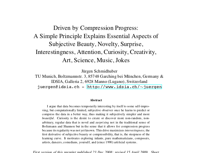
The story begins with this paper, one of the most influential works in the study of cross-disciplinary creativity in recent years.
The paper explains curiosity as “…the desire to create or discover more regular data that is novel and surprising…in the sense that it allows for compression progress because its regularity was not yet known.”
Basically, your brain prizes efficiency. If it can remember one thing instead of ten things, it’s happy. For example, learning that fruits are tasty is one piece of information, which is much easier to remember than individually memorizing each kind of fruit, and whether it’s tasty or not. This has obvious value for survival: the brain that is only trying to remember a few, vital pieces of information will outperform the brain trying to remember a bunch of inconsequential details.
The drive that has evolved to reward us for seeking out simpler kinds of data is called curiosity. Curiosity tends to get directed toward areas in which we don’t know something:
- You know traffic patterns fluctuate, but your brain makes you curious about whether there is an easy-to-remember pattern
- You know the sky is usually blue, but not always, and the brain wants a simple rule to know what to expect
- You know people react negatively when you talk about your accomplishments, but your brain wants a simple heuristic to remember what to say or not say
The curiosity drive is pushing you to learn a pattern, a rule, or a heuristic that will help you compress your knowledge of that area into something easier to remember.
It doesn’t have to be a perfect rule. Those are rarely found, and never last. What your brain is looking for is progress in its ability to compress its knowledge. Thus, compression progress. Any new rule that is better at compressing previously accumulated experience than the last one qualifies:
- Traffic is worse during rush hour when people are traveling to and from work, which tends to be in the morning and late afternoon
- The sky is always blue due to its chemical makeup, but can often be obscured by clouds, or darkened at nighttime
- People react negatively when I talk about my accomplishments because they think I’m bragging, which implies I think I’m better than them
All these are rules or patterns we learned first as children, which got progressively refined as we grew older and wiser.
The brain rewards compression progress with interestingness — defined as the steepness of the learning curve from the previous rule to the new one. You learn as a baby that things fall when you drop them. The discovery of the phenomenon of gravity, which helps explain a wide range of things, a baby finds tremendously interesting (thus all the objects they try dropping to test their new theory).
As an adult, when I learned about the concept of compound interest, I found it very interesting. It explained everything from the existence of banks, to why certain people are so much richer than others, to why people advise saving early for retirement. My brain can drop all those puzzle pieces it’s trying to fit together, and hold in its stingy memory just the one concept, compound interest.
The steeper the learning curve — the greater the improvement from the old rule to the new one — the more interesting you find a piece of data. Think back to the times your mind was totally blown. It’s likely that that new information was remapping something pretty deep in your understanding of the world. And it was a good feeling — your brain rewarding you for a job well done.
Compression progress is at the heart of both science and art.
Scientists are always analyzing one tiny part of the world, trying to find a law that explains previous data more simply than the previously known law. They can’t disregard old data. They have to find a program that compresses (or explains) all the previous data better than the previously best known program.
Compression progress goes far beyond storage efficiency. Since short and simple explanations tend to reflect some repetitive regularity in the environment, they help predict the future as well. Scientists study past data to find a new theory that predicts the results of new experiments.
Getting better at compression progress not only helps you survive, it potentially helps you predict the future. Planning and preparing for an uncertain future becomes much easier when you’ve compressed your life experience into fundamental principles of how the world works. Some might call this wisdom.
But compression progress is also fundamental to art. Beauty is the artistic equivalent of interestingness. Studies have shown that our brains store a representative model of a human face, and then perceive a new face by looking at only the differences between it and this model. New faces that don’t deviate much from the model, for example, by being symmetrical or having simple proportions, are more easily compressed, and thus appear to us as more beautiful.
Jokes also work this way: the premise of the joke sets up a mental model with some sort of flawed assumption or hidden meaning. The punchline both reveals the flawed assumption, and corrects it with a simpler one very efficiently, often in just a few words. Our brain rewards this efficiency with the feeling of “funny.”
What you find when you look out on the world is compression everywhere. Communication is compression, packaging up tangled thoughts into neat little words with agreed-upon meanings. Love is compression, fusing a series of experiences, memories, feelings, and thoughts into an exhilarating state of mind. Supply chains are compression, adding value at each stage and refining the product into the most elegant expression of utility possible.
And as we’ve discussed, note-taking in all its forms is compression. Let me show you some examples from other media.
PICASSO’S BULL
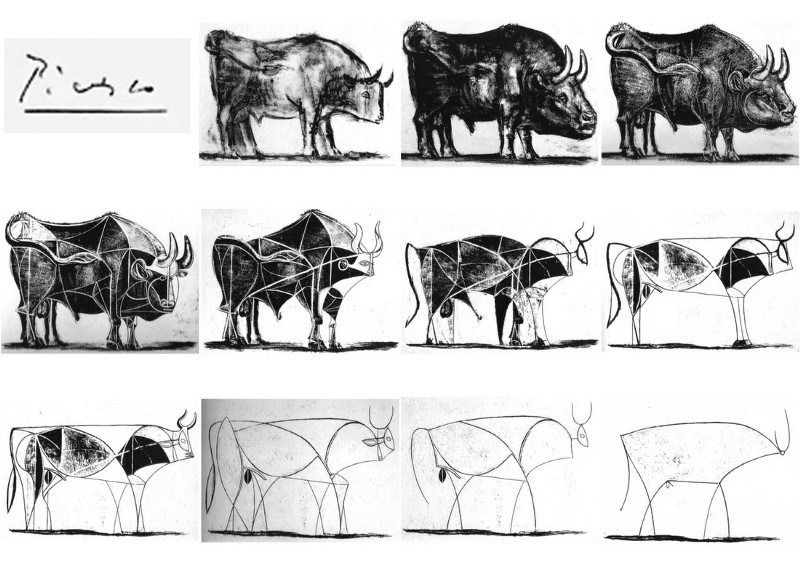
One of the most famous and clear examples of compression is Picasso’s Bull, which he painted in a series of 11 lithographs in 1945. His goal, it seems, was to find the “essence” of the beast in a series of progressively simpler images.
The first image is a lively and and realistic drawing in full ink. In the second and third images, he adds expression and power, making them even more evocative of the spirit of the animal.
And then he stops building, and begins to dissect the creature along lines of force that follow the contours of its muscles and skeleton. Not unlike a butcher would carve meat. He starts to abstract the bull in the subsequent images, simplifying and outlining the major planes of its anatomy.
Ten years earlier Picasso had said “A picture used to be a sum of additions. In my case a picture is a sum of destructions.” We see this at work here, as he starts to erase sections of the bull to redistribute the balance between the front and rear. By enlarging the eye and flattening its horns, for example, he moves the focal point to the front of the animal.
But Picasso is also creating as much as he is destroying. He collapses the strength of the animal’s shoulders with a bold white line running diagonally in image 5, and then counterbalances it with an equally strong black line running parallel to the shoulders in image 6. The point where these lines intersect suggests the bull’s center of balance.
The compression continues in the final 5 images. As Picasso starts to understand the balance of form in the animal, how weight is distributed between the front and the back, he starts to remove structural lines of support that are no longer needed. Like a builder removing the external scaffolding of a building once it’s almost finished.
Picasso finishes the drawing with a final image, encasing what he has discovered are the most essential elements in a taut, nearly continuous outline. Along the way, even the head has been dropped as a means to emphasizing the horns, and the genitals are left in place only to confirm the animal’s gender.
What we are left with is a stunningly simple line drawing that somehow still manages to capture the fundamental spirit of a bull. It’s important to note that he probably couldn’t have achieved this in one step — the learning curve would have been too steep. Picasso once described this process as “charging up” his arm with the essence of the bull. He often wouldn’t keep the whole sequence, turning the canvas upside down and painting over it at each stage.
But what’s critical for us to understand is that each of the stages was still necessary. Each step contained its own discoveries, its own lessons, its own mistakes. He could have gotten discouraged, or taken a break to work on his art certification, or gone back to “perfect” his first try. But he took a different path — creative destruction. Breaking down, then building up. Diverging, then converging. Compressing, then decompressing.
If even an artistic genius like Picasso needed a step-by-step onramp to creativity, I think you can give yourself a break.
PROGRESSIVE SUMMARIZATION IN MUSIC
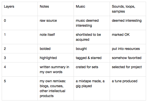
One of the participants in my online course Building a Second Brain, from which this series is drawn, applied P.S. to music. Here’s the layers (or stages) he came up with:
Look at columns 3 and 4
You see the same principles at work in columns 3 and 4: a large volume of unknown quality comes in at Layer 0. He needs to select a subset for further listening and study, but also wants to preserve it all in case something slips through the cracks.
At Layer 1, he has a list of shortlisted tracks. At Layer 2, he’s purchased some of them, investing in their further development. At Layer 3, he’s tagged and starred a smaller subset, a further investment of attention. Layer 4 songs are ready to be played in live sets, and Layer 5 includes only the most valuable and important songs, that he’s actually played or recorded. By this point, these songs are part of his corpus of work and maybe even his identify.
These layers (or stages) define this person’s workflow: the sequence of steps in which value is added, including decision points, milestones, and outputs at each stage.
How he actually implements this workflow is up to him. They could be just conceptual, a mental model of how ideas progress to recordings. He could track which layer each one is at on a kanban board, on a whiteboard, in a notebook, or with small pieces of colored tape. He could use tags and labels in a software program, or invent a naming convention using abbreviations, or designate separate folders for each layer.
Do you see how there are few principles, but infinite implementations? Leave room for your own creativity in the organizing process.
PROGRESSIVE SUMMARIZATION IN A TWEETSTORM
Here’s a final example that’s more feasible for anyone to try. It comes from a tweetstorm (a series of threaded tweets on a topic, on Twitter) I came across one day.
Nicholas hasn’t taken my course, but I could see the progressive layers:
Layer 0 is the original source, which is linked to at the end of the thread. Layer 1 is the screenshot he took and attached to his tweet. Layer 2 is the section he highlighted. And Layer 3 is the body of the tweet, where he paraphrased one idea to further emphasize it.
Can you see what he’s done? Instead of doing what most people do, simply sharing a link with no context or explanation, he’s provided us with a finely graded onramp to understanding this source. If the body of his tweet catches my eye, I may decide to read the highlighted text. If that still resonates, I’ll read the text screenshot and the rest of the thread. If I want even more, the link to the full source is included at the end.
From my perspective, this is a service to humanity. I’m not forced to make an all-or-nothing decision to read the whole source, or nothing at all. He’s not teasing me with a comment like “What a great article!”, only for me to discover 20 minutes in that it has no relevance to me. He’s making use of the precious attention he’s spending reading and taking notes, to also make those notes more accessible to me as a prospective reader.
Imagine if we all did this. Social media could become a platform for learning and collaboration, instead of gossip and controversy. We could each immerse ourselves in the field we’re most passionate about, surfacing and distilling the best nuggets of knowledge for others to incorporate as building blocks in their own work.
Instead of everyone reading the same best-selling books, creating a market of a few superstar writers while the vast majority can’t make a living, we could democratize the craft. We could diversify our reading, into the niches and subcultures that rarely see the light of day, but probably hold world-changing insights.
This is a world worth creating. Building a second brain isn’t just about fortifying your own knowledge empire. It’s about becoming an authority, a distributor, and an ambassador of the knowledge you are uniquely positioned to understand and create.
OTHER EXAMPLES
I’ll leave you with a collection of examples from my own notes, from a wide variety of different kinds of media. They should illustrate that any kind of media can be progressively summarized:
- Mindgym Performance Mgmt notes (white paper)
- Psychological Capital paper notes (academic paper PDF)
- Google Uses Structured Interviews to Improve the Hiring Process and Retention Rates (online article)
- Critical Chain PM podcast (podcast)
- Toyota Kata notes (book)
- Premature Synchronization is the Root of All Evil (tweetstorm)
- Baumol’s cost disease (Wikipedia article)
- Notes on Demistifying the MOOC (NYT) (New York Times article)
- Habit Mapping (paper notebook)
- DOES San Francisco 2016 w/ John Willis notes (YouTube video)
- Good Strategy, Bad Strategy notes (audiobook)
- Giles Bowkett: Why Scrum Should Basically Just Die In A Fire (blog post)
- Kirkpatrick’s Four-Level Training Evaluation Model — MindTools.com (output from Liner app)
- Stratechery: Jeff Bezos’ Annual Letter, Facebook Messenger and Payments, Facebook Instant Articles Fizzing?(email)
The Only Subscription
You Need to
Stay at the
Edge of AI
The essential toolkit for those shaping the future
"This might be the best value you
can get from an AI subscription."
- Jay S.
Join 100,000+ leaders, builders, and innovators

Email address
Already have an account? Sign in
What is included in a subscription?
Daily insights from AI pioneers + early access to powerful AI tools







Comments
Don't have an account? Sign up!