Was this newsletter forwarded to you? Sign up to get it in your inbox.
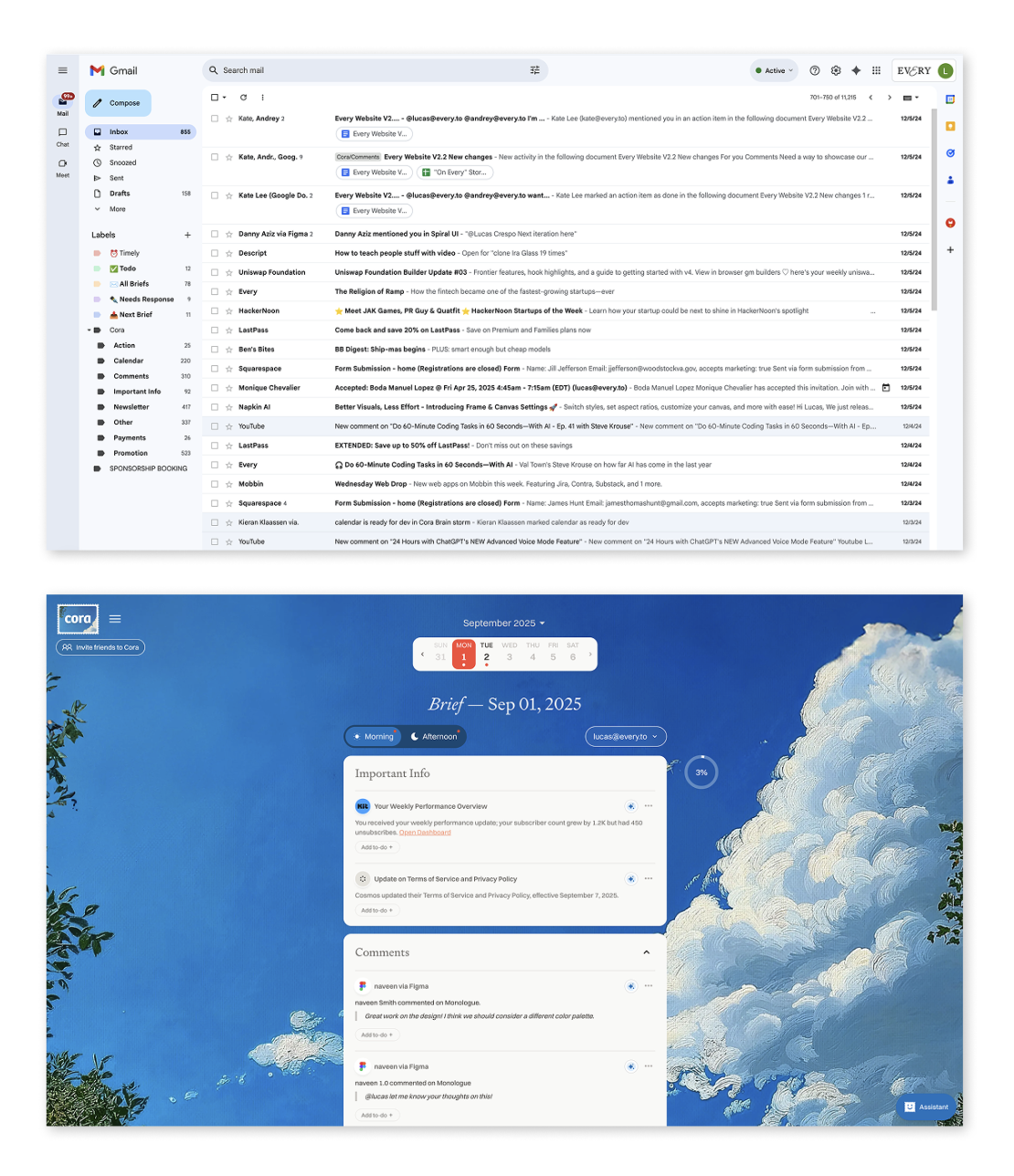
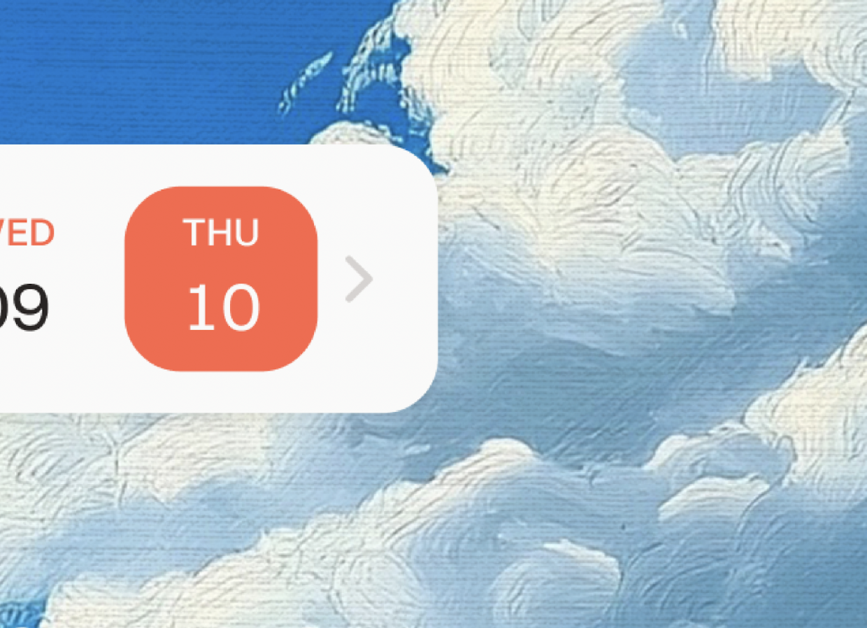
I’ll start where it started: Gmail, midnight, me looking up from the fluorescent screen to the sky outside my window—dark but open, a few thin clouds drifting past the treetops, the kind of depth that reminds you there’s air beyond the glass. By contrast, the inbox on my screen looked like a lab: white tiles, hard light, rows of cells, sterile and devoid of life.
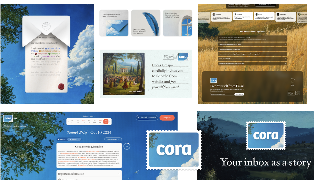
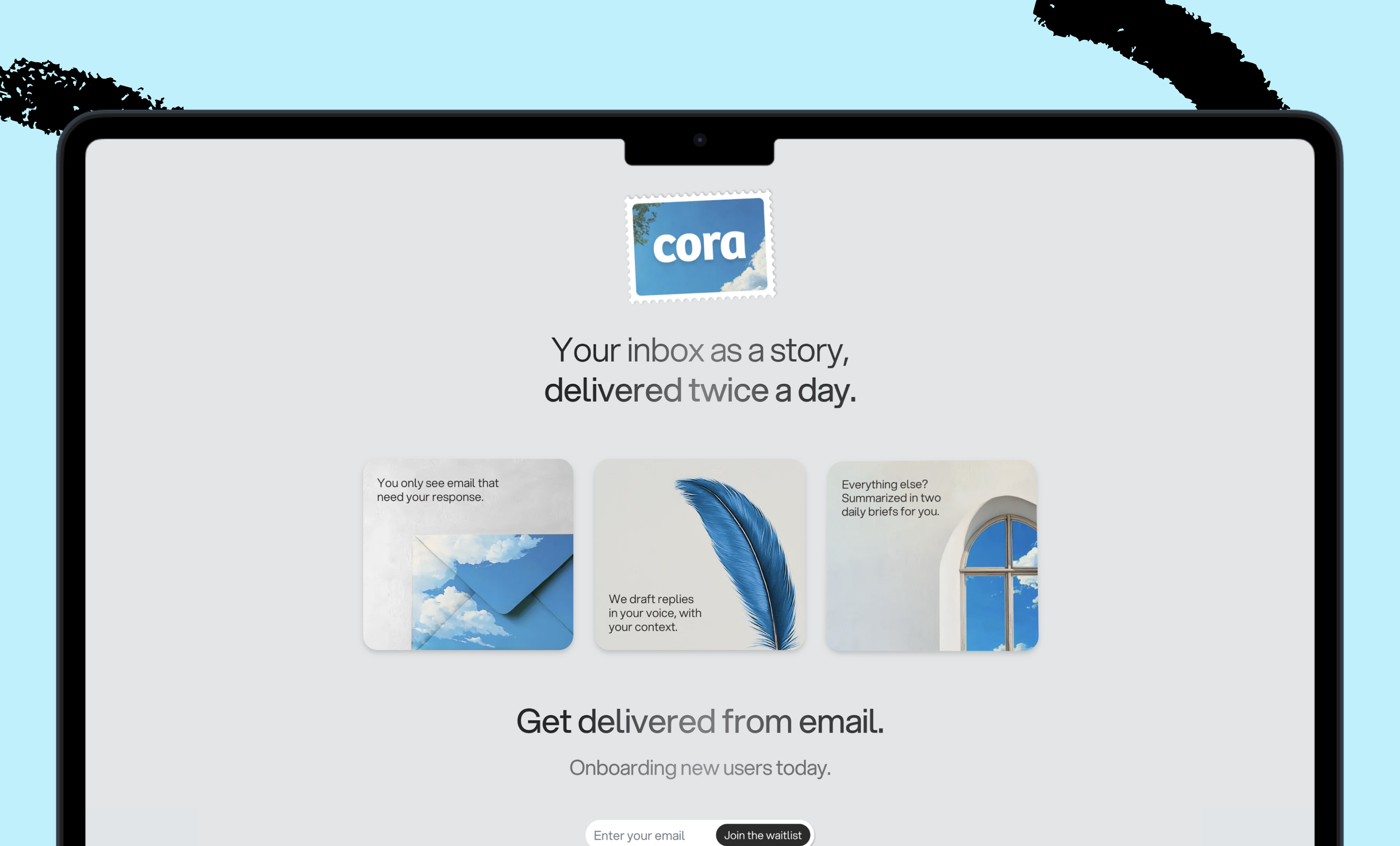
For Cora, the AI-enabled email assistant we’re building at Every, we wanted more of what was outside my window and less of what was glowing on my screen: Outside air, inside the app. I took the idea to Midjourney: skies, oil-paint textures, soft depth—the kind of details that add up to a place where you want to spend time.
The first images we generated looked perfect in Figma: highly detailed oil-paintings, impressionist brushwork, all in 4k image quality. In production, it fell apart. The more emails the user had, though, the bigger their Cora Brief became, and the more the background stretched and pixelated. We needed 8k, sometimes 10k-pixel resolution just to maintain the painting’s integrity. Each image iteration grew heavier and heavier. We were generating images with heights over 18k pixels. Pages would’ve taken eons to load.
From an engineering perspective, it made no sense. You don’t use a massive image for a background when you can’t predict page height, because if everyone is getting a different view of the image, you can’t guarantee a coherent experience. Our approach violated other “best practices” of product design, too: You don’t add texture when flat colors load instantly. You don’t choose paintings over flat backdrops when you’re building software that needs to work on every connection speed.
But we weren’t just building software. We were building a place.
We talk about online places as spaces—Slack channels are “rooms,” Twitter a “public square”—but we don’t really think of them that way, and we even less design them that way. Even the apps we don’t label as spaces, like Gmail, are sometimes rooms we inhabit for hours of our day. Most of them feel like conference rooms under fluorescent lights. Functional? Yes. Somewhere you want to be? No.
We solved the engineering for our painted-sky backgrounds. More importantly, we discovered something: Art direction is product architecture. It makes trade-offs clearer, keeps the experience coherent, and gives people a reason to choose your product in a world where AI can generate the median in seconds.
The gravity of sameness
Open any design gallery—Dribbble, Behance, wherever designers show their best—and squint. Dashboards blur: rounded corners, neutral grays, tidy rows of cards. Landing pages collapse into one rhythm: hero text left, image right, three features below. We got so good at a certain kind of design, and that kind of design is so effective, that the outcome looks nearly identical across the web.
With good reason: Style guides gave teams shared rules to follow. Design systems turned those rules into reusable patterns. Utility frameworks like Tailwind made those patterns shippable in code. Each step improved access and reliability, but it also narrowed the expressive range. When teams reach for the same components, apply the same spacing scale, and follow the same accessibility guidelines (as we should), differentiation becomes a deliberate fight against defaults.
Now add AI. Ask a model to “design a SaaS dashboard” and it returns the statistical median: sidebar navigation, metric cards, data table. Competent, functional, and forgettable. As AI-built interfaces become tomorrow’s training data, the effect compounds. The median tightens. The web accelerates toward a single, hyper-optimized, bloodless template.
When sameness costs nothing, difference carries the value. If two products solve a problem equally well, people choose the one that feels better to use—-the tone of voice that resonates, the design that delights, the experience that feels lighter or more focused. Think about writing in Word versus Google Docs: Both let you draft this article, but Docs wins for a million small reasons—cleaner interface, snappier feel, less clutter. Those subtle differences add up.
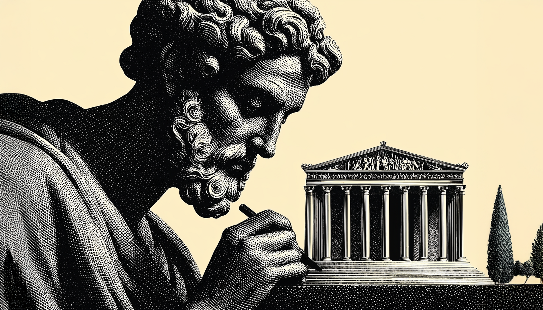
That is the job of art direction. It defines a feeling—and protects it—as the project progresses through technical decisions, sprints, and performance work. Where graphic design solves problems at the level of a single asset—a logo or layout—and product design solves problems at the level of interactions, art direction operates one tier higher. It shapes the overall look, feel, and atmosphere so that every visual choice communicates the same idea. It’s the visual north star—the mood, tone, and narrative that tie individual assets and interactions into a coherent whole.
Design is about what you make. Art direction is about how it all fits together—and, ultimately, what it makes people feel.
Was this newsletter forwarded to you? Sign up to get it in your inbox.
I’ll start where it started: Gmail, midnight, me looking up from the fluorescent screen to the sky outside my window—dark but open, a few thin clouds drifting past the treetops, the kind of depth that reminds you there’s air beyond the glass. By contrast, the inbox on my screen looked like a lab: white tiles, hard light, rows of cells, sterile and devoid of life.
For Cora, the AI-enabled email assistant we’re building at Every, we wanted more of what was outside my window and less of what was glowing on my screen: Outside air, inside the app. I took the idea to Midjourney: skies, oil-paint textures, soft depth—the kind of details that add up to a place where you want to spend time.
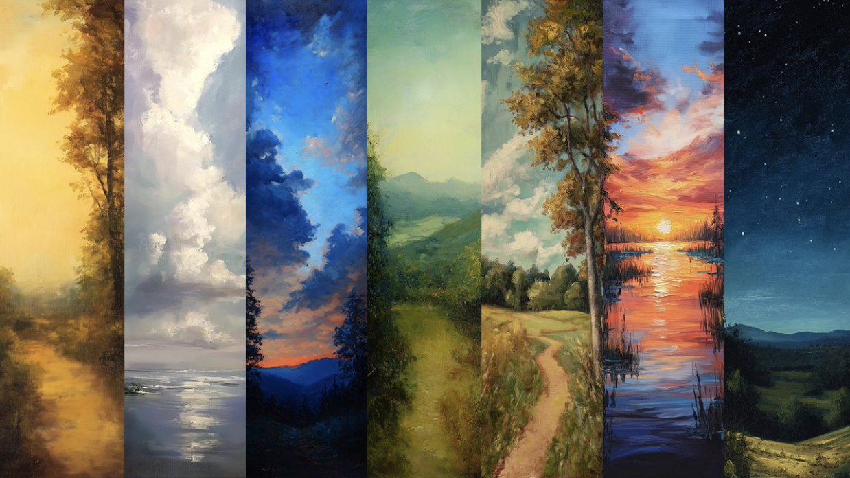
The first images we generated looked perfect in Figma: highly detailed oil-paintings, impressionist brushwork, all in 4k image quality. In production, it fell apart. The more emails the user had, though, the bigger their Cora Brief became, and the more the background stretched and pixelated. We needed 8k, sometimes 10k-pixel resolution just to maintain the painting’s integrity. Each image iteration grew heavier and heavier. We were generating images with heights over 18k pixels. Pages would’ve taken eons to load.
From an engineering perspective, it made no sense. You don’t use a massive image for a background when you can’t predict page height, because if everyone is getting a different view of the image, you can’t guarantee a coherent experience. Our approach violated other “best practices” of product design, too: You don’t add texture when flat colors load instantly. You don’t choose paintings over flat backdrops when you’re building software that needs to work on every connection speed.
But we weren’t just building software. We were building a place.
We talk about online places as spaces—Slack channels are “rooms,” Twitter a “public square”—but we don’t really think of them that way, and we even less design them that way. Even the apps we don’t label as spaces, like Gmail, are sometimes rooms we inhabit for hours of our day. Most of them feel like conference rooms under fluorescent lights. Functional? Yes. Somewhere you want to be? No.
We solved the engineering for our painted-sky backgrounds. More importantly, we discovered something: Art direction is product architecture. It makes trade-offs clearer, keeps the experience coherent, and gives people a reason to choose your product in a world where AI can generate the median in seconds.
Make your team AI‑native
Scattered tools slow teams down. Every Teams gives your whole organization full access to Every and our AI apps—Sparkle to organize files, Spiral to write well, Cora to manage email, and Monologue for smart dictation—plus our daily newsletter, subscriber‑only livestreams, Discord, and course discounts. One subscription to keep your company at the AI frontier. Trusted by 200+ AI-native companies—including The Browser Company, Portola, and Stainless.
The gravity of sameness
Open any design gallery—Dribbble, Behance, wherever designers show their best—and squint. Dashboards blur: rounded corners, neutral grays, tidy rows of cards. Landing pages collapse into one rhythm: hero text left, image right, three features below. We got so good at a certain kind of design, and that kind of design is so effective, that the outcome looks nearly identical across the web.
With good reason: Style guides gave teams shared rules to follow. Design systems turned those rules into reusable patterns. Utility frameworks like Tailwind made those patterns shippable in code. Each step improved access and reliability, but it also narrowed the expressive range. When teams reach for the same components, apply the same spacing scale, and follow the same accessibility guidelines (as we should), differentiation becomes a deliberate fight against defaults.
Now add AI. Ask a model to “design a SaaS dashboard” and it returns the statistical median: sidebar navigation, metric cards, data table. Competent, functional, and forgettable. As AI-built interfaces become tomorrow’s training data, the effect compounds. The median tightens. The web accelerates toward a single, hyper-optimized, bloodless template.
When sameness costs nothing, difference carries the value. If two products solve a problem equally well, people choose the one that feels better to use—-the tone of voice that resonates, the design that delights, the experience that feels lighter or more focused. Think about writing in Word versus Google Docs: Both let you draft this article, but Docs wins for a million small reasons—cleaner interface, snappier feel, less clutter. Those subtle differences add up.
That is the job of art direction. It defines a feeling—and protects it—as the project progresses through technical decisions, sprints, and performance work. Where graphic design solves problems at the level of a single asset—a logo or layout—and product design solves problems at the level of interactions, art direction operates one tier higher. It shapes the overall look, feel, and atmosphere so that every visual choice communicates the same idea. It’s the visual north star—the mood, tone, and narrative that tie individual assets and interactions into a coherent whole.
Design is about what you make. Art direction is about how it all fits together—and, ultimately, what it makes people feel.
Making the room livable
When we committed to oil-painted skies for Cora, we created a cascade of technical requirements. The paintings had to hold their integrity at any page height—8k to 10k resolution, not 4k. (Note that we’re talking about image assets, not display standards—standard HD is 1920 x 1080.) File sizes ballooned. Every new email stretched the canvas. Load times went from milliseconds to seconds.
Faced with these requirements, we could have said, “Let’s use a gradient instead.” Or better—just white. But would a gradient make you want to open your inbox? Would a white background give you that feeling of outside air inside the app?
It’s tempting to build functionality and sprinkle “design” on top. But when you have a visual north star from the beginning, you go the other way around.
We spent weeks solving problems that wouldn’t exist with a white background. We serve more bytes than a standard email client. Our engineers learned how to solve compression problems instead of shipping features. The trade-off was worth it: The texture gave people a reason to choose our product, and the constraint made it better at performance. Cora loads fast and works everywhere, and people tell us they prefer opening it to Gmail.
Ship the atmosphere
After months of building Cora and watching Every's aesthetic evolve, certain principles keep surfacing. They're not rules, exactly—more like gravitational forces that pull every decision in a particular direction.
Define the feeling (not the features)
Most email tools lead with features. The default result is an endless checklist—rows of messages stacked under sterile fluorescent light. Gmail, for example, feels like a to-do list written by other people. It piles on, without giving you much sense of control or escape.
We start differently: by asking what it should feel like to use. For Cora, the answer was a breath of fresh air—an escape from the hospital-light sterility. Naming that end state gives you a north star, and the job becomes translating it into color, type, rhythm, and space.
To get there, I pulled references from film, architecture, fashion, even games—not just other SaaS apps. Then I tested for feeling, not preference: What does this make you feel? The response tells you if the creative direction is doing what you want. Once the mood is set, every choice has to be traced back to it. That’s how you keep the atmosphere consistent and intact.
In the game Super Mario Bros., there’s a flower that, when you pick it up, gives you the ability to shoot fireballs at enemies that come your way. You don’t care about the flower itself—you care about who you become after touching it: someone who can throw fireballs. Software works the same way. People don’t just buy a tool; they buy the transformation it creates—calmer, smarter, more inspired, more in control. That promise has to live in the copy, the visuals, the flow—everything.
Give the internet texture
Most digital products are flat. They’re optimized for efficiency, but the trade-off is that they all blur together. After a while, staring at them feels like staring at drywall—your eyes slide right off.
I wanted Cora to feel different, more like a hand-crafted object. That’s why I leaned into oil-painting textures. On their own they don’t do much, but once we set a full-bleed painting behind the app and echoed that canvas grain across surfaces, the whole register shifted. Instead of a screen you click past, it suddenly felt closer to something you’d linger on in a museum.
In our case, texture extends beyond the visual. We also give the product texture—we add friction at select places in the product itself. For instance, we only surface a few messages at once, technically making it “harder” to get through your inbox. But this also reinforces a sense of calm and spaciousness. That mood is what actually helps people get through their inbox.
Every surface is the product
Atmosphere only works if it’s consistent. If the mood shifts from one screen to the next, you notice the seams—and the spell breaks. So I try to carry the same tone everywhere, from the landing page to the app to the logo to the social share cards.
Think of it like a building: Product design lays down the walls, foundations, and circulation paths, but art direction decides whether those rooms feel warm or sterile, inspiring or oppressive. Both layers are architecture. Both shape the experience of inhabiting the space. A hallway that feels cramped or a lobby that feels airy—those are art direction choices as much as design ones.
And it’s rarely the work of a single “art director.” Most organizations spread that responsibility across product managers, designers, even CEOs—anyone making calls about how things look and feel. The danger is when a dozen small decisions start to pull in different directions. That’s why atmosphere needs a dedicated guardian: Whether that person’s title is “art director,” “creative director,” or “graphic designer,” someone needs to protect the vision from brainstorming through launch to customer support. Without that, the product becomes a patchwork of good intentions rather than a coherent place.
Make the internet beautiful
Software is content now. AI can generate a competent interface in seconds. Components are commodified. Patterns are free. The defensible position is to care about what machines can’t: how a place feels. But making it “pretty” isn’t enough. You have to articulate texture—oil-painted, soft depth, breathing motion—and turn that into rules. The tools are changing, but the need for atmosphere isn’t. It’s more important, now, than ever.
Every surface someone touches should feel like somewhere they chose to be. Every room should carry its own quality of light. Every interaction should remind them that humans made this, for humans.
The internet doesn’t have to look like an office park. We can add texture. We can create depth. We can build places worth being.
Make the internet beautiful. That’s the guiding principle. Everything else follows.
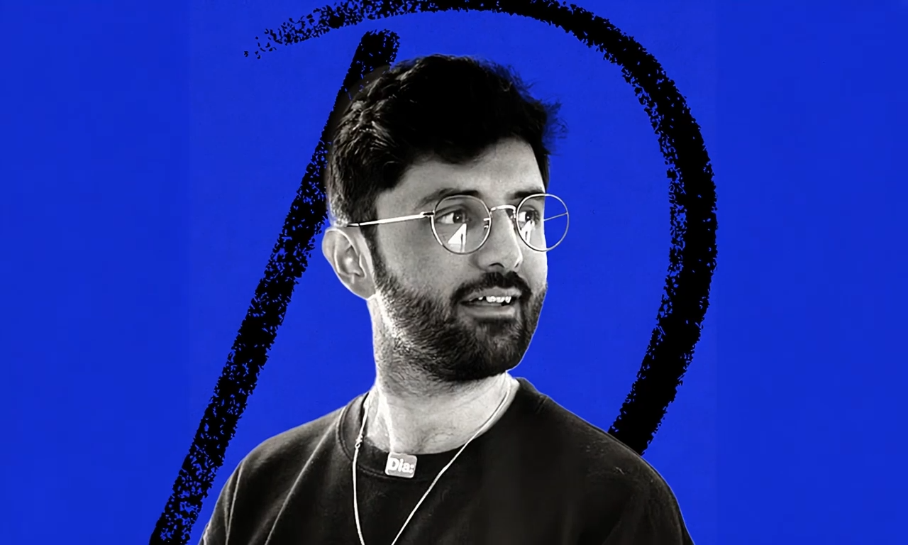
Lucas Crespo is the creative lead of Every. He was previously an art director at the advertising agencies BBDO and VML. You can follow him on LinkedIn and on X at@lucas__crespo.
To read more essays like this, subscribe to Every, and follow us on X at @every and on LinkedIn.
We build AI tools for readers like you. Write brilliantly with Spiral. Organize files automatically with Sparkle. Deliver yourself from email with Cora.
We also do AI training, adoption, and innovation for companies. Work with us to bring AI into your organization.
Get paid for sharing Every with your friends. Join our referral program.
Ideas and Apps to
Thrive in the AI Age
The essential toolkit for those shaping the future
"This might be the best value you
can get from an AI subscription."
- Jay S.
Join 100,000+ leaders, builders, and innovators

Email address
Already have an account? Sign in
What is included in a subscription?
Daily insights from AI pioneers + early access to powerful AI tools
 Front-row access to the future of AI

Ideas and Apps to
Thrive in the AI Age
The essential toolkit for those shaping the future
"This might be the best value you
can get from an AI subscription."
- Jay S.
Join 100,000+ leaders, builders, and innovators
Email address
Already have an account? Sign in
What is included in a subscription?
Daily insights from AI pioneers + early access to powerful AI tools
Front-row access to the future of AI
 Cassius Kiani
 Danny Aziz
 Naveen Naidu Mummana
Comments
Don't have an account? Sign up!