TL;DR: Design has always been core to what we do at Every—it’s a big part of what makes our products feel like ours. Daniel Rodrigues is Every’s senior designer, and Lucas Fischer is the design engineer who helped bring our smart dictation app Monologue to iOS. This is their first time writing for us, and they’re pulling back the curtain on the design process: studying vintage radios, crouching beside light switches to understand how shadows move, and exploring 20 wrong keyboard concepts to find one right one. If you’ve ever wondered what it takes to make software feel like something you could reach out and touch, this is your read.—Kate Lee
While designing the iOS app for Every’s smart dictation app Monologue, I (Daniel Rodrigues, Every’s senior designer) did a lot of things I didn’t expect. I studied vintage radios. Design engineer Lucas Fischer and I worked with a musician to craft the sound a button makes when you tap it. And at one point in January, I found myself crouched beside a light switch in my apartment, pressing it on and off, watching how the shadow moved. I needed to understand how a real button catches light to make a fake one feel real.
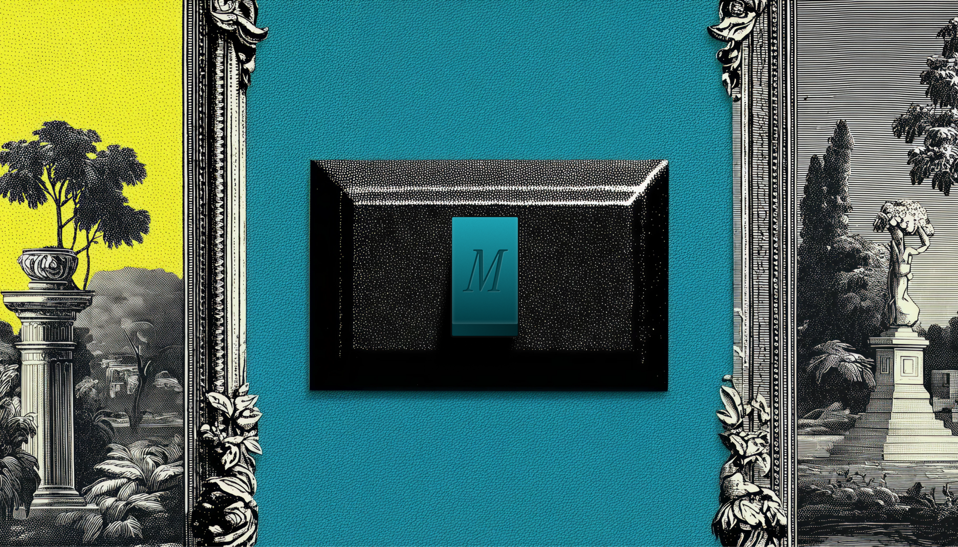
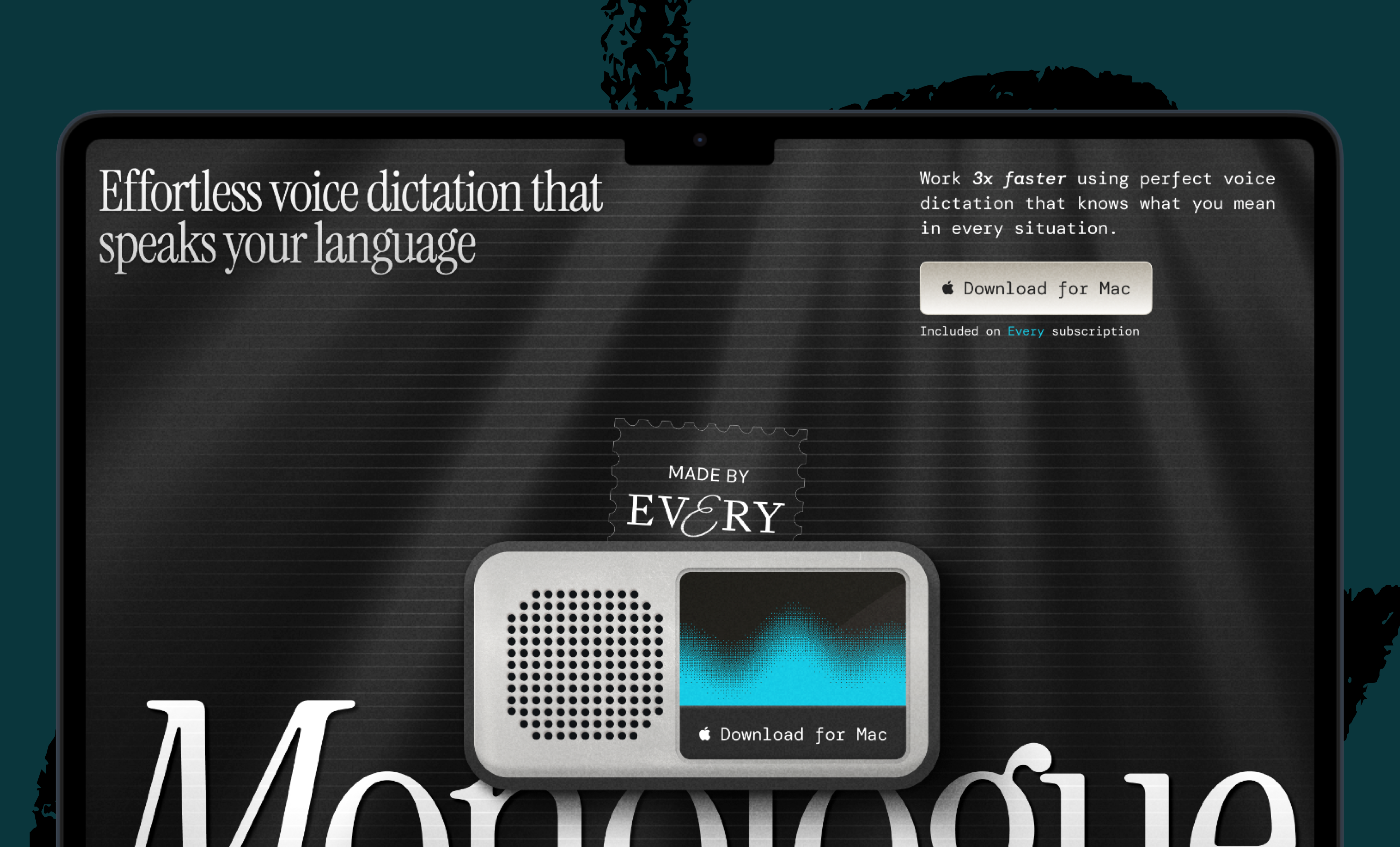
Until recently, Monologue only lived on Mac desktops. A week ago, we brought it where most people do their typing: their phones. The app is deliberately sparse—few buttons and a restrained color palette—but each element is designed to feel like something you could reach out and touch, like the light switch on the wall.
What follows is an inside look at the design principles and engineering decisions that we used to make a few buttons on a screen feel like something more.
Decide where quality matters most
I designed Monologue’s desktop app for Mac with its general manager, Naveen Naidu, in September 2025, so I had an established design language to work from: a love letter to how using tech devices used to feel, with a black-and-white palette and a nostalgic 1990s vibe that resonates with millennials and Generation Z’s pining for the good old days of tech.
The main difference in designing Monologue for iOS was creating an experience that looked—and felt—good on a much smaller screen. This constraint made the work easier because it pushed us to keep the interface minimal and clean while still infusing it with character.
Before I opened Figma, the key design tool I use, the most important decision was figuring out where to focus my energy. Three things stood out: the onboarding flow, the keyboard, and a recorder for long-form notes.
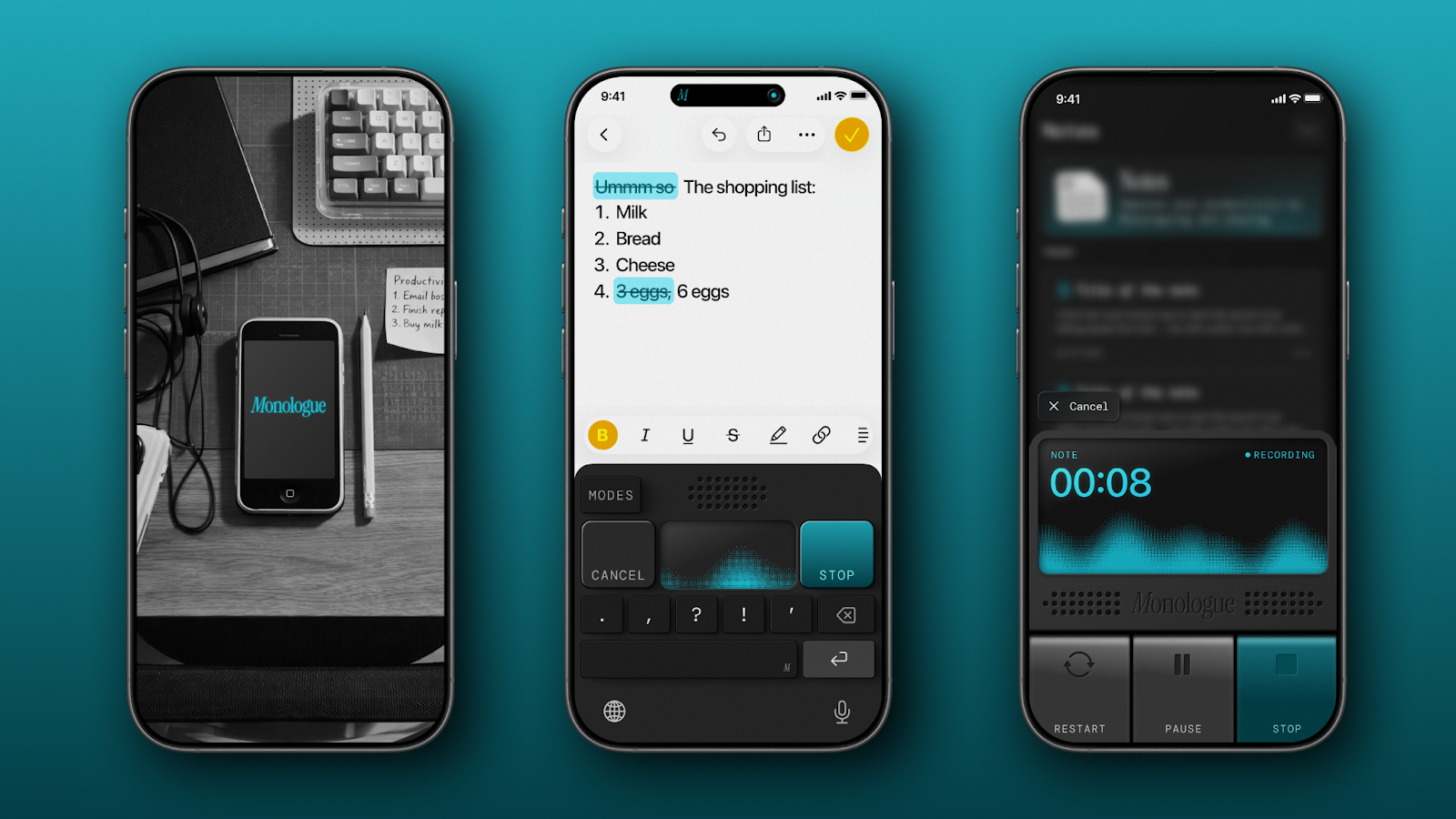
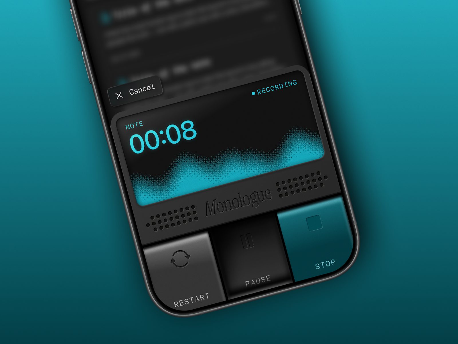
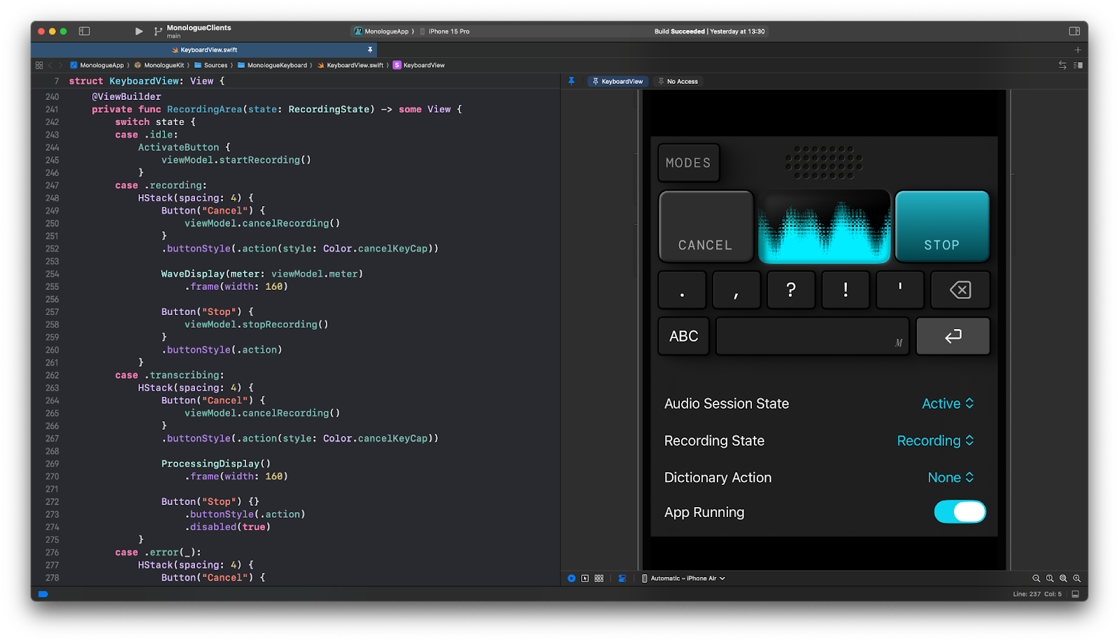
The onboarding is a user’s first contact with the app, and we wanted that moment to be a delightful one. The keyboard is what appears when you hit record with Monologue inside any app—it replaces your standard typing keyboard with one that transcribes your voice. The notes recorder is for longer, more open-ended capture, the place you’d go when inspiration about a side project strikes on a walk, and you need to get it down somewhere, stat. The keyboard and notes recorder are the screens users would use every day, the ones they’d remember.
What comes after your IDE? Intent.
Stop herding AI agents across terminals and branches. Intent bundles each task into a single workspace with a living spec, agent notes, and full change visibility. Orchestrate agents like a system, not a swarm: Direct specialists, keep work aligned, and ship without copy-pasting context. Works with Augment, Claude Code, Codex, or OpenCode.
Everything else—the screen that shows statistics like words dictated and time saved, or the dictionary feature where you can add your own vocabulary to improve transcription—was a translation of what we’d already built on Mac. Important, but not where a user’s heart would be won (or lost).
Let failed concepts clarify direction
Once I knew where to focus, my first step was abundantly—some might even say wastefully—exploratory. For the keyboard, I ran an internal “keyboard competition” getting input from our creative director Lucas Crespo, Naveen, and Lucas: I designed around 20 different concepts in Figma, knowing full well that most weren’t quite right. Those wrong answers were in no way a wasted effort. When you’re trying to define what you want, it helps enormously to have a clear visual understanding of what you don’t want.
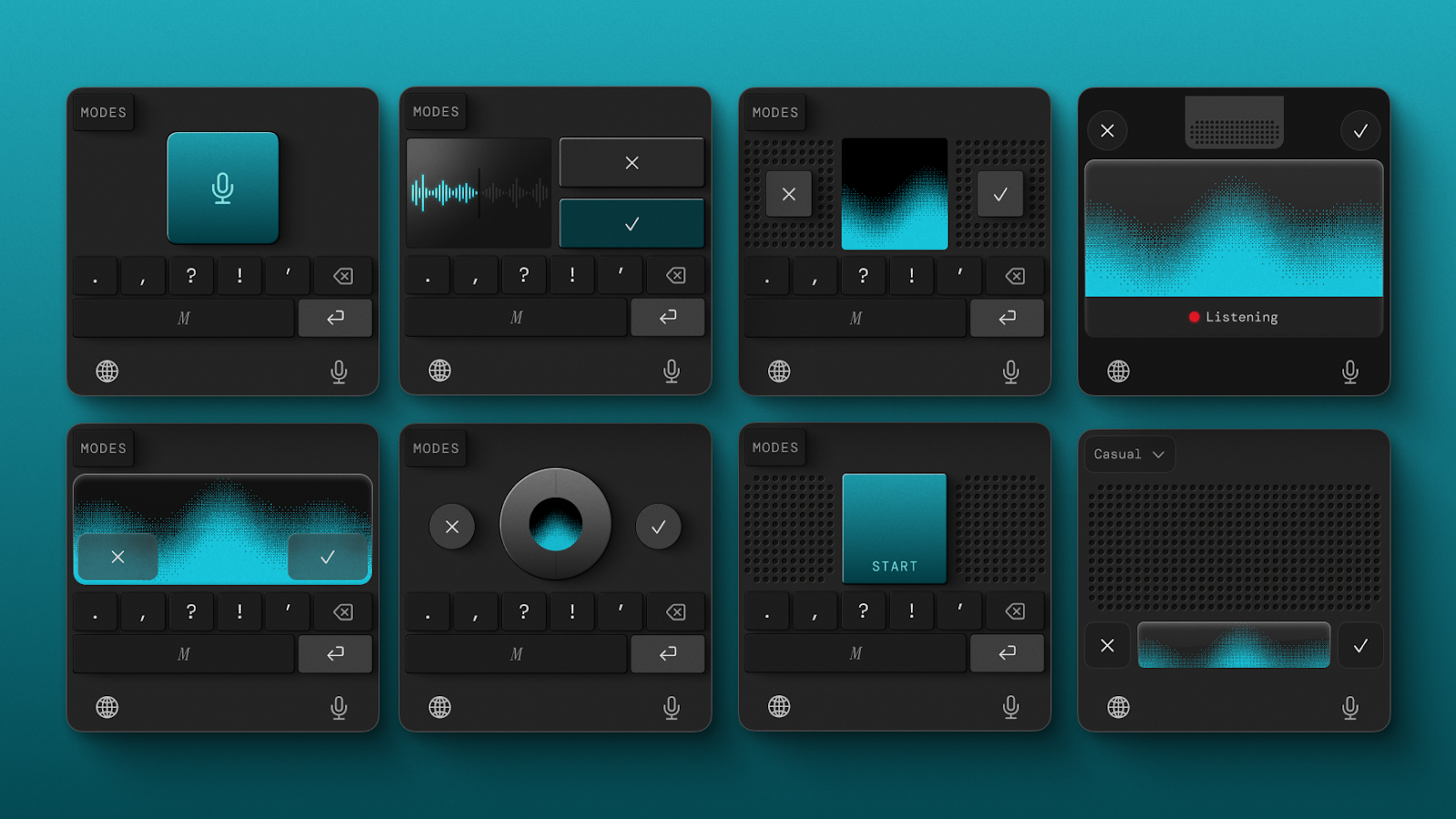
From those 20 concepts, we narrowed our options down to about five strong candidates, then started combining elements from each: the button proportions from one, a typographic treatment from another, a specific approach to shadow and depth from a third. The final keyboard design that made it into the app was assembled from the best fragments that survived this process.
Translate weight, shadow, and touch into software
The vision for the iOS app was for it to exist beyond pixels, crossing the divide into the real world we inhabit. I wanted the keyboard and the notes recorder to feel tangible, like objects that could sit on a desk in front of you. Skeuomorphism has been accused of being overdone, and fairly so, but I think of it as borrowing the credibility that physical things naturally have, like weight, shadow, and texture. Something similar to the way a real button communicates—without explicit explanation—that it can be pressed.
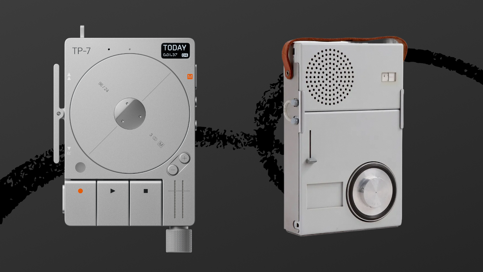
I studied devices made by Braun, the German company whose radios and calculators became icons of industrial design, and Teenage Engineering, a Swedish electronics company known for making synthesizers and gadgets that feel like toys in the best possible way. I was trying to understand how physical buttons behave. I wanted to know, for example, how their shadows shift when pressed when they catch light in specific ways.
I tried to mimic this in Figma, but some details resisted translation. The pressed state of the notes recorder was the hardest: I understood how a physical button behaves when depressed (that’s the anecdote about me crouching beside a light switch from the introduction), but knowing what it looks like in real life and reconstructing it on screen turned out to be two very different problems. I couldn’t get the shadows right.
So I asked Google’s image editor Nano Banana a simple question: How would this button look if it were pressed? It generated an image that gave me the input I needed to mimic that in Figma. It was much easier for me to work from a visual than to reason abstractly about how light should behave.
Translating that sense of physicality from Figma into the app was the next step. Rather than exporting my designs as static image assets, Lucas built every button and UI control natively in SwiftUI, Apple’s framework for building interfaces. In practice, each element on screen isn’t a flat picture of a button; it’s a living, programmable object. This lets the app animate transitions—the small visual shifts that happen when a button is pressed for the app to go from idle to recording—in ways that feel genuinely physical.
We also layered in sound effects and haptics—the tiny vibrations you feel when you tap your phone sometimes—so that users could hear and feel the app. Every sound in Monologue is custom-performed by a musician, including the ones that play when you start and stop a recording. We focused on this especially in the onboarding flow because people are often multitasking when they open a new app—walking down the stairs or bagging groceries—and sound and touch cut through that in a way visuals alone can’t. A crafted sound paired with a small pulse in your palm, the moment you open the app, gets users to pay attention.
Make every interaction coherent—and easy to test
A design can look beautiful in a static mockup and still fall apart in practice because it’s not intuitive to use. Once I had a direction, the next step was stress-testing it against every “state” it needs to support. In design, a “state” is every version of the UI a user might encounter while using the app. For the keyboard, that meant: What does it look like when it’s sitting idle, waiting for input? What about when it’s actively recording? What happens visually when a user cancels mid-dictation, or when something goes wrong, and you need to surface an error?
Each of those moments needed to feel coherent within the same design language. The keyboard we shipped was the one where everything cohered: It looked right, and it made sense at every point in the interaction.
The challenge for Lucas on the engineering side was keeping up with the pace of iteration. Monologue’s keyboard has a lot of states, and the initial prototype made it painfully slow to test any of them. Even a small change required “recompiling” the entire app (essentially waiting for the computer to rebuild the whole application from its source code, even if you only tweaked one tiny detail), and only then seeing whether an adjustment worked. When you’re trying to polish dozens of subtle visual details across dozens of states, that kind of friction kills momentum, not to mention the joy of development.
So Lucas rebuilt the keyboard from scratch with a clear separation between how it looks and how it works under the hood. Then he built a SwiftUI playground for it—essentially a live sketchpad of sorts where we could see changes to the keyboard instantly, without restarting or rebuilding anything. We ended up using this pattern of engineering across most of the app’s components: Each feature has its own playground, so we can test how it looks and feels in isolation without waiting for the full app to recompile every time.
Product design for AI tools that people love
Not every AI product needs skeuomorphic buttons and custom sound effects, but the bar for what “functional” means is shifting. AI is making it faster and cheaper to build “functional” products, so the ones that endure are those where someone thought about what it feels like to use them. For us, that meant studying physical objects, exploring 20 wrong directions to find one right one, and hiring a musician to build sounds we could have pulled from a stock library.
The principles behind those decisions are portable: Figure out which parts of your product users will use daily, and let yourself over-invest there. Explore directions you suspect are wrong, because they’ll sharpen your sense of what right looks like. When something on screen feels too thin, look at the physical world for cues. And test your designs against every messy, unglamorous state a real user will encounter. That’s what we did, and it’s how a few buttons on a screen ended up feeling like something we’re proud of.
Monologue is now on iOS for everyone to experience their voice as a keyboard—wherever they are. Read about the features, including whisper mode and how to take long-form notes, and download the app.
Thanks to Rhea Purohit for the editorial support.
Daniel Rodrigues is a senior designer at Every. You can follow him on X at @darustudio and on LinkedIn. Lucas Fischer is a full-stack design engineer.
To read more essays like this, subscribe to Every, and follow us on X at @every and on LinkedIn.
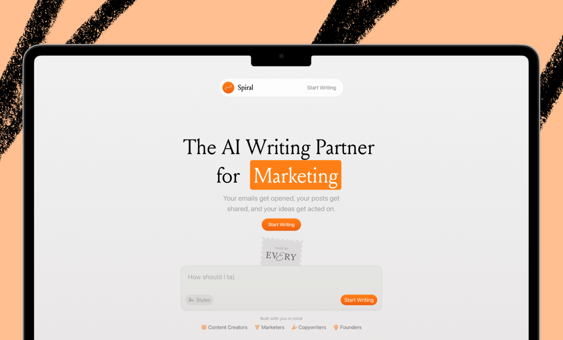
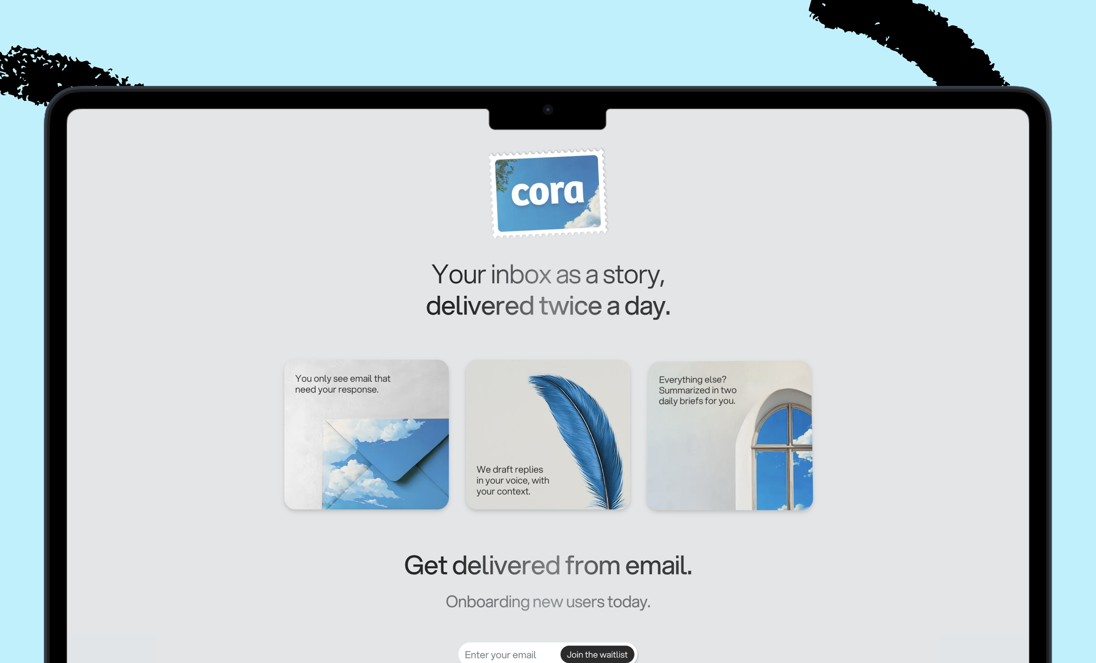
We build AI tools for readers like you. Write brilliantly with Spiral. Organize files automatically with Sparkle. Deliver yourself from email with Cora. Dictate effortlessly with Monologue.
We also do AI training, adoption, and innovation for companies. Work with us to bring AI into your organization.
Discover Every’s upcoming workshops and camps, and access recordings from past events.
Get paid for sharing Every with your friends. Join our referral program.
For sponsorship opportunities, reach out to [email protected].
Help us scale the only subscription you need to stay at the edge of AI. Explore open roles at Every.
The Only Subscription
You Need to
Stay at the
Edge of AI
The essential toolkit for those shaping the future
"This might be the best value you
can get from an AI subscription."
- Jay S.
Join 100,000+ leaders, builders, and innovators

Email address
Already have an account? Sign in
What is included in a subscription?
Daily insights from AI pioneers + early access to powerful AI tools
 Front-row access to the future of AI
 Bundle of AI software
.png)
 Katie Parrott

 Katie Parrott
 Edmar Ferreira
Comments
Don't have an account? Sign up!