
Let me tell you a secret.
One reason I started superorganizers is to get a chance to talk to awesome people.
People that are nerdy about productivity in the same way I am.
That's why the mission statement for this newsletter is to uncover how the smartest people in the world organize what they know to do their best work.
But that's not the whole point.
The point of this is also to build new tools to help us organize, and think, and do our work better. The point is to make this way of life accessible to everyone — even if you're not writing your own personal encyclopedia like Ceasar is.
In just a few short months we've built our own little community of almost a thousand people. And so, I think it's time to start exploring what those new tools could be.
That's why in addition to doing interviews, I've also been hacking away on interesting prototypes with a few friends. The goal is to take what these superorganizers already do and make it 10x easier, more accessible, and more fun.
But prototypes aren't any good if no one gets to see them. That's why I'm creating a new part of this newsletter: Prototype Tuesday.
On Prototype Tuesdays, I'll periodically release a prototype of something awesome for the community to play with. This requires some trust: these prototypes are going to be rough. They're going to have bugs.
But if you squint at them, hopefully you'll be able to see a promising vision for the future.
I think the idea of building new things together, as a community, sounds extremely fun. So, let’s do this :)
Here's the first prototype for Prototype Tuesday: Thinker.
Prototype Tuesday #1: Thinker
Thinker is a tool to help you find patterns in messy data from the bottom up. All you have to do is answer one simple question: where does this go?
Thinker will take a CSV of your data, and display each row as an item that you can plot on a map. Then using a simple drag-and-drop interface you can cluster and link items together, to form a high-level visualization of your data.
You might be wondering where this comes from. Let me explain…
Bubble Maps help us find patterns from the bottom up
When I work with companies, one thing I often do is create data visualizations of customer feedback to help guide the product and marketing roadmap. I call these Bubble Maps.
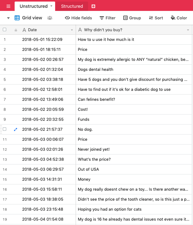
Basically, what I do is start with a set of unstructured data. Let's say it's a list of customer objections. It's probably a spreadsheet that looks something like this:
In this case there were about 250 responses for why people didn’t buy this product. I wanted to create a visualization that could pull the patterns out of this data, and help us see the main objections.
This would allow us to build a roadmap for improving the offering, and, by extension, the results of the business.
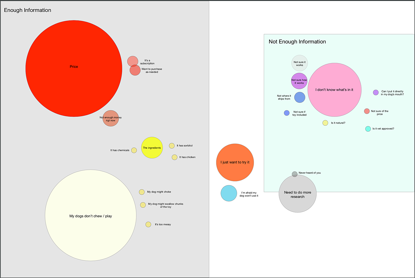
So I created a bubble map. The end result looks like this:
A bubble map turns a spreadsheet into a prioritized roadmap!
For example, we can see from this bubble map at a glance that many people didn’t buy because they didn’t know the ingredients of the product. That makes it really easy for us to start pulling levers to boost conversions.
Here’s the problem though: this process took a while. It required lots of hunting through a spreadsheet to find patterns, and then going into Sketch and building the bubble map by hand.
That’s where Thinker comes in. Thinker makes it easy to build bubble maps and find these types of patterns just by asking the question: where does this go?
My friend (and legendary superorganizer) Mark Bao and I built it over the course of a couple of weeks. He did the vast majority of the programming. Mark is awesome.
Try Thinker by clicking the button below, or keep reading to see how it works.
Using Thinker to find patterns
Let’s use a simple example to understand how this works. Let’s say you’ve gathered a bunch of data from customers about their favorite foods, and you want to find the patterns in the data.
Thinker will take a CSV of your data and display each row as an item that you can plot on a map:
If you drag one item on top of the other it creates a bubble:
You can change the color of bubbles:
You can even link items that go together, but aren’t the same:
You can do this again, and again, until you’ve fully categorized everything in your map.
You can even create multiple levels of hierarchy:
The idea to be able to go from 100s of rows of unstructured data, to a fully organized visualization that lets you pull out actionable patterns in < 10 minutes. No Excel, Sketch, or Figma required!
What can I use it for?
Any time type of long-term data gathering project. Here are some examples:
- Organizing customer complaints to find the biggest painpoints in your product
- Organizing feedback from your team
- Gathering feature requests from RFPs to map the table stakes for your enterprise product
- Categorizing book highlights for your thesis
And lots more…
So that’s Thinker. You can try it right now by clicking below.
I’d love your feedback! Play around with it. Break it.
But most importantly, tell me what you think! I’d love to create a community discussion about it. Replies go straight to my inbox.
Dan
HOT TIP: click “Load Example Data” to use pre-baked test data.
Also, it doesn’t work on mobile for now! Sorry about that.
P.S. Huge props again to Mark Bao for being my partner in crime on this. You should check out Mark’s community for PMs, Know/How, here.
Dan Shipper is entrepreneur and writer living in New York City. You can reach him on Twitter at @danshipper, or reply to this email. If you liked this article subscribe below to get more like these in your inbox every week!
The Only Subscription
You Need to
Stay at the
Edge of AI
The essential toolkit for those shaping the future
"This might be the best value you
can get from an AI subscription."
- Jay S.
Join 100,000+ leaders, builders, and innovators

Email address
Already have an account? Sign in
What is included in a subscription?
Daily insights from AI pioneers + early access to powerful AI tools







Comments
Don't have an account? Sign up!