TL;DR: Design has always been core to what we do at Every—it’s a big part of what makes our products feel like ours. Daniel Rodrigues is Every’s senior designer, and Lucas Fischer is the design engineer who helped bring our smart dictation app Monologue to iOS. This is their first time writing for us, and they’re pulling back the curtain on the design process: studying vintage radios, crouching beside light switches to understand how shadows move, and exploring 20 wrong keyboard concepts to find one right one. If you’ve ever wondered what it takes to make software feel like something you could reach out and touch, this is your read.—Kate Lee
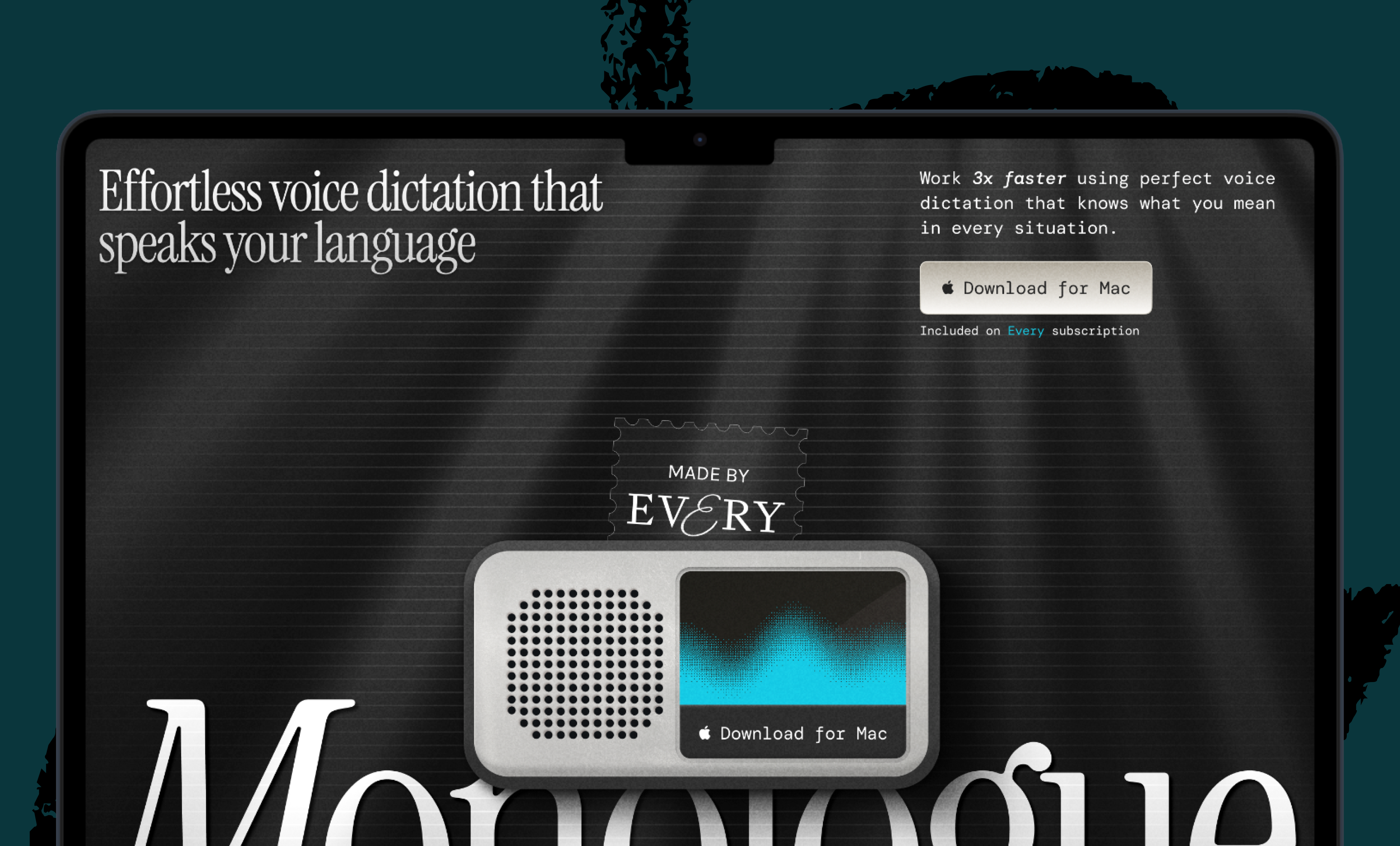
While designing the iOS app for Every’s smart dictation app Monologue, I (Daniel Rodrigues, Every’s senior designer) did a lot of things I didn’t expect. I studied vintage radios. Design engineer Lucas Fischer and I worked with a musician to craft the sound a button makes when you tap it. And at one point in January, I found myself crouched beside a light switch in my apartment, pressing it on and off, watching how the shadow moved. I needed to understand how a real button catches light to make a fake one feel real.
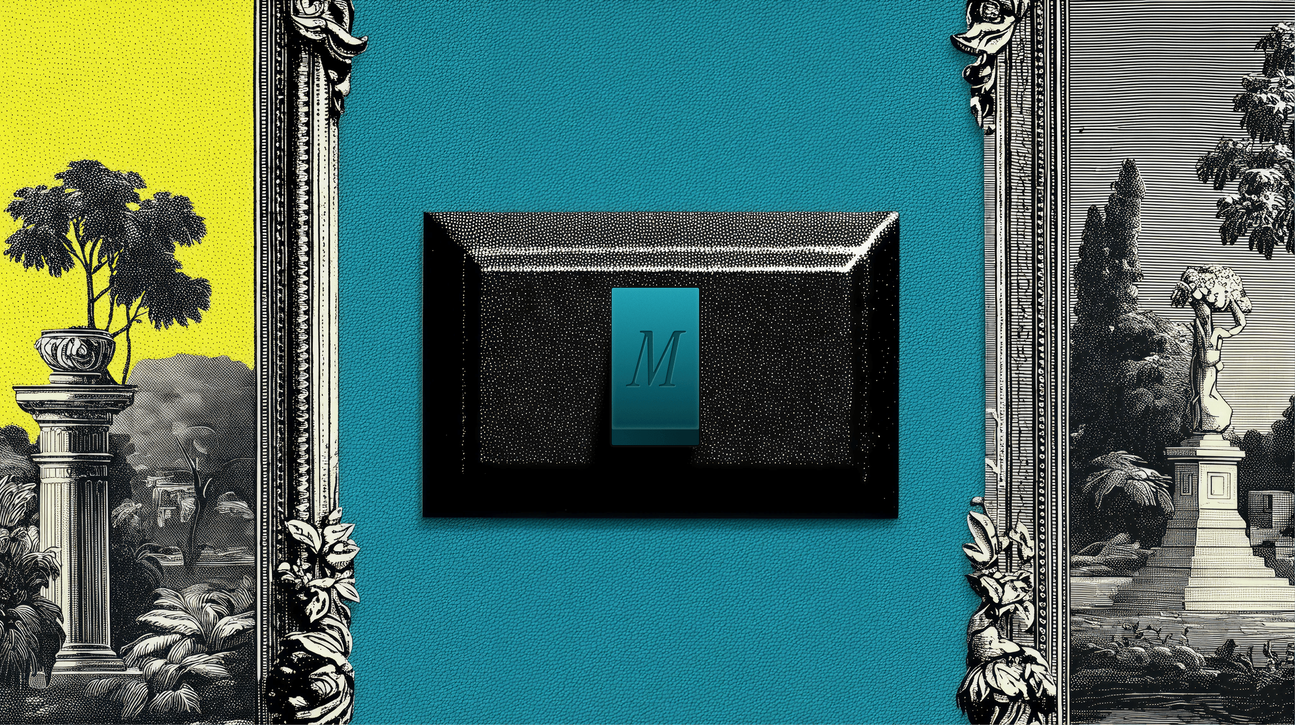
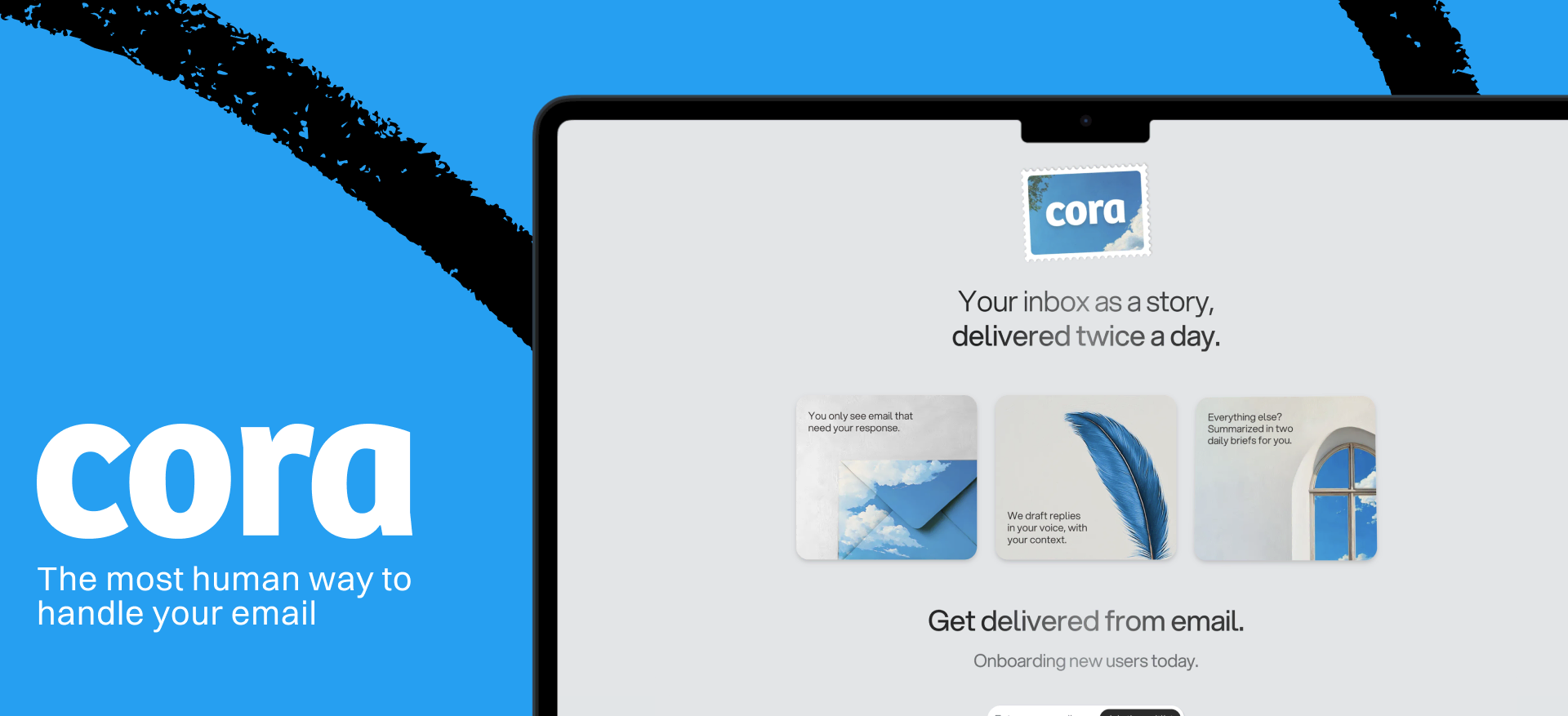
Until recently, Monologue only lived on Mac desktops. A week ago, we brought it where most people do their typing: their phones. The app is deliberately sparse—few buttons and a restrained color palette—but each element is designed to feel like something you could reach out and touch, like the light switch on the wall.
What comes after your IDE? Intent.
Stop herding AI agents across terminals and branches. Intent bundles each task into a single workspace with a living spec, agent notes, and full change visibility. Orchestrate agents like a system, not a swarm: Direct specialists, keep work aligned, and ship without copy-pasting context. Works with Augment, Claude Code, Codex, or OpenCode.
What follows is an inside look at the design principles and engineering decisions that we used to make a few buttons on a screen feel like something more.
Decide where quality matters most
I designed Monologue’s desktop app for Mac with its general manager, Naveen Naidu, in September 2025, so I had an established design language to work from: a love letter to how using tech devices used to feel, with a black-and-white palette and a nostalgic 1990s vibe that resonates with millennials and Generation Z’s pining for the good old days of tech.
The main difference in designing Monologue for iOS was creating an experience that looked—and felt—good on a much smaller screen. This constraint made the work easier because it pushed us to keep the interface minimal and clean while still infusing it with character.
Before I opened Figma, the key design tool I use, the most important decision was figuring out where to focus my energy. Three things stood out: the onboarding flow, the keyboard, and a recorder for long-form notes...
Become a paid subscriber to Every to unlock this piece and learn about:
-
Why Daniel built 20 versions of a keyboard he knew were wrong
-
The Braun radio and Swedish synthesizer behind Monologue’s most-tapped button
-
The engineering workaround that let the team test dozens of UI states


 Rhea Purohit
 Naveen Naidu
 Katie Parrott
Comments