
Invisible Details of Interaction Design
What makes great interactions feel right?
Jul 17, 2023 · 16 min readUpdated Apr 24, 2026
Sponsored By: Sanebox
Today's essay is brought to you by SaneBox, the AI email assistant that helps you focus on crucial messages, saving you 3-4 hours every week.
Design can feel like there's no science to it—only feel and intuition. Even researchers have trouble grounding interaction design practices in science, inherently treating them as a mysterious black box. While from my own experience that's partly true, I have been trying to deconstruct and excavate the why behind great displays of interaction design.
The essence of the word "interaction" implies a relationship between a human and an environment. In my experience, great revelations surface from making something—filling your headspace with a problem—and then going for a synthesizing daydreaming walk to stir the pot.
This writing is neither a tutorial nor a collection of guidelines, but rather an observation of the invisible details of a few interactions that I use often but rarely think about. Besides recreating interfaces, I found this exercise in reflection to be another great way to build a stronger design intuition and vocabulary.
Metaphors in interaction design
Interaction design is an art form to make experiences that fluidly respond to human intent. When does a swipe trigger an action? Do gestures retain momentum? What happens if a finger is covering content? How can we predict intent based on context? Executing well on details like these makes products feel like a natural extension of ourselves.
But it's not an art form in the same way as painting or composing music. There's a unique human component to interaction design. Why? Because ultimately people are trying to get stuff done using a product. Beauty in form and composition is not enough. There's an inherent satisfaction apparent in striking a holistic balance between form and function.
Imagine having an AI assistant sort your inbox for optimum productivity. That's SaneBox - it filters emails using smart algorithms, helping you tackle crucial messages first. Say goodbye to distractions with features like auto-reply tracking, one-click unsubscribing, and do-not-disturb mode.
SaneBox works seamlessly across devices and clients, maintaining privacy by only reading headers. Experience the true work-life balance as SaneBox users save an average of 3-4 hours weekly. Elevate your email game with SaneBox's secure and high-performing solution - perfect for Office 365 and backed by a 43% trial conversion rate.
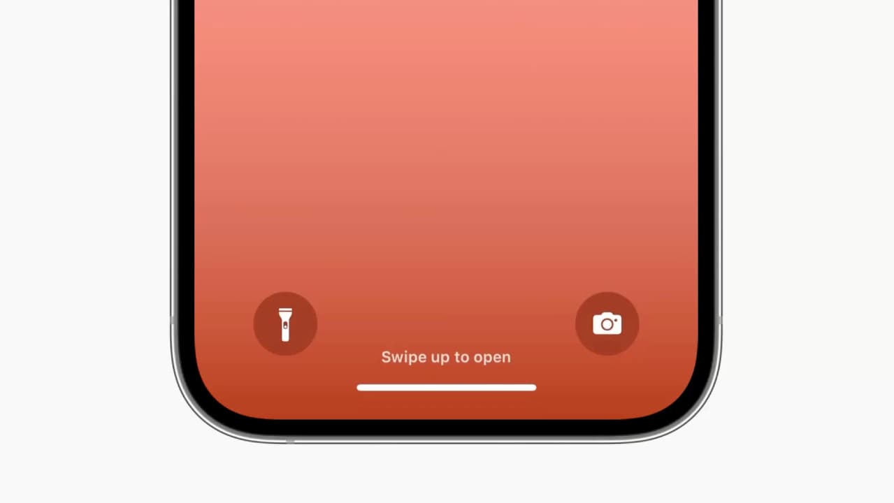
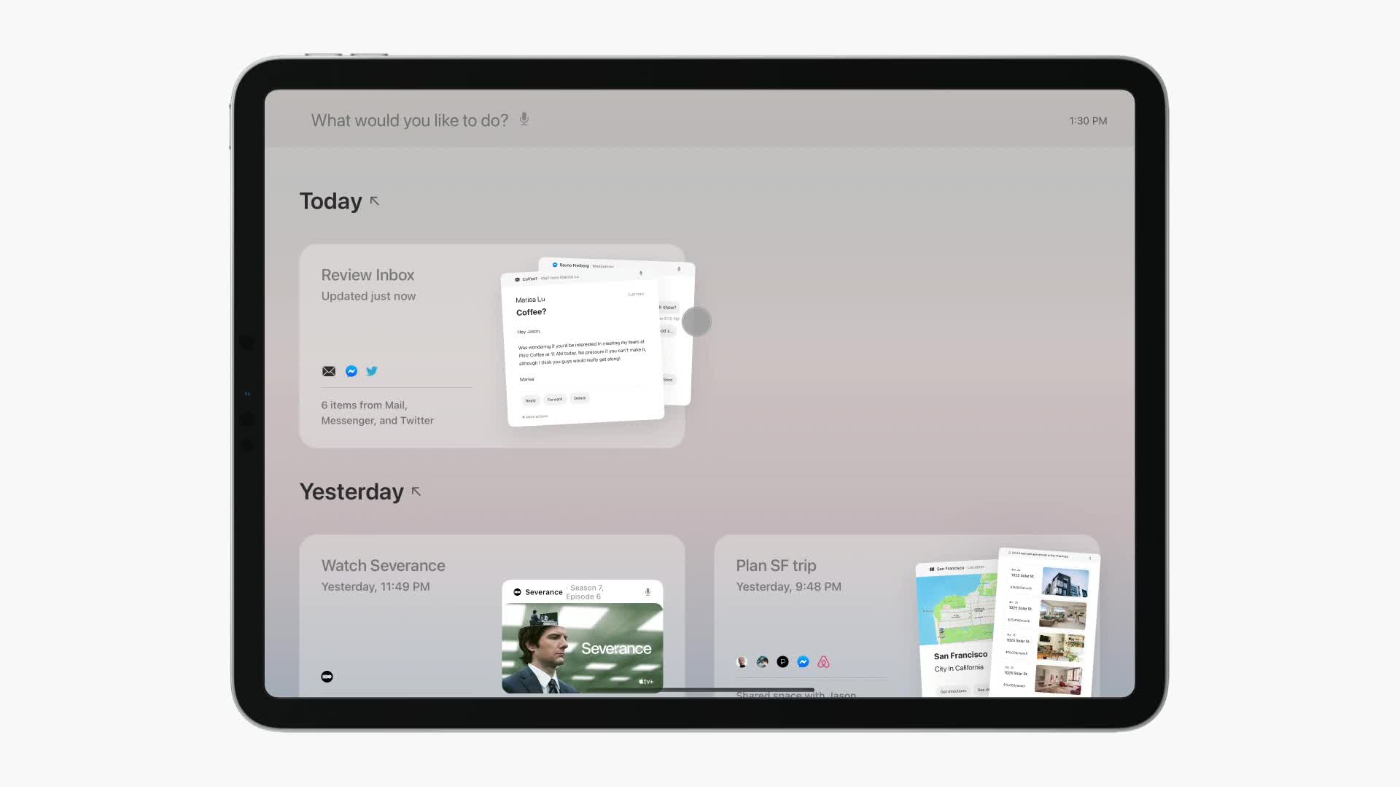
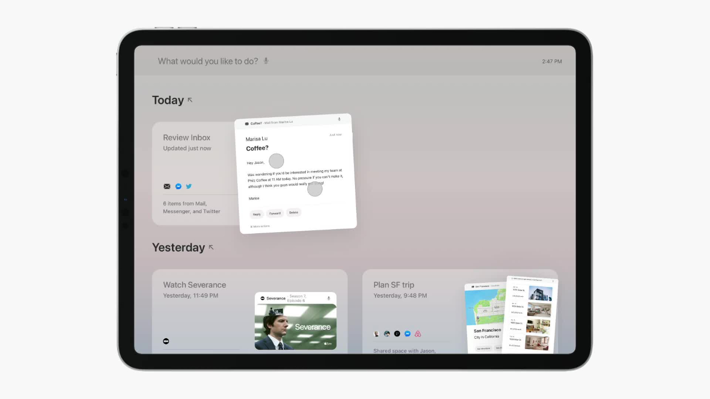
Great interaction design rewards learning by reusing metaphors. You can use most touch interfaces with just two gestures: tapping and swiping. For example, on iOS the only gesture you're explicitly taught how to do is swiping up to open:
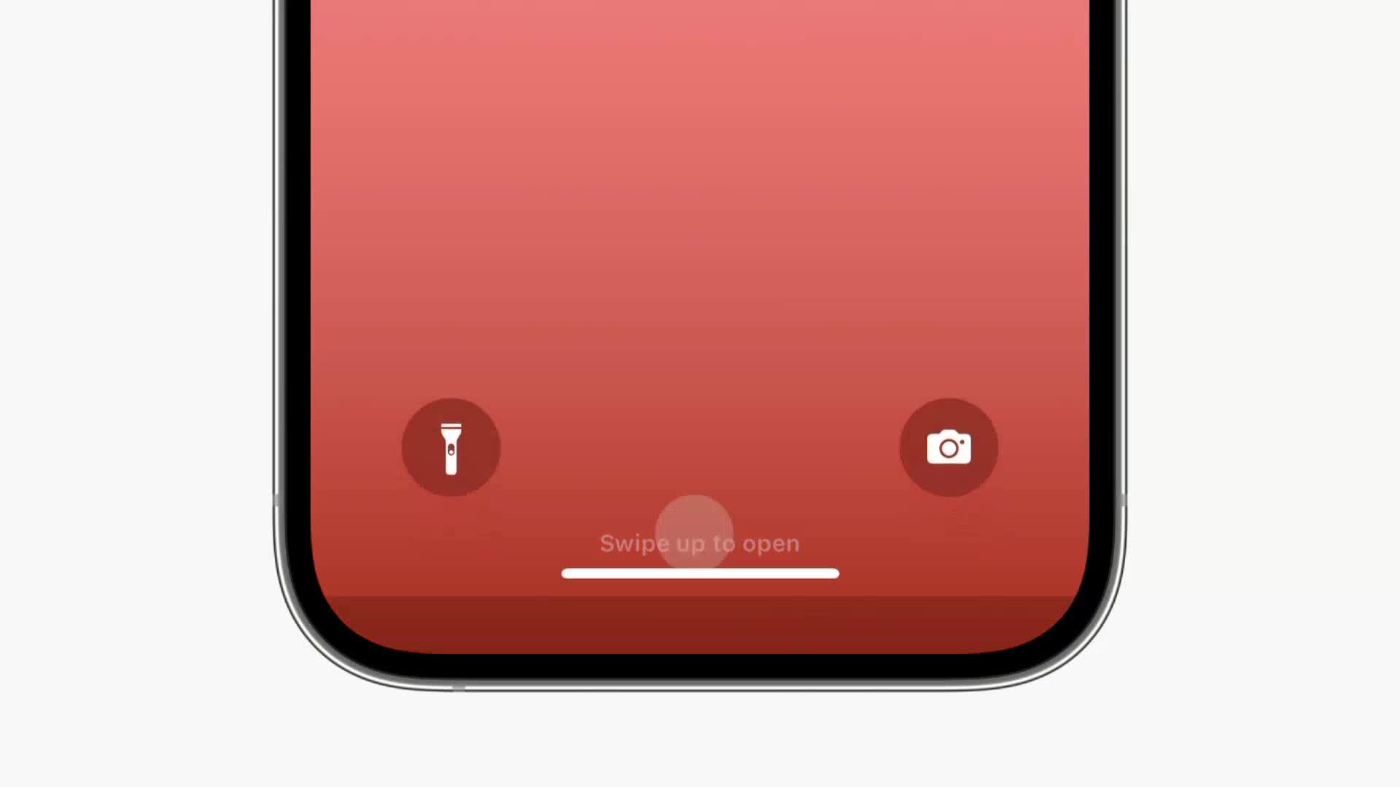
Now you've learned swiping, which unlocks control over many other parts of the interface. The sliding motion also tells you that the interface is composed of stacked layers, like a deck of cards. Knowing so, you might be enthused to try swiping down on the screen to discover more controls. Conceptually, the interface is further implicitly teaching you that swiping down reveals layers of system functionality. This knowledge compounds as you delve deeper into the Apple ecosystem.


Great interactions are modeled after properties from the real world, like interruptibility. This sounds silly because obviously flipping a page in a book is interruptible. But imagine if it were an animation that you had to wait for.

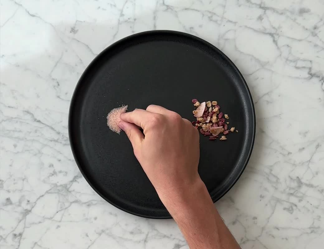
Pinching is another gesture that we've come to intuitively associate with zooming. Simply put, zooming is an act of precision—adjusting the amount of detail visible.
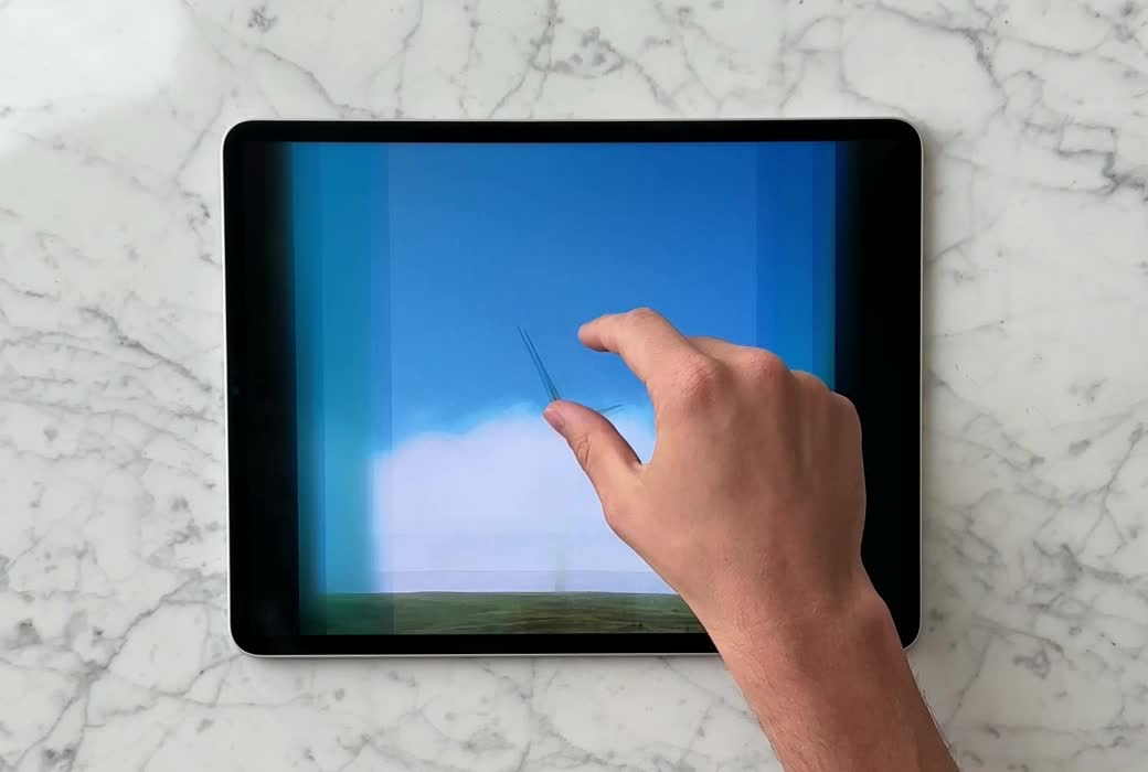
We can think of pinching akin to movements that require intricate motor skills, like picking up tiny objects or working with spices. Naturally, we pinch our fingers for higher precision:
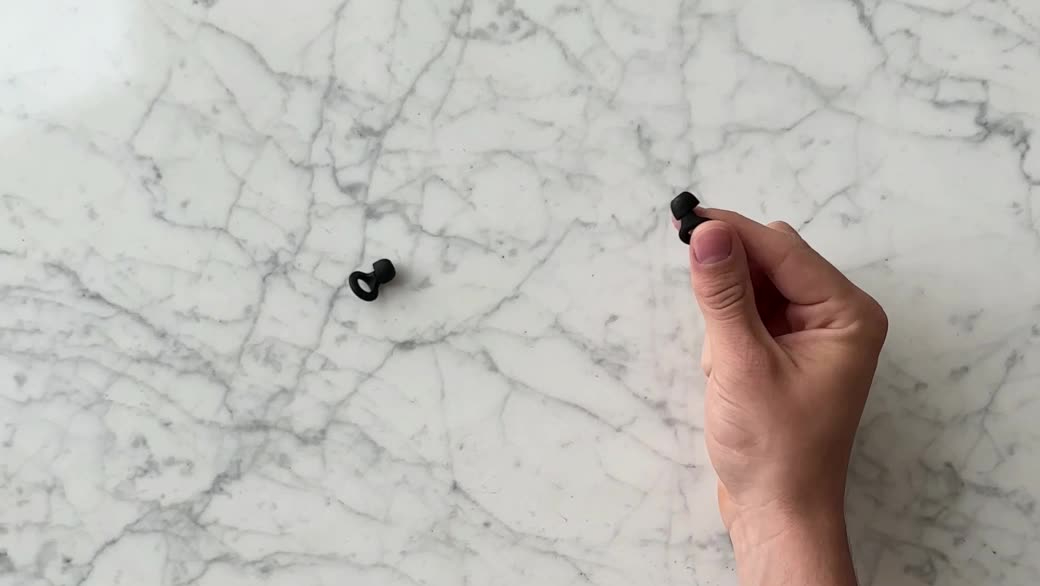
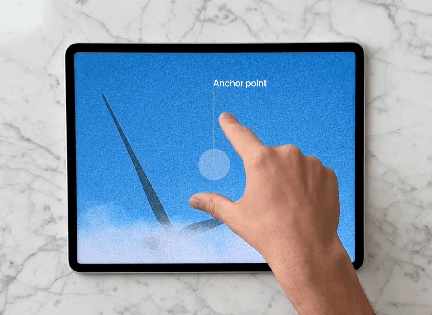
On a touch screen, the interface needs to first establish an anchor point from where the zooming originates, and it's a lot easier and more precise to pick the anchor point with the fingers pinched together:

Technically, the anchor point also needs to be calculated when the fingers start from apart. But usually, this implies zooming out, and that the exact precision of the origin is not as important. Deliberate precision requires two fingers to start from close together, like grabbing an object.
Scientifically or intuitively, there are hundreds of design decisions made by someone obsessing over the tiniest margins so that when they work, no one has to think about. And many of them tap into our instinctive behaviors.
Kinetic physics
The lock screen sliding up establishes that, in essence, it's just an overlay that can be dismissed by swiping up, and within that framing, so is an app. That means you also now know how to dismiss an application.
Let's take a look at how dismissing an app morphs into the Dynamic Island (the pill-shaped cut-out at the top of the iPhone screen). Notice how the gesture retains the momentum and angle at which it was thrown. It's never perfectly centered or consistent in timing.
This movement builds on our natural sense of physics from the real world, like how swiping a playing card would feel—although the movement of the playing card exhibits less bounce since it's conceptually lighter and does not magnetically morph into something.
Swipe gestures
When does a swipe trigger an action? It seems trivial: you press down, move a little, and trigger an action after releasing the finger. After building a few touch interactions myself using SwiftUI, I realized that might not always be the case. Sometimes we expect the action to be triggered while swiping.
Lightweight actions, such as displaying overlays, feel more natural to trigger during the swipe after an arbitrary amount of distance. For example, with a single gesture, I can immediately grok the overlaying surface, understand that it gives me a search input, and then dismiss if it's not what I want. Waiting for the gesture to end would feel like a drag here.

Here's an example from the MercuryOS SwiftUI prototype I was working on. It feels expected to trigger an action when elements moving during the gesture reach their logical, final position. Notice how the screen is unlocked after both the titles snap to their position, and then locked with a single gesture without releasing the finger. Again, waiting for the gesture to end before unlocking would make the interface feel broken and provide less affordance.
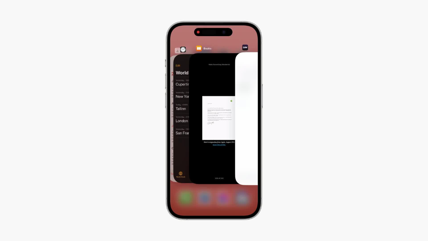
Now, let's look at examples where triggering an action requires explicit intent. The iOS App Switcher will never dismiss an app before the gesture ends, no matter the distance or the fact that the app is partially off screen:
This makes sense to me because dismissing an app is destructive, and it wouldn't feel nice if the app were to dismiss in the middle of the swipe. What if I were to change my mind halfway through and accidentally reached the threshold for dismissing? I could potentially lose some important progress in an app. To make sure the interface responds to intent, triggering on gesture end, regardless of distance, feels right here.
Here's another example where, despite swiping an adequate amount of distance for the view to be fully visible and snap, it doesn't until the gesture ends. This makes it lightweight to briefly peek at another screen when scanning for an app, without committing to it, and quickly interrupt the gesture by changing direction.

Responsive gestures
Truly fluid gestures are immediately responsive. As mentioned above, gestures can have an explicit trigger threshold, but this does not mean that simply performing an animation 0 → 1 would feel great.
For example, a naive implementation for pinching a card would exponentially zoom in after a certain threshold:

Pinching an adequate amount to animate would not feel exactly broken, but the interface gives zero affordance or confidence that the card is even pinchable with a lower velocity. Nor does this feel satisfying to perform.
It feels a lot better by feeling the scale delta applying immediately, and then performing an animation past a given threshold:
For some reason navigating iOS Settings does not feel as responsive as the App Switcher. A layer slides over from the right, which tells me that it can be dismissed by swiping left. But if you happen to mis-tap, then swiping back immediately does not interrupt the animation. You have to wait for it to end.

Spatial consistency
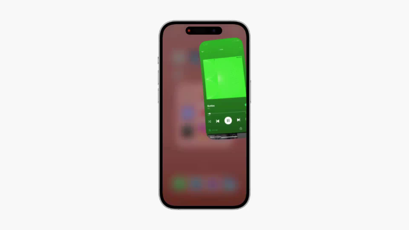
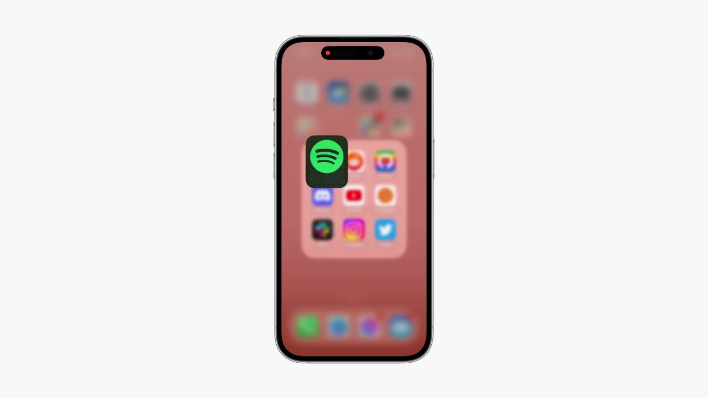
The Dynamic Island has this nice interaction where on tap the application slides out under from the Island to cover the screen:
But if the Island is expanded, which conceptually tells the interface my intent is to receive more detail, the application does not slide out from the Island. Instead, it launches from the icon, if it’s visible. Alternatively, the application slides in from the right:

I can only assume that by launching Spotify from the icon, it is a lot more clear where the audio is playing from. Let’s say you have three music apps on the same row. Through motion, this helps establish a relationship between the audio player and its source.
Similarly, if the app slides in from the right, it communicates where it is spatially—in the App Switcher. By moving in from the right, not left, it also signifies that the app is now first on the stack of apps in the switcher.
However, the native Clock app will never open from its icon. It always jumps out from the Island, even when expanded:

This seems to support the theory above. Because the Island timer module is only specific to one app and there can't be another with the same Island, there's no need to make it clear where it's from.
Fluid morphing
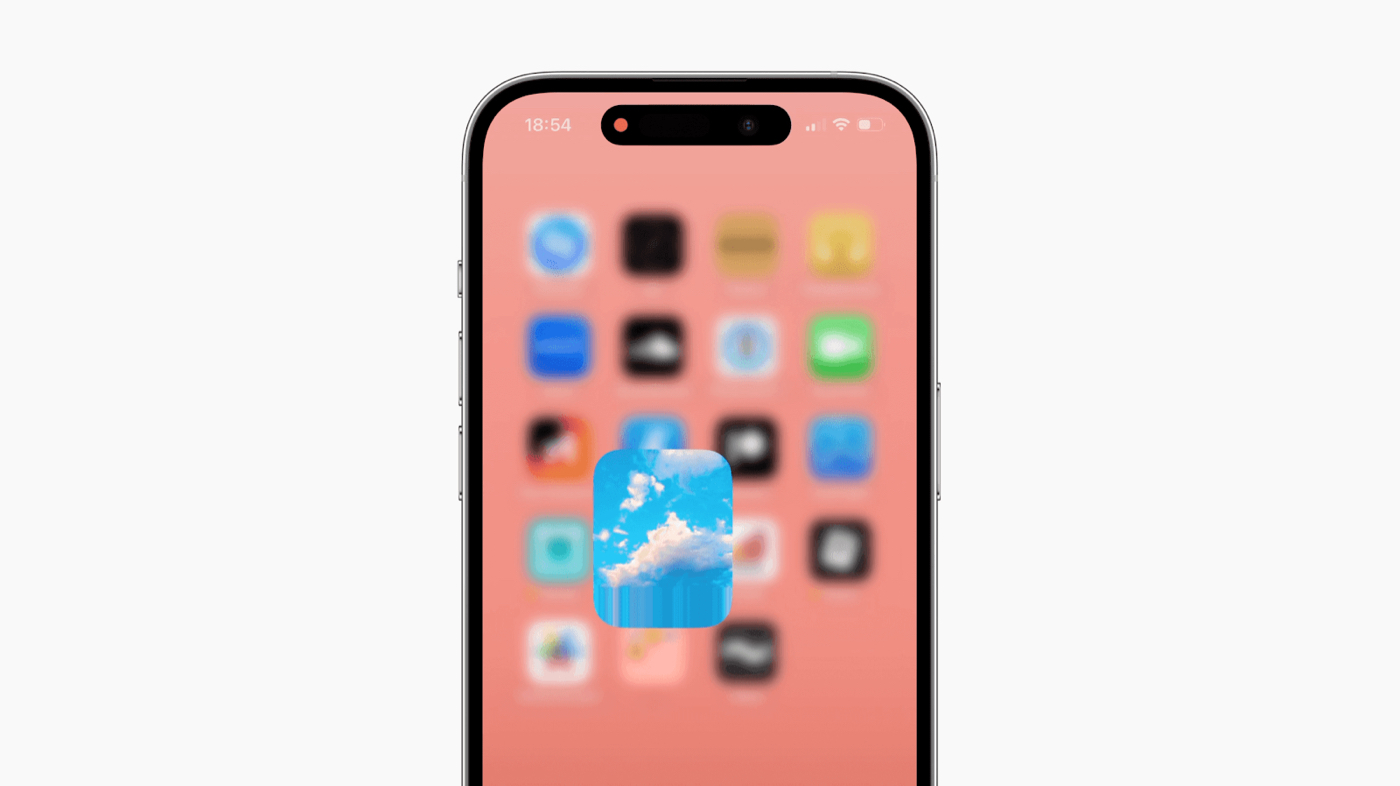
We're all familiar with the beautifully fluid, interruptible gestures of iOS to quickly navigate apps. Swiping up morphs the full screen app into its icon.
A curious detail here is that the icon is intentionally stretched from the bottom to fill the frame as it fluidly morphs its shape from a vertical rectangle to a uniform square. It's a tiny bit more obvious what happens when looking at the non-standard GitHub icon:

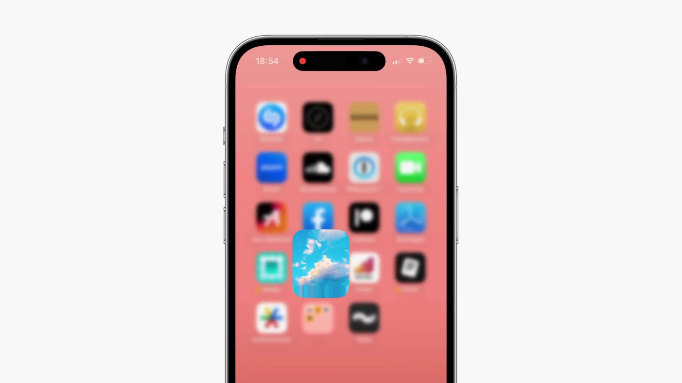
This technique does assume that app icons adhere to the guidelines outlined by Apple. The Bluesky icon ignores the recommended safe zone, and as a result, the bottom ~10pt of the icon is cropped, duplicated, and stretched, resulting in this weird repeating image effect:
In practice this does not feel completely off, but definitely not as great:
Frequency and novelty
As a designer, I love to animate everything. Object permanence, creating a focal point, and delight are all good reasons for doing so. But it's not so obvious when not to animate something.
Sometimes we can get away with not animating mouse or keyboard interactions, without it feeling jarring. There is an inherent disconnect between input from peripheral devices and what happens on the screen. Pressing a key feels less visceral and more mechanical than touching the screen.
A good example is command menus. It's tempting to throw an opacity and scale fade on the overlay. But if we for a moment consider the interaction frequency being hundreds of times a day, it does start to feel more like a cognitive burden after seeing the same animation for the hundredth time.
When so commonly executed, the interaction novelty is also diminished. It doesn't feel like you're doing anything peculiar, deserving of a special flourish.
A case in point: I was working on a bookmarking tool and intuitively felt great about animating the active indicator and elements being added and removed from the list:

After a couple of days they began to feel sluggish. Despite making the motion even snappier, my perceived performance was making me feel like I had to wait too long when interfacing with the keyboard. I removed motion from core interactions and suddenly felt like I was moving much faster:

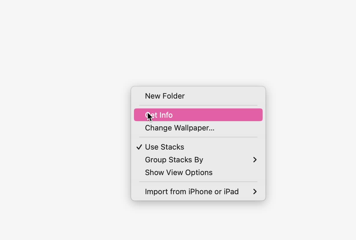
Context (right-click) menus on macOS also appear without motion. They’re used thousands of times a day, with very low novelty and high frequency. Despite being a mouse interaction, it feels right to not animate the menu appearing:

Interestingly enough, the menu subtly fades out. On closer inspection, the selected item briefly blinks the accent color (pink) to provide assurance that the element was successfully selected. I can only assume that the menu fading out makes this feel more graceful and intentional than abruptly disappearing after the blink:
Another good example is the App Switcher on macOS, which gets a lot of mileage for heavy keyboard users. The overlay never animates, which makes moving between apps feel snappy:
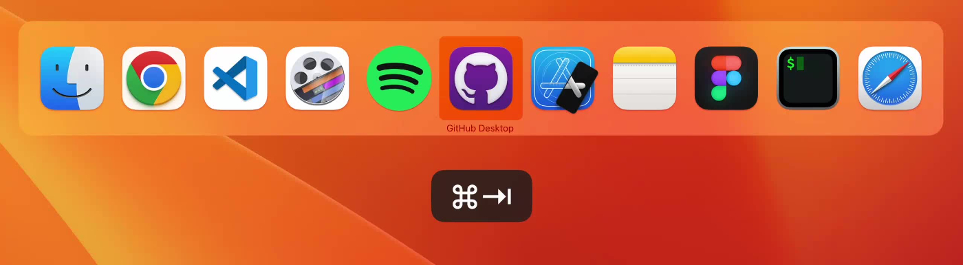
Furthermore, if the time delta between pressing Command and Tab is low enough, the previously active window receives focus immediately without showing the menu:
Fidgetability
Wonderful interactions don't have to be entirely practical. We've all been in math class, either biting our lips or repetitively clicking a pencil while crunching numbers. Behaviors like this are considered fidgeting—in other words, repetitive movements that help release situational stress or enhance concentration. Although there is no scientific research that supports this claim, fidgeting does feel like a part of intentional interaction design.

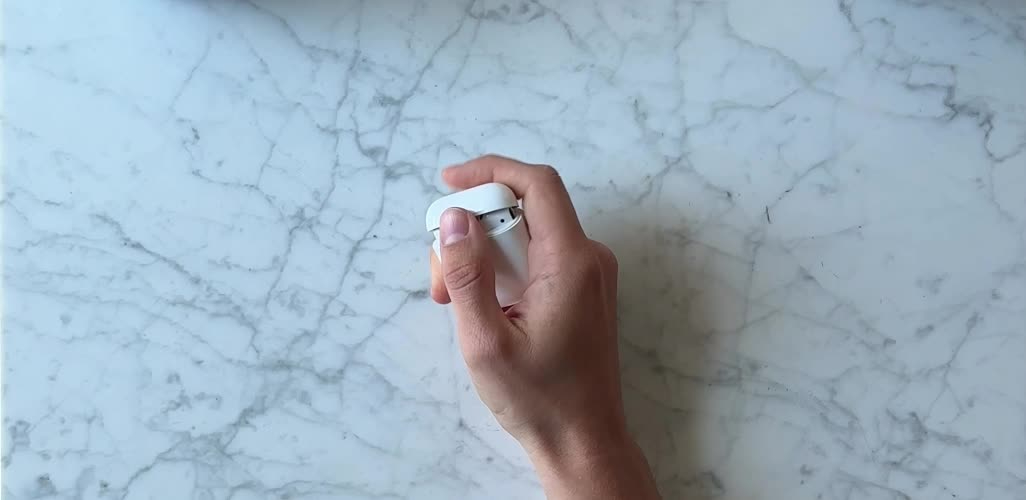
Fidgetability could also be an afterthought or a happy side effect. However, the AirPods case is uncannily satisfying to play with. Assuming that to be a coincidence would be generous.
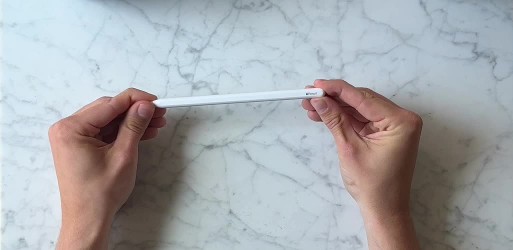
Apple Pencil is a more obvious candidate to intentionally design to be fidgetable. The tip of the pencil is unscrewable, which means it can be replaced eventually. Oddly enough, twisting the tip and rotating the pencil body provides satisfying friction to casually play with while thinking.
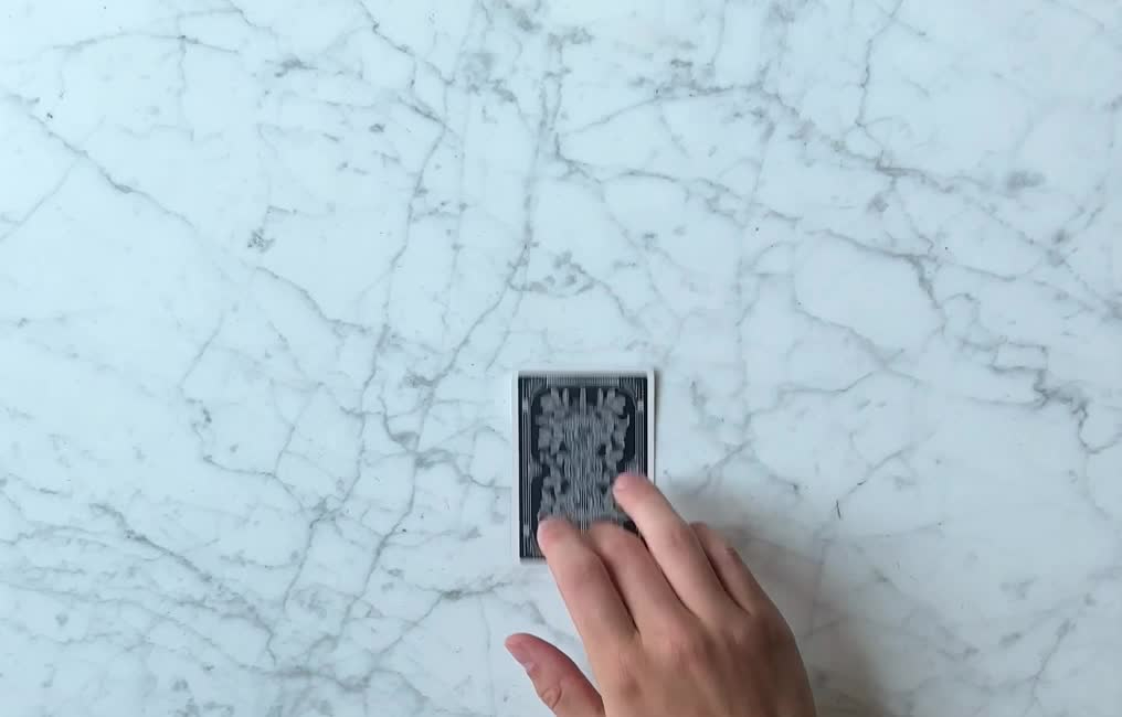
Here's a crazy one that I would not bet my money on being intentional (although it is cool).

Scroll landmarks
On macOS you can always find the pointer by shaking the mouse. This interaction feels wonderful because it taps into the frustration and natural reaction that people feel when losing track of the pointer.

Something similar happens to me on mobile when browsing long-form content. I've scrolled down halfway, and while reading I want to recall something from above. But I feel awkward scrolling back up because I will lose my precious scroll position and reading progress.
I made a tiny prototype where double-tapping the scrollbar will place a landmark for the current scroll position. Now I could freely navigate around the page and double-tap the landmark to get back to where I was before.
This feels familiar to use because the scrollbar is already interactive on touch. If you didn't know, long-pressing the scrollbar would make it draggable, which is much faster to scroll quickly.
This reminds me of an old minimap prototype I made, inspired by games where you always have a bird's-eye view of the surrounding environment. Why not have a similar heads-up display for navigating a page?
Touch content visibility
On touch interfaces, sometimes a finger might obfuscate what's happening on the screen, making it hard to perform gestures at pixel-level precision. Commonly, the interface would render a temporary representation of what's underneath the finger.
For example, when pressing down and dragging to move the text caret on iOS, a magnifying loupe will appear above the touch point. However, whenever the finger moves downwards and no longer covers the caret, the loupe disappears.

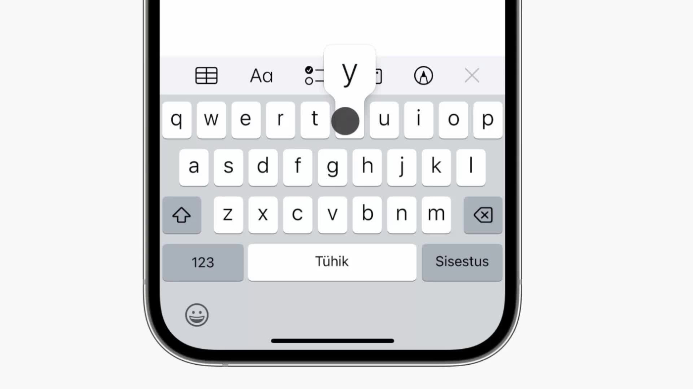
A similar detail is used for the keyboard. Pressing a key will show an enlarged key, which gives you confidence that the interface understood what you meant.
It doesn't always make sense to mirror the obfuscated region. For example, sliders can be tiny and disappear under the touch of the thumb. It helps to ensure that the dragging gesture does not cancel when moving away from the slider and still pressing down:
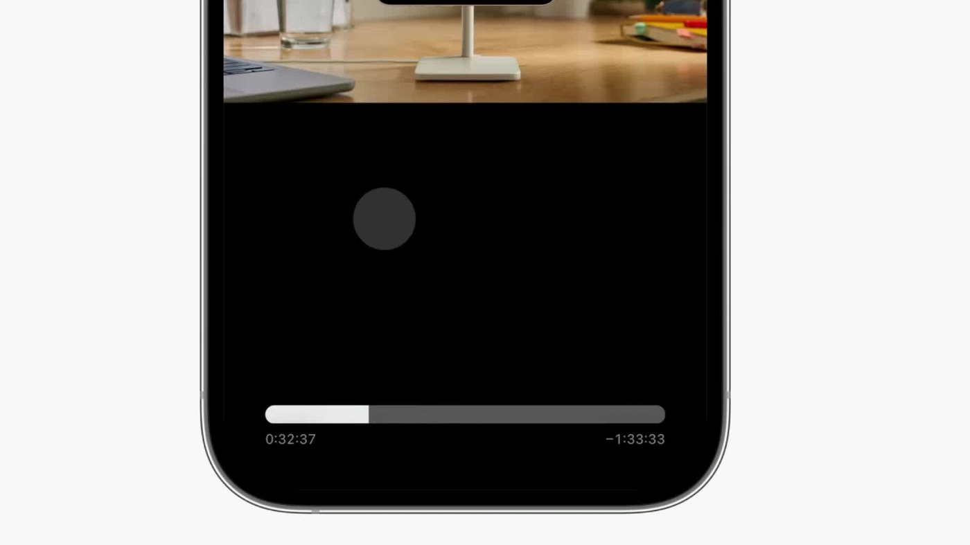
Although seeking video is mostly a visual interaction, there's an unintelligible level of discomfort apparent when interacting with an element that you can't see.
Here's a more obvious example where it's critical to understand the contents of the menu:

Implicit input
Forever long we've been peeling back the layers between humans and computing. Touch input elevated the relationship by introducing gestures and haptics. Soon applications will no longer be bound by the constraints of a fixed screen.
The keyboard, mouse, touch, and voice are all explicit inputs. They feel like a natural extension of ourselves when dialed into perfection. But isn't the mother of all inputs no input at all? When an interface makes use of context as input and can infer what you're trying to do without asking, it truly feels magical.
For example, by looking at the screen, Apple Maps will show the active route navigation without unlocking. Apple Wallet will increase the brightness when presenting a pass for scanning. Spotify will adjust the interface to be more accessible while driving.

Some custom iOS apps will blur the contents of the app when opening the App Switcher. At first, I figured it was just a performance optimization. But it turns out that it's a deliberate attempt to conceal possibly sensitive data, like medical records or a bank statement.
Fitts's law
Fitts's law states that the time to click on something depends on distance and size. The bigger the target, and the closer it is to where your pointer is, the better.
Operating systems make use of "magic corners" on the edges of the screen because the target area is infinitely large. For example, on macOS, you can configure what happens when the pointer moves to a corner. You could show the Launchpad from the top-left corner:

The target size is infinite because the pointer can't overshoot past the corner, so the precision required for this interaction is very low. Reaching for any corner becomes a quick flick of the mouse. This is also why operating systems place commonly used menus, like the Apple menu, in corners.
Radial menus are an exemplary case of Fitts's law. They spawn around the pointer, making the size and distance towards any target the same for all actions. Over time, muscle memory will kick in and even make it possible to select an action based purely on distance and direction.
Here's a radial menu you can try:

Scrolling
On most operating systems, you can scroll any scrollable region, even if the window itself is not active. This is great, except when another window scrolls unintentionally.
With the Magic Mouse I can scroll on a window, then move the pointer over a second window to click or find something, and the scroll events will not register on the second window. This feels great to me.

However, with any traditional mouse, like the Logitech MX Master 3, the scrolling on the first window is cancelled and hijacked by the second window. It's frustrating when this happens daily:

With the Magic Mouse, scrolling is cancelled explicitly by focusing another window:
Pointing devices like the Magic Trackpad and Magic Mouse also unlock direct manipulation for desktop computing. Besides the obvious interactions, like swiping between apps, it's possible to directly manipulate sliders by scrolling, all with a single interaction:

Designing beyond intuition
For me, understanding and articulating why something feels right does not come as intuitively as designing something to feel right. But they are two sides of the same coin. There must be a reason. It can be as simple as a particular spring curve or something more innate, like metaphors. Analyzing and making sense of design details beyond just "it feels nice" helps nurture taste, amplify the level of execution, and grow an appreciation for how hard the pursuit of excellence is.
Each image in this piece was originally a video with animations. To see the originals click here.
Thanks to Paco, Alasdair, Emil, and Thomas for reading early drafts and offering their insights and feedback. No artificial intelligence was used to generate content for this article.
Rauno Freiberg is a staff design engineer at Vercel based in Estonia. He previously worked at The Browser Company. This post was originally published on his website.
Resources
- E. Goodman, E. Stolterman, R. Wakkary. "Understanding Interaction Design Practices" (2011)
- C. Karunamuni, N. Vries, M. Alonso. "Designing Fluid Interfaces" (2018)
- Brandur. "Learning From Terminals to Design the Future of User Interfaces" (2017)
- S. L. Kriescher. "The Effects of Fidgets on Attention and Learning of College Students" (2020)
- Paul Morris Fitts. "The information capacity of the human motor system in controlling the amplitude of movement" (1954)
- Kevin Hale. "Visualizing Fitts's Law" (2010)
- "Apple Human Interface Guidelines" (1987)
- Rasmus Andersson. "The curious case of user interfaces" (2023)
- Metamuse. "Rethink the OS with Jason Yuan" (2020)
- Jason Yuan. MercuryOS (2019)
- Paul Graham. "How to Do Great Work" (2023)
- Brian Lovin. App Dissection.
Thanks to our Sponsor: SaneBox
Thanks again to our sponsor SaneBox, the AI-powered email filter that lets you prioritize important messages and saves you 3-4 hours a week. Customize your preferences, easily snooze, unsubscribe, or enable do-not-disturb mode for a serene inbox across devices and clients.
Enjoy unmatched privacy and security, as SaneBox only reads headers, never email content. Join thousands of satisfied users and make SaneBox your go-to solution for a clutter-free email experience.
The Only Subscription
You Need to
Stay at the
Edge of AI
The essential toolkit for those shaping the future
"This might be the best value you
can get from an AI subscription."
- Jay S.


Comments
Don't have an account? Sign up!