How Apple Builds the Future
It hides its secrets in plain sight
June 8, 2023 · Updated February 5, 2026
When Apple unveiled Vision Pro, its first new hardware platform since the Apple Watch’s launch in 2015, it was the first time most of us had seen it. And yet, if you’ve used Apple products at all over the past decade, the product’s design was almost déjà vu.
A curved pane of black glass. A brushed aluminum body. A cloth headband and a braided power cord. Upraised, rounded rectangle buttons. A Digital Crown.
The Vision Pro wasn’t an iPhone, or an Apple Watch, but its design was clearly related to both. There was an uncanny feeling that you’d seen this thing before, that you almost could have predicted what Apple was building if you’d looked in the right spot.
The Digital Crown—the small round knob on the right of the Apple Watch—was lifted straight from horology, when the watch first launched in 2015. As an analogue to the crown used to set and wind a traditional watch, it was a way to anchor the Apple Watch to its mechanical ancestors, launched alongside the first generation’s solid gold case. For the button-averse Apple, it was almost a surprising bit of physical excess.
Then the Digital Crown gained a second life as a volume knob on Apple AirPods Max in 2020. It began its third life on Monday, as the way to dial the real world in or out on the Vision Pro headset. The Digital Crown went from an homage to a default new Apple input control.
If you’ve ever worn a watch before, you know instinctively how to use the Apple Watch crown. Now that familiarity is paying off for Apple again: If you’ve ever worn an Apple Watch, you already know how to use at least one part of the Vision Pro. The learning curve of virtual reality is high, and Apple can bring it down a bit with familiar design elements. That familiarity is part of what makes the Apple ecosystem so sticky.
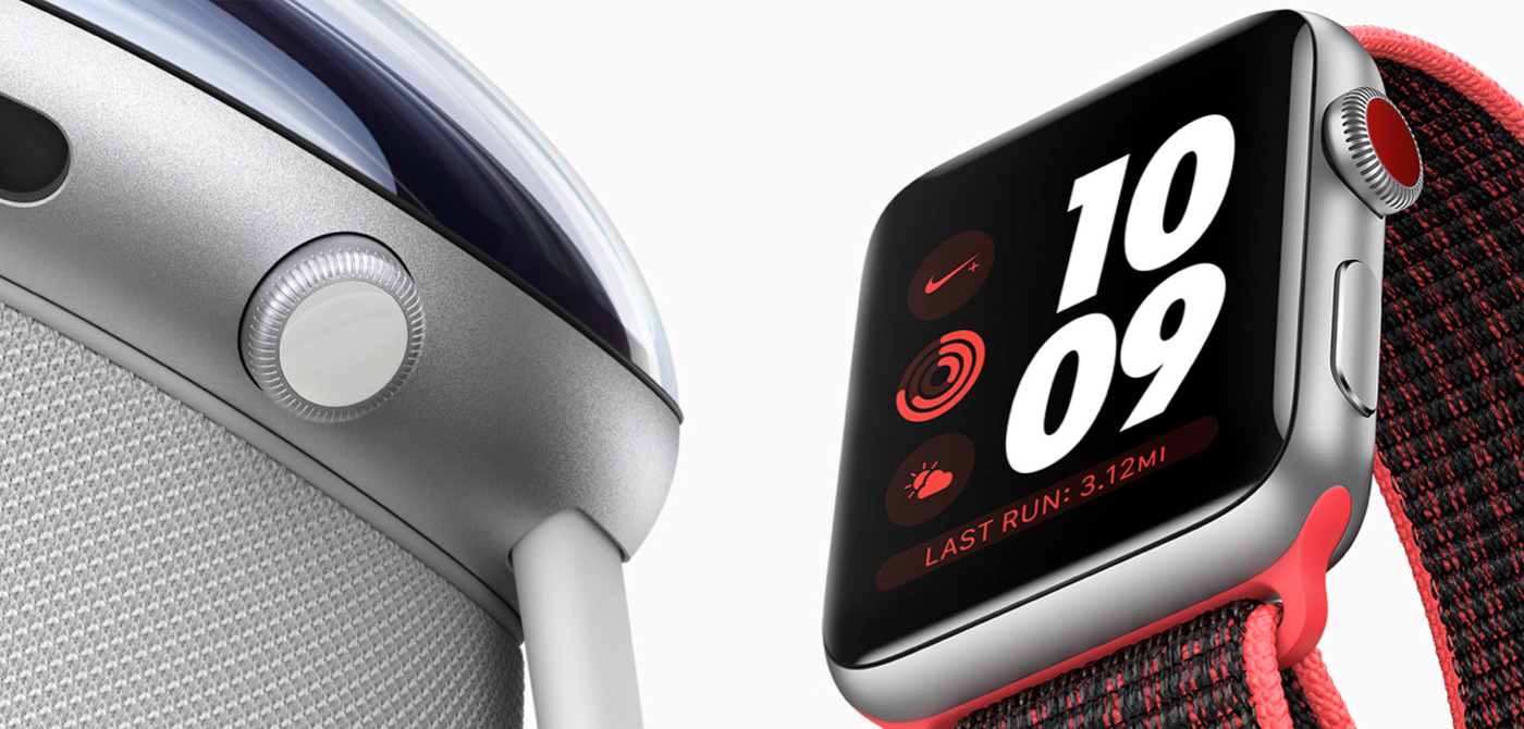
The Digital Crown on the Vision Pro is most reminiscent of the Digital Crown on the Apple Watch Series 3, the first with cellular support and a corresponding colored dot on the Crown.The Vision Pro is filled with recognizable design elements, things we’ve seen and used before. Even the smaller details were anchored to past Apple products. Apple Watch Ultra’s Tail Loop band—the black one, at least—came with an orange pull tab (alongside the Ultra’s other orange highlights). That, too, showed up in Vision Pro’s headband, orange and all.
Same for Vision Pro’s battery pack, which looks like nothing more than an aluminum variant of the MagSafe Battery Pack (a magnetic power bank for the iPhone released in 2021). And the Vision Pro’s cloth-covered “woven power cord” came first with the HomePod before showing up in the M2 MacBook and the Apple Watch Ultra.
The little details *chef’s kiss*
This is just the beginning of a long list of tech the Vision Pro imported from other Apple products. Some of the copied hardware feels obvious, like the M2 CPU. Of course the headset would use Apple’s latest CPU.
Other aspects of the Vision Pro are delightfully unexpected. They help us finally make sense of stuff Apple’s been building for a while.
Take Spatial Audio for example. Apple’s seemingly random developments in the audio space started with the HomePod in 2018, which seemed like a side project for the tech giant. Yet that’s where Apple first started experimenting with what it then called “spatial awareness to... automatically adjust the audio.” They shortened the name to Spatial Audio with the launch of the iPhone11 the next year.
Apple went to the trouble of remastering Apple Music in spatial audio for AirPods, and it all felt like a bit of wasted effort. That is, until Spatial Audio became a keynote feature in a virtual reality device, where sense of presence is the whole game. Then it all made sense. Perhaps you could have virtual reality without spatial audio, but it wouldn’t be nearly as immersive.
Suddenly a half decade of seemingly unrelated audio investments made the Vision Pro a better product from launch.
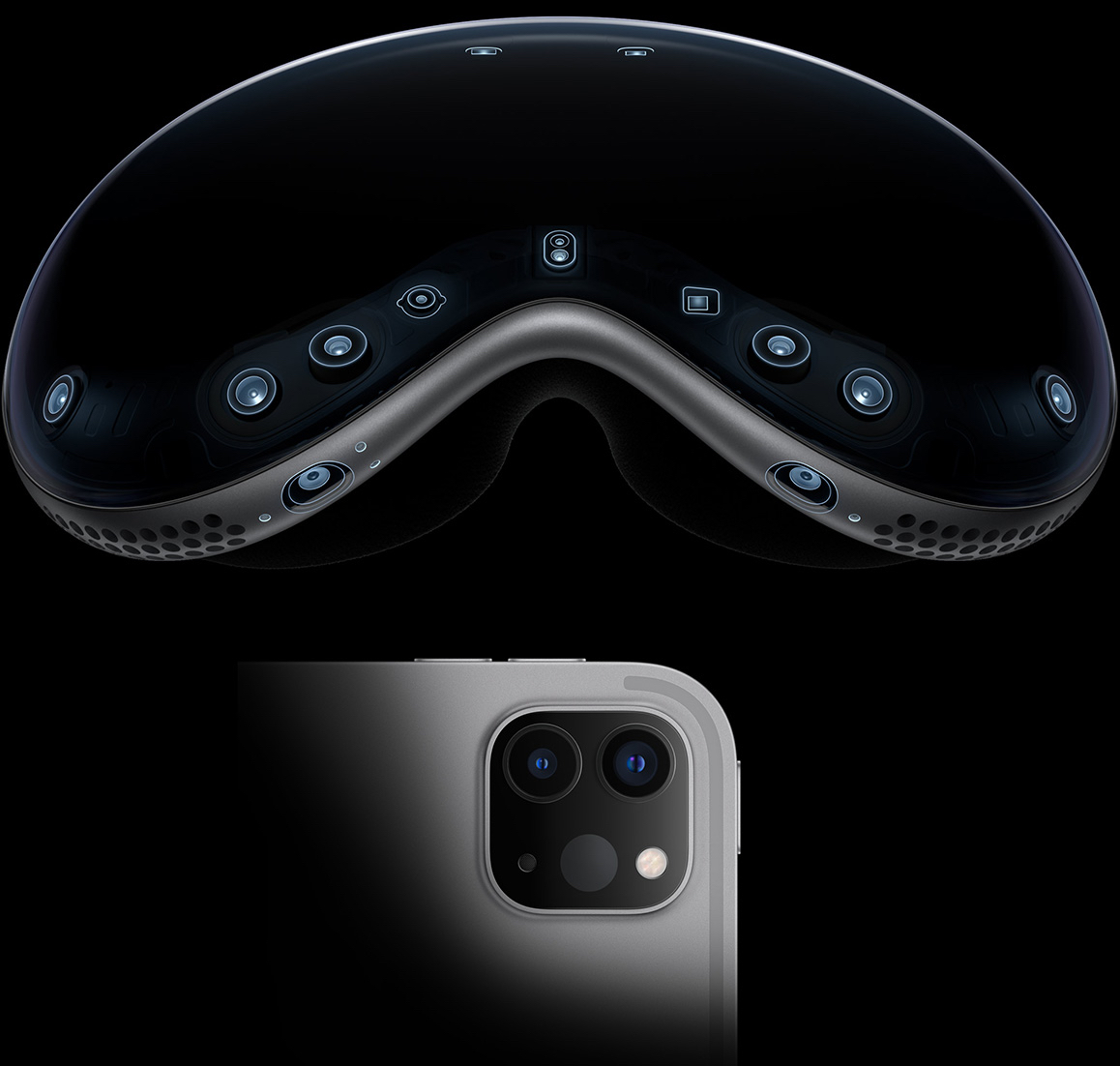
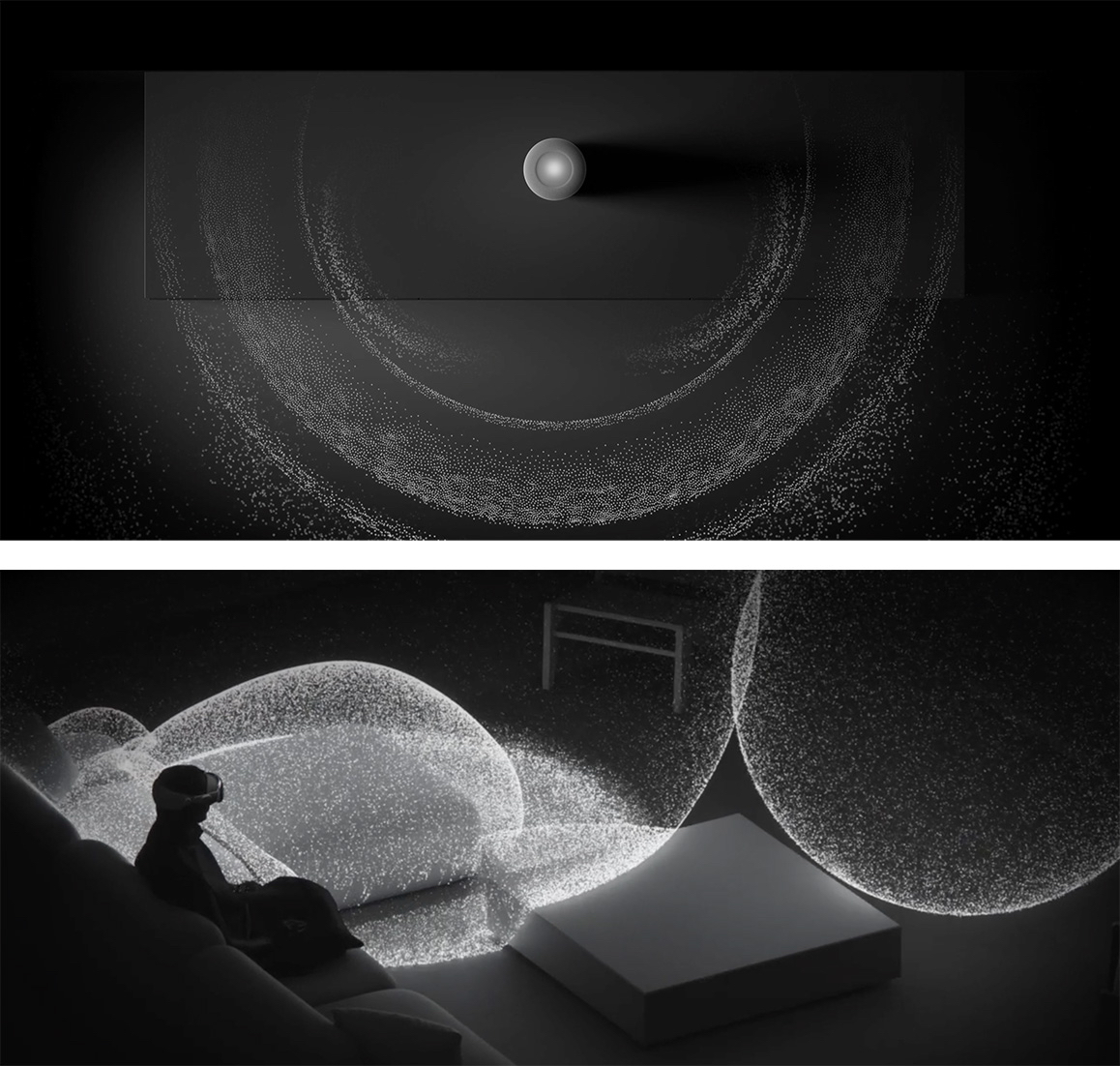
Even Apple’s animation explaining Spatial Audio on Vision Pro is directionally similar to the HomePod’s Spatial Audio animation.Many features in other Apple devices found their logical endgame in the Vision Pro. Take, for example, Apple’s experiments with LiDAR (“light detection and ranging” sensors, used to detect depth in adaptive cruise control, among other things). When Apple first shipped it on the 2020 iPad Pro, its press release said: “The breakthrough LiDAR Scanner enables capabilities never before possible on any mobile device.”
Yet the use cases were few and far between. It helped the built-in Measure app to take better measurements of your room, but it never seemed to be a truly needed feature on the iPad. As The Verge’s Dieter Bohn wrote at the time, you’re “paying for LiDAR you may not use.”
Maybe Apple built it into the iPad as a way to experiment with the LiDAR sensor and get early data on its usage, before building it in as one of the core sensors in Vision Pro. It’d be hard to build an AR/VR headset without that sensor. And it would be hard to get real-world experience in working with the sensors without shipping them in a mass-market product.
Who knows—perhaps the LiDAR sensor now in iPads and iPhones will be the foundation of 3D photography for Vision Pro in a future update.
It’s not just hardware features that Apple ships in one product to later reuse in another. It experiments with software in the same way. Take the hover effects, introduced with 2022’s iPad Pro. It detects when an Apple Pencil is near the screen and slightly increases the icon size when you’re hovering nearby.
The Only Subscription
You Need to
Stay at the
Edge of AI
The essential toolkit for those shaping the future
"This might be the best value you
can get from an AI subscription."
- Jay S.
Join 100,000+ leaders, builders, and innovators

Email address
Already have an account? Sign in
What is included in a subscription?
Daily insights from AI pioneers + early access to powerful AI tools



Comments
Don't have an account? Sign up!